The Wyckoff Distribution Schematic
The Wyckoff distribution schematic is the five-phase map of a market top, the mirror of the accumulation schematic, and it tracks how professional money unloads inventory into public buying inside a range before the markdown takes price away. A top is not a bar. It is a process that takes weeks or months, and it looks like health almost the whole way through.

The classic accumulation and distribution framework built this map to explain why so many traders buy near highs that felt safe. Think of it as an estate sale where everything must go, priced to keep the crowd coming through the rooms until the house is empty, after which the seller locks the door and walks away. The price never crashes during the sale, because a crash would empty the room. The crowd leaves happy. The seller leaves done.
Where the accumulation schematic mapped the bottom, this lesson maps the top only. The cause built inside this range is measured downward, projected from the breakdown, not upward.
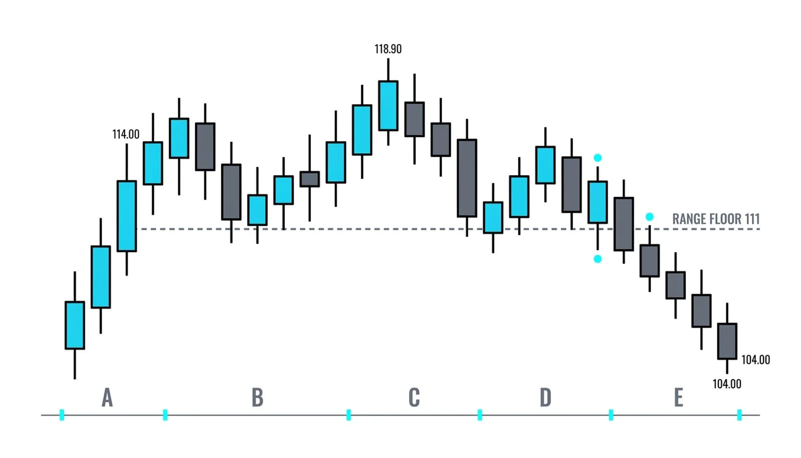
Phase A: The Top Stops Being a Trend
Phase A is where the advance meets supply and stops behaving like a trend. Four events open the schematic, and you can name them in one breath each.
Preliminary supply appears first: the first down move on noticeably heavy volume after a long climb, a warning that large sell orders are now meeting the buying. Then the buying climax prints, a violent final push to the high on enormous volume where public enthusiasm peaks and the operator sells aggressively into it. The automatic reaction follows, a sharp drop that sets the floor of the range because sellers briefly overwhelm what is left of the demand. Finally the secondary test recovers back toward the high on lighter volume, checking what buying remains, and it stalls.
Those four events draw the boundaries. The buying climax marks the ceiling, the automatic reaction marks the floor, and everything that follows happens between them. The trend is over the moment the range exists, even though nobody at the party believes it yet.
Phase B: Selling Into Strength
Phase B is the unloading campaign, and it is the heart of the schematic. For weeks, price swings between the floor and the ceiling, and every rally to the top of the range is a delivery. The operator does not dump inventory in one session, because that would collapse the price and destroy the exit. Instead, professional money sells into strength, tranche by tranche, letting each wave of public optimism absorb another block of shares.
The volume balance across phase B tells the real story. Rallies toward the ceiling tend to run on thinning volume, because genuine new demand is drying up. Down moves toward the floor tend to run on heavier volume, because real supply is hitting the tape. Support appears at the floor again and again, and each time it does, the crowd reads it as proof the market is strong. The operator reads it as one more chance to sell at a good price next week.
This phase can stretch far longer than an impatient trader expects. The campaign ends when the inventory is gone, not on any fixed schedule.
Phase C: The Test of Demand
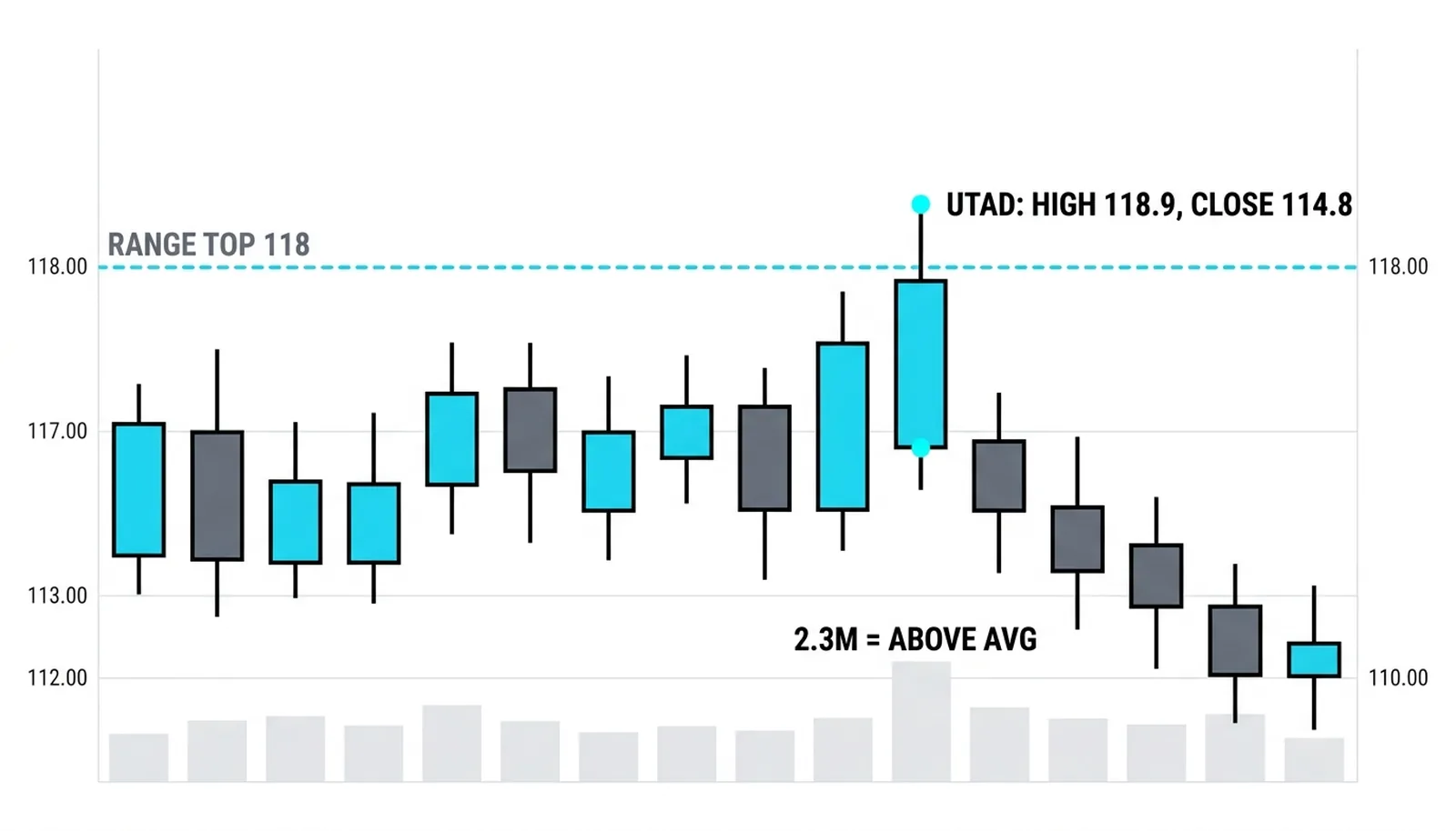
Phase C is the test. Price pushes above the top of the range, often with a burst of good news, and the breakout crowd piles in. The move is designed to prove one thing: whether enough demand remains above the range to carry price higher, or whether the push is the last trap.
In a true distribution, the poke fails. Price closes back inside the range, often on the same bar or within a few sessions, and the breakout buyers are immediately underwater. That failure is the signature. The upthrust-after-distribution lesson takes this event apart in full detail, because it is the single most important tell at a top.
Phases D and E: Lower Highs, Then the Break
Phase D is confirmation. Rallies after the failed test no longer reach the old high. They stall at lower levels, printing a clean run of lower highs, and each stall is a last point of supply where the final sellers finish their work. Volume on these rallies is weak. Volume on the reactions is not. Demand is exhausted and the operator is nearly flat.
Phase E is the markdown. Price breaks the range floor, the cause built during phase B begins to pay out, and the decline feeds on itself as the comfortable crowd becomes the trapped crowd. The breakdown often comes on a volume expansion, because there is no professional bid left underneath. The same market that felt safe for two months now drops for weeks.
Two honesty beats before the example. First, the schematic describes how tops tend to unfold, not a form to fill in: real tops skip phases, repeat them, or stretch phase B far past what feels reasonable. Second, the crowd's experience of this range is comfort, price holding near the highs while the news stays good, and that comfort is precisely the product being sold. Shares at retail prices. That is why the volume evidence points the other way from what a comfortable market suggests.
One Top, Measured End to End
A hypothetical stock climbs from 88 to 114 over several months on an average of 1.3 million shares a day. Then the schematic begins.
Preliminary supply appears as a down bar from 113.8 to a 110.9 low, closing at 111.8 on 3.4 million shares, nearly triple the average. The buying climax prints a 118.0 high on 5.1 million and closes at 116.2, well off the high. The automatic reaction slides to 111.3 on 2.1 million, setting the floor. The secondary test recovers to 115.6 on only 1.7 million and stalls under the old high. Phase A is complete: the range runs roughly 111 to 118.
Phase B runs seven weeks inside that band. Rallies toward 117 come on shrinking volume; down days toward 112 come on heavier. Phase C pokes to 118.9 on 2.3 million and closes at 114.8, back inside. Phase D rallies reach 116.4, then only 114.5. Then the breakdown prints 110.7 on 3.9 million.
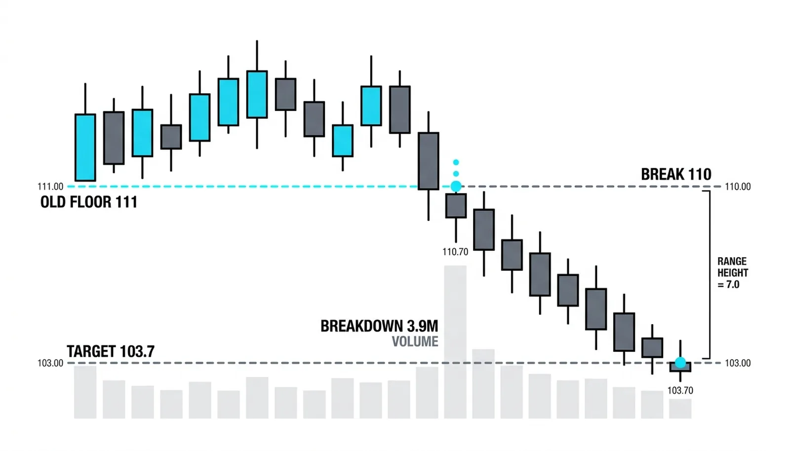
The range height is 7.0 points, so the projected downside target from the 110.7 breakdown is 103.7, reached within three weeks in this illustration. The invalidation was clear the whole time: a heavy-volume close above 118.9 with follow-through cancels the entire top thesis.
| Phase | What the crowd sees | What the operator is doing | The volume tell | What confirms the phase |
|---|---|---|---|---|
| A | A normal pullback in a strong trend | First large sales into the climax | Climax volume, then a lighter retest | Secondary test stalls under the high |
| B | Healthy sideways consolidation | Steady unloading into each rally | Thin rallies, heavy down days | Repeated rejection at the ceiling |
| C | A breakout to new highs | Final sales into breakout buying | Above-average poke volume that fails to hold | Close back inside the range |
| D | Chop before the next leg up | Finishing the last inventory | Weak rally volume, lower highs | Last points of supply hold |
| E | A scary but temporary dip | Done selling, no bid underneath | Expansion on the breakdown | Range floor breaks and holds as resistance |
The Wyckoff Distribution Schematic, Answered
What is the Wyckoff distribution schematic?
It is the Wyckoff method's five-phase map of a market top, showing how professional money sells a large position into public buying inside a trading range before price marks down. It is the mirror image of the accumulation schematic at bottoms.
What are the phases of a Wyckoff distribution?
Phase A stops the uptrend with preliminary supply, a buying climax, an automatic reaction, and a secondary test. Phase B is the unloading campaign inside the range. Phase C tests demand with a push above the range that fails. Phase D prints lower highs at last points of supply. Phase E is the markdown.
How is distribution different from accumulation?
Distribution is accumulation inverted: the operator sells instead of buys, the range sits at highs instead of lows, and the cause it builds projects downward from the breakdown instead of upward from the breakout. The event logic mirrors, the direction does not.
How do you measure the downside target after distribution?
Count the height of the range and project it downward from the breakdown point. A 7-point range breaking at 110.7 targets roughly 103.7. The Wyckoff method's point-and-figure counting refines this, but the simple range projection is the working version.
The next lesson isolates the single event that confirms most tops: the upthrust after distribution, what it looks like on the bar, and what the volume must do for the signal to count.