The Four Categories of Indicators
Every indicator on any charting platform falls into one of four categories: trend, momentum, volatility, and volume. Each family answers a different question about the same chart. The organizing idea is that plain, and once you hold it, the hundreds of indicators on your platform stop looking like a catalog and start looking like four shelves.

Think of a toolbox with four trays. The drawers look similar from the outside, and each tray exists because a different question needs a different instrument. Trend tools ask where price is going. Momentum tools ask whether the move still has energy. Volatility tools ask how wide the swings run. Volume tools ask how much participation stood behind the move.
Earlier in this level, you learned that every indicator is a lens over the same chart. This lesson is the map of the lens drawer. You have already met most of the lenses: the moving average family, MACD with its histogram, Parabolic SAR, and ADX. Now you sort them.
Trend: Is Price Heading Somewhere
The trend family answers the oldest question in trading: is price actually going somewhere, or just wandering?
Moving averages are the core of this family. A rising average with price above it says up. A falling average with price below it says down. Crossovers between a fast and slow average flag shifts in direction. Parabolic SAR belongs here too, trailing price and flipping sides when direction changes.
ADX sits adjacent to this family. It does not say which way price trends. It says whether a trend exists at all, and how strong it is. Readings above a threshold like 25 suggest a real trend; readings below suggest drift.
Even the zero line of MACD does trend work. When the MACD line sits above zero, the fast average is above the slow one, which means the underlying trend leans up. Below zero, it leans down.
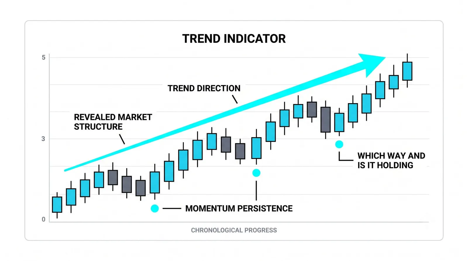
The blind spot is ranges. In a sideways market, trend tools whip back and forth. Crossovers fire and fail. SAR flips every few bars. The family assumes a destination exists, and in a flat market there is none. Trend tools are honest about direction and helpless about chop.
Momentum: Is the Move Fading
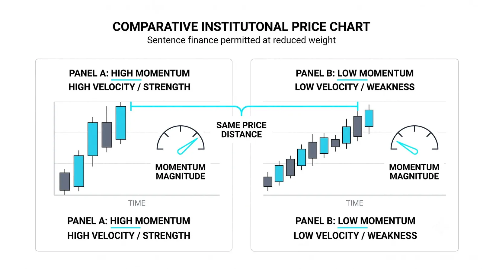
Momentum tools answer a different question: not where price is going, but whether the trip still has fuel.
You already know the machinery. The MACD line measures the gap between a fast and slow average. The signal line smooths that gap. The histogram shows the distance between them. When the histogram shrinks, the move is losing thrust even if price still climbs.
Divergences live here. Price makes a new high while the MACD line makes a lower high, and the tool is telling you the push behind the move weakened. That is a momentum statement, not a trend statement. The trend can still be up while momentum fades.
The blind spot is false turns inside strong trends. In a powerful trend, momentum tools repeatedly flash exhaustion and the trend ignores them. The histogram shrinks, the move pauses for two bars, and then it accelerates again. Traders who treat every momentum dip as a reversal signal get run over by the strongest trends. Momentum tells you about energy. It does not get the final word on direction.
Volatility: How Wide Are the Swings
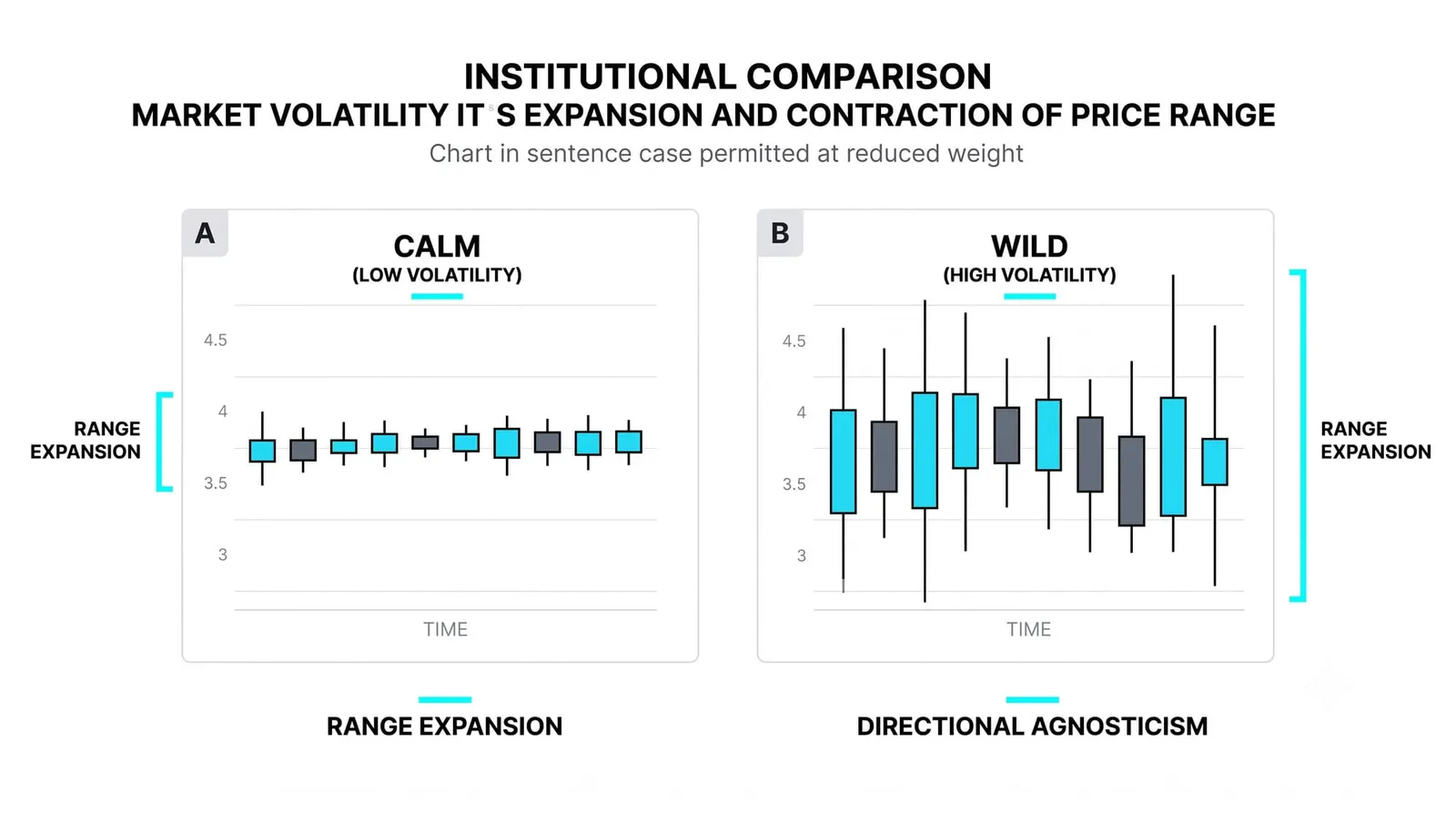
Volatility tools ignore direction entirely and measure the size of the swings.
These indicators are built from the range of price movement. An average true range calculation takes the span of each bar, smooths it over a set of periods, and tells you how much price typically travels. Band-style indicators wrap a moving average with boundaries set by recent volatility, widening when swings grow and narrowing when they shrink.
This family answers practical questions. How far away should a stop sit so normal noise does not hit it? Is the market calm or agitated? Is a quiet squeeze forming that often precedes expansion? A stock that moves 3 points a day needs different risk sizing than one that moves half a point, and volatility tools give you that number.
The blind spot is direction. Volatility tools carry none. A true range reading of 2 points tells you the bars are wide. It says nothing about whether the next wide bar runs up or down. Traders who forget this treat a volatility spike as a signal. It is not a signal. It is a measurement of temperature, and temperature does not pick a side.
Volume: How Much Stood Behind It
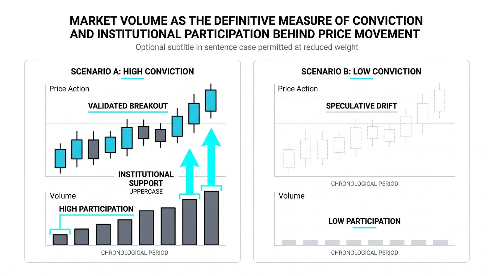
Volume tools ask who showed up. You met raw volume back in the price behavior level, where you learned to read the bars under the chart. On-chart volume indicators repackage that same data into lines and oscillators, but the question stays the same: did real participation back this move?
The logic is simple. A breakout on heavy volume means many traders committed at the new price. A breakout on thin volume means few did, and the move has weaker footing. Volume readings confirm or doubt what price claims.
The blind spot is timing. Volume tells you a move had backing or lacked it. It does not tell you when the next move starts. A stock can sit on declining volume for weeks, quietly building pressure, and the volume reading gives you no clock. It validates or questions what already happened. It never schedules what comes next.
Choosing by Question, Not by Toy
Pick the question first, the family second, the tool last.
Most beginners do the reverse. They find an indicator with an exciting name, bolt it on, and then hunt for a question it might answer. That is how charts end up with six overlapping windows all saying the same thing in different colors.
Work the other direction. Ask what you need to know. If you need to know whether a trend exists, reach into the trend tray. If you need to know whether the move is tiring, reach into momentum. One or two tools per job is enough. Two tools from the same family usually compute from the same data and agree with each other, which feels like confirmation and is not.
Four windows on one chart is a desk, not a dashboard. A dashboard shows you a few readings you actually watch while driving. A desk buried under printouts means you stopped reading any of them. Keep the chart sparse enough that every tool on it earns its space by answering a question you actually ask.
One Chart, Four Questions
Here is a hypothetical illustration with round numbers. A stock climbs from 50 to 60 over two months, with one pullback to 55 along the way. Watch each family answer its own question.
Trend: Price sits above a rising 50-period average for the whole climb. Even at the pullback low of 55, price holds above the average. The trend read: up, uninterrupted.
Momentum: The MACD histogram shrinks as price slides from 60 toward 55. The move's energy fades into the pullback. The momentum read: fading, but only within the dip.
Volatility: Weekly ranges stay between 2 and 3 points for the entire two months. No expansion, no spike. The volatility read: orderly, calm, no stress.
Volume: Participation holds steady through the pullback, with no surge of selling at 55. The volume read: unbothered, nobody rushing for the exit.
Four answers, one chart, no contradiction. Each reading came from its own tray, and each stayed inside its own question. The trend tool did not try to time the pullback. The momentum tool did not declare the trend dead. The volatility tool did not pick a direction. The volume tool did not set a date. That discipline is what the four categories are for.
| Category | Question It Answers | Blind Spot |
|---|---|---|
| Trend | Is price heading somewhere, and which way? | Whipsaws in sideways ranges |
| Momentum | Does the move still have energy? | False exhaustion signals inside strong trends |
| Volatility | How wide are the swings? | Carries no direction at all |
| Volume | How much participation backed the move? | Says nothing about timing |
Indicator Categories, Answered
Which category of indicators is best?
None of them, because each answers a different question. Asking which category is best is like asking whether a hammer beats a tape measure. Trend tools dominate in trending markets and fail in ranges. Momentum tools shine at turning points and misfire in strong trends. The best category is whichever one matches the question you are asking right now.
Can categories contradict each other?
Yes, and they often do, because they measure different things. Momentum can fade while the trend stays up, exactly as it did in the worked example. That is not a contradiction; it is two honest answers to two different questions. Trouble starts when you treat a momentum reading as a trend verdict.
Do you need one indicator from each category?
No. You need coverage of the questions your method actually asks. Many traders run one trend tool and one momentum tool and never touch the other two trays. Add a category only when you catch yourself asking a question your current tools cannot answer.
Where do oscillators fit?
Most oscillators, including the ones built around MACD-style math, live in the momentum category. They oscillate because they measure the ebb and flow of energy in the move. A few hybrid tools borrow from two families, but every oscillator you will meet answers some version of the momentum question: is the move fading?
You now have the full map of the indicator layer: what indicators compute, the moving average family, MACD, and the four categories that organize everything else. Next, this level closes with the question that decides whether any of this knowledge pays: why indicators alone are not a strategy, and what has to surround them before a trade is actually a plan.