The Standard Deviation Indicator, Explained
The standard deviation indicator measures how far price has been scattering from its own average, bar by bar, and plots that scatter as a single line. High reading, closes have been straying widely from their mean. Low reading, they have been hugging it. It is the raw material inside the Bollinger Bands, promoted from a band width to a standalone chart.

Think of it as a ruler for the market's fidget. Lay it against the last 20 closes and it reports how twitchy they have been around their center, in price units. The ruler does not care which way the twitching pointed. A market fidgeting in place scores high, and a market marching steadily in one direction can score lower, because a march has structure and fidgeting does not.
The tool sits in the volatility category, and the construction it feeds lives in the Bollinger Bands breakdown; this lesson owns the bare line.
What Sigma Actually Measures
Standard deviation, the sigma of statistics class, is the typical distance between the individual values and their average. Over a 20-bar window, the indicator computes the average of the last 20 closes, then measures how far each close sits from that average, and reports the typical size of those distances. A tight cluster around the mean gives a small number; closes sprayed across a wide range give a large one.
The direction blindness is the part traders trip on, so the numbers deserve a table before the prose. A market fidgeting in place with closes spread about 2 points can print a higher sigma than a market marching steadily 10 points higher, because the march's closes line up along the path while the fidget sprays around the middle. Sigma answers how spread out, never which way.
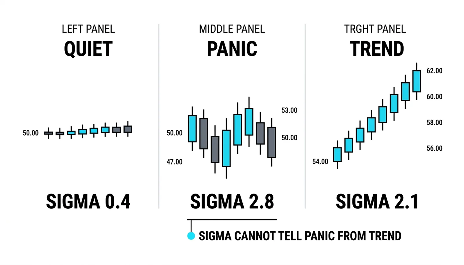
Three windows on one hypothetical market make it concrete. The quiet stretch: closes within 0.4 points of their average, sigma 0.4. The panic stretch: closes swinging 3 points either side of the average, sigma 2.8. The trend that follows: closes marching in a steady staircase, sigma 2.1, almost as high as the panic but half as wild bar to bar. A trend is a real dispersal of price; sigma counts it as dispersal even though no panic occurred.
The Reading: Regimes, Not Signals
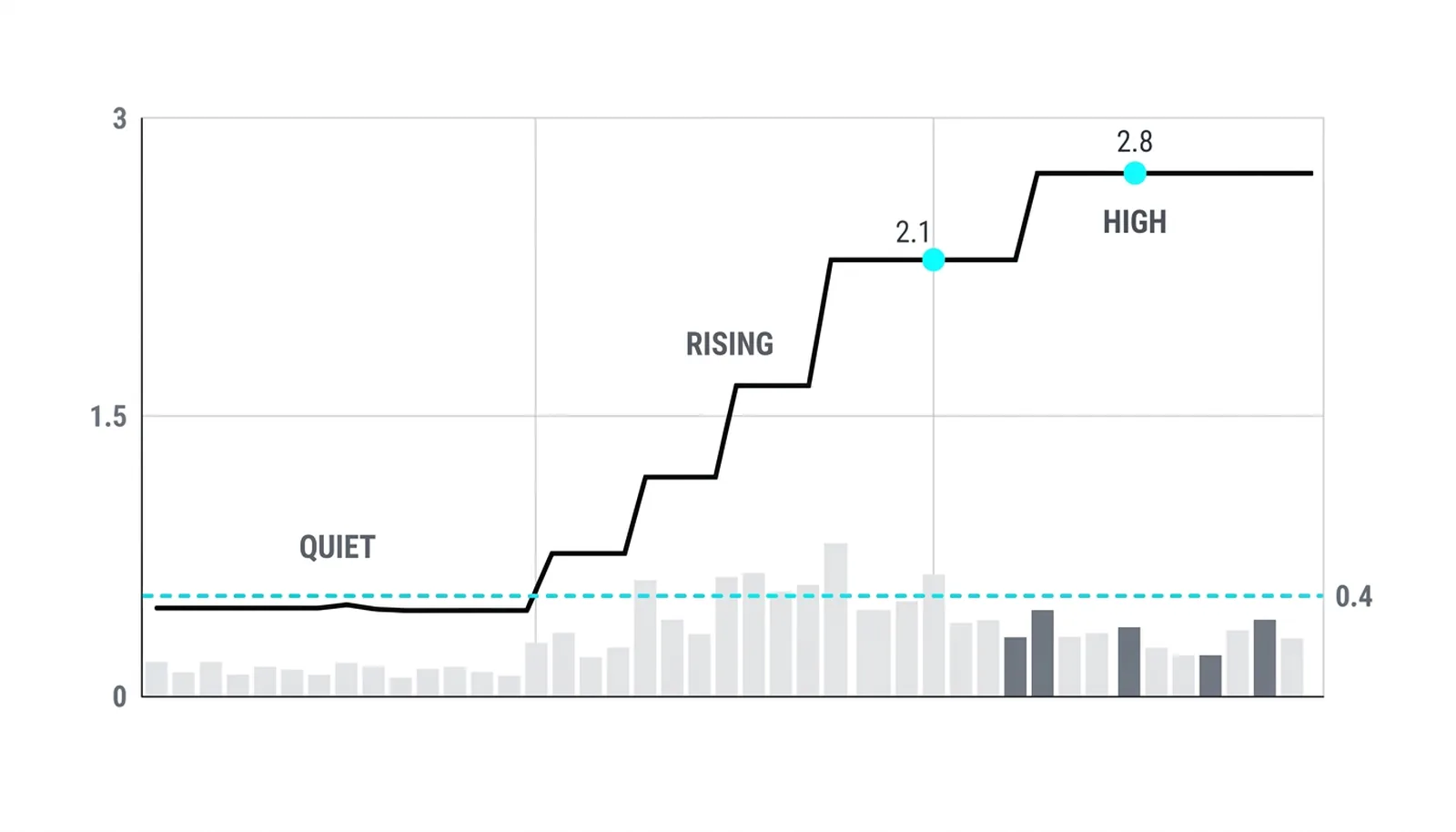
The line is a regime dial, and it behaves like the volatility lesson's clustering says it must: lows persist, highs persist. A sigma at its lowest reading in months marks the same quiet stretch the squeeze logic hunts, and the persistence is what makes the reading usable, a low reading today is evidence about this week, not about a reversal date. High sigma marks storms, and storms host both crashes and melt-ups, so the high reading carries no direction either.
The honest usage is comparative. Sigma means little as an absolute number, since a sigma of 2 is calm on one market and wild on another, and the price-scale warning from the momentum and ATR lessons applies unchanged: divide by price to compare across markets, or just read the line against its own history on the same chart, which is what the visual does best.
The Bollinger Connection
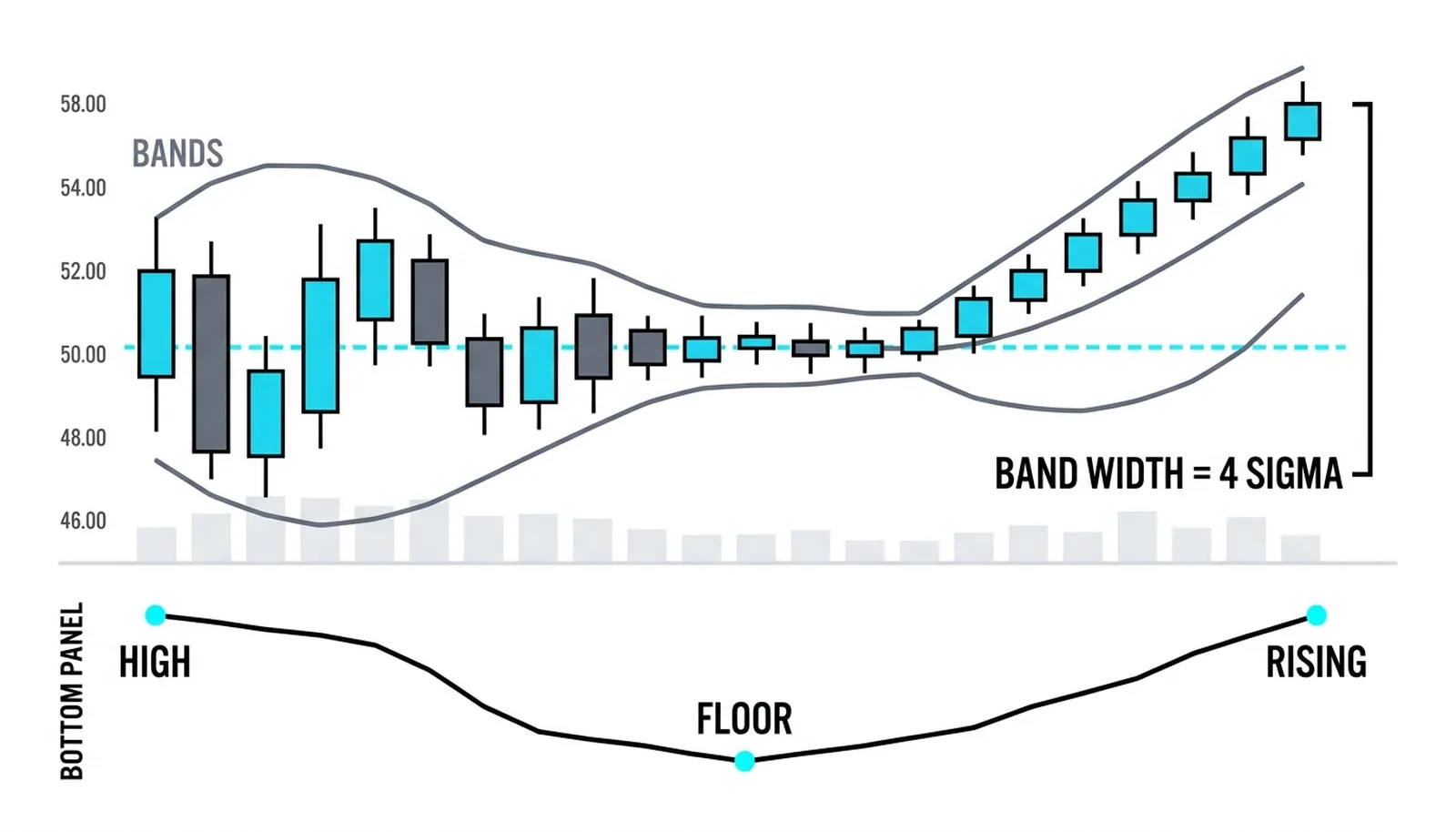
Every Bollinger Band width is this line, rescaled. The bands sit two sigmas above and below a moving average, so the distance between them is four sigmas, and the BandWidth indicator divides that distance by the middle band to make it comparable across time. Plot the raw sigma line under a Bollinger chart and the two shapes match exactly, one scaled, one not.
Why plot the bare line at all, then? Two reasons. First, it decouples the volatility read from the bands' visual weight, which makes regime changes easier to see early. Second, it is the honest ancestor for anyone learning the channel tools: once sigma is understood, the Bollinger construction, the BandWidth squeeze measurement, and the Keltner contrast with ATR all become one connected system rather than four formulas. The trading treatments live in the squeeze lesson and the reversion lesson; this line is their shared fuel.
One footnote closes the statistics properly: variance is sigma squared, and its units are price squared, dollars squared, which is useless on a chart. Sigma is the square root taken precisely to keep the units in price. That is why the indicator plots sigma and nobody plots variance.
Three Windows, One Number
Round numbers, all hypothetical. Window one: a market drifts near 50, closes landing within 0.4 points of the 20-bar average. Sigma: 0.4. Nothing is happening, and the line says so.
Window two: the same market in panic, closes swinging from 47 to 53 around the average. Sigma: 2.8. The line tripled, the market's fidget tripled with it, and the reading carries no hint whether the panic was selling or buying, because sigma never knows.
Window three: recovery done, a staircase trend lifts closes from 54 to 62 over twenty bars in near-even steps. Sigma: 2.1, nearly the panic reading, while the bars themselves were orderly. The lesson in one line: sigma measures scatter, the trend supplied the scatter, and only the chart's direction tells the two stories apart.
| Sigma state | The regime read | The tie-in |
|---|---|---|
| At lows for the period | Quiet stretch, clustering says it persists | The raw material of the squeeze condition |
| Rising off lows | Scatter arriving; expansion under way | Bands begin widening; breakout context builds |
| High in a trend | Real dispersal along a path, not panic | Read direction from price; sigma only rates the fidget |
| High after a vertical move | Storm exhaustion territory | Same caution the ATR extremes carry |
Standard Deviation Indicator, Answered
What does the standard deviation indicator measure?
The typical distance between the last N closes and their average, plotted over time. High values mean closes have been straying widely from their mean, low values mean they have been hugging it. It measures scatter only, with no direction attached.
How is it different from Bollinger Bands?
The bands are built from it: upper and lower bands sit two standard deviations from a moving average, so the band width is four sigmas scaled to the chart. The standalone line shows the same information without the price overlay, which makes regime shifts easier to spot early.
What is a good period for the standard deviation indicator?
Twenty matches the Bollinger default and keeps the two tools consistent, which matters if you read them together. Shorter windows react fast and whipsaw; longer windows smooth the regime read. Whatever period you choose, read the line against its own history rather than as an absolute level.
Can standard deviation predict a move?
No. It describes how scattered recent closes were, and volatility clustering means the description tends to persist for a while, which is useful for regime and sizing decisions. Direction never appears in the calculation, and expecting a low sigma to time a breakout or a high sigma to time a reversal is reading a forecast into a ruler.