Relative Strength on a Chart
Relative strength is the practice of comparing how much two assets moved over the same period, so instead of asking whether a stock went up, you ask whether it went up more than its market. That second question is the one that decides what to trade. A stock rising 2% while its index rises 5% is not strong. It is being dragged upward, and there is a difference.

Think of two shops on the same street in a slow season: the one that still has a queue is the one worth watching. Relative strength is how you find that queue on a chart.
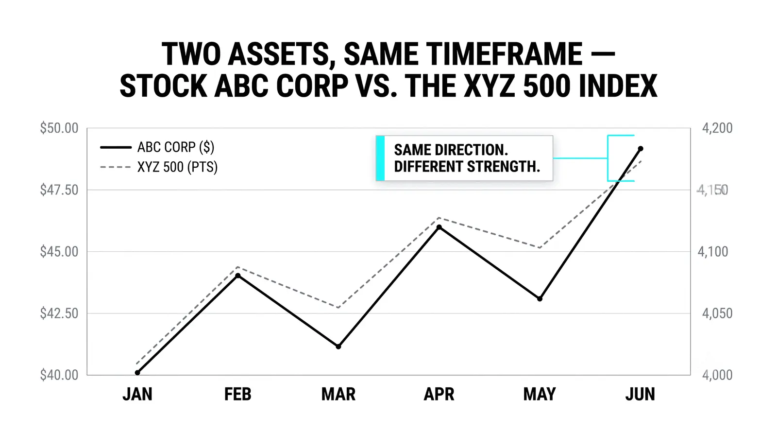
What Relative Strength Actually Measures
The measurement is simple. Take the percent change of one asset over a set window, then take the percent change of another asset or an index over the same window, and compare the two numbers.
The point is the gap between them, not either number alone. In a strong market, almost everything rises. A rising tide lifts leaky boats too. So "my stock went up" tells you almost nothing about whether you picked well.
The leaders are the ones that rose more than the crowd. The laggards are the ones that rose less, or fell while the crowd climbed. Relative strength is the tool that separates those groups with arithmetic instead of opinion.
You can run the comparison two ways. Compare a stock against its index to judge it against the whole market. Or compare two stocks in the same sector against each other to pick between them. Both use the same math.
How Traders Read It
The most common method is ranking. Take your watchlist, calculate each stock's percent change over a fixed window, say the last 20 sessions, and sort the list from biggest gain to smallest.
The names at the top are your relative strength leaders. The names at the bottom are the laggards. Do this weekly and you will see the list reshuffle, which is itself useful information.
The second method is the ratio chart. Divide the price of one asset by the price of another and plot the result as a single line. Most charting platforms let you enter something like "AAPL/SPX" as a symbol.
A rising ratio line means the numerator is winning. A falling line means the denominator is winning. A flat line means they moved together and neither has an edge.
The ratio line removes the noise of the overall market direction. You stop asking "is the market up?" and start asking "who is beating whom?"
The Ratio Chart Trick
Dividing one chart by another strips out the move both assets share. What remains is only the contest between them.
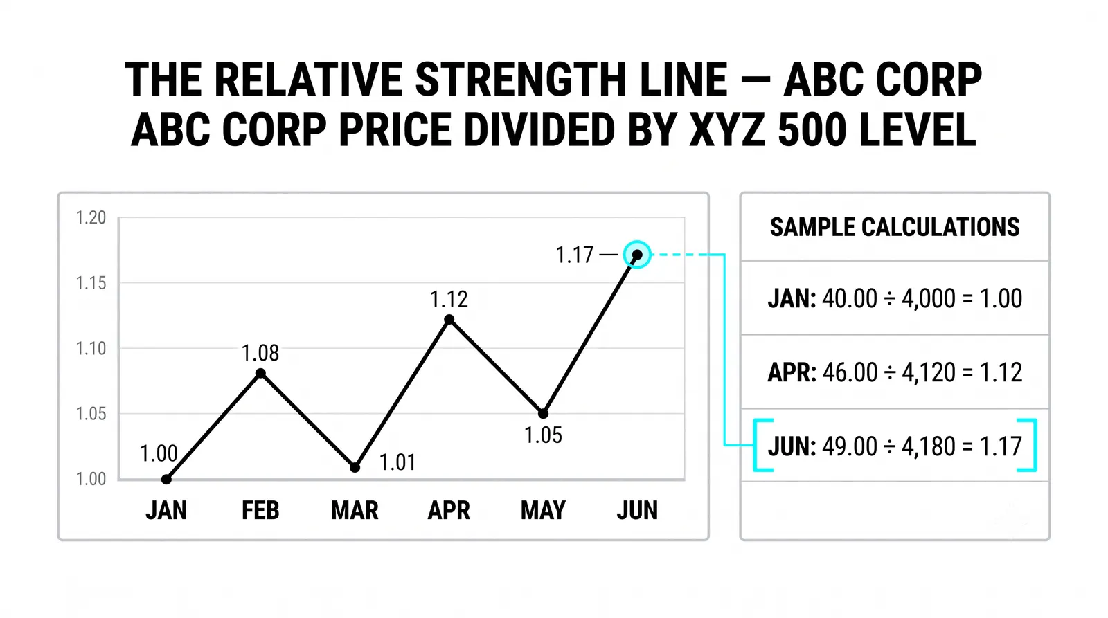
Say the whole market rallies 10% and both of your stocks rally with it. On separate charts, both look strong. On the ratio chart, if they rose by the same amount, the line goes flat. The shared move cancels out.
A flat ratio is a real answer. It tells you neither asset has an edge, so picking between them is a coin flip.
A rising ratio is also a clean answer. The numerator is outperforming, and the slope of the line tells you how fast. You can even draw trendlines and support levels on the ratio chart itself, because it behaves like any other price series.
This is why many traders check the ratio before the price chart. The price chart shows what happened. The ratio chart shows who won.
What Relative Strength Is Good For
Three practical uses cover most of what you need at this stage.
- Choosing between candidates in the same sector. Two bank stocks both look fine on their own charts. The one with the stronger percent change over your window, or the rising ratio line, is the one the market is favoring. Trade the favorite, not the one you hope catches up.
- Confirming a leader's reputation. A stock everyone calls a leader should show it in the numbers. If the famous name is lagging its index over the past month, the reputation is stale. Trust the comparison, not the story.
- Spotting laggards to avoid. A stock that cannot keep up in a rising market often falls hardest when the market dips. Relative weakness is a warning label. Cross those names off your long list.
None of this predicts the future. It tells you where money has been flowing, which is a better starting point than a hunch.
Two Stocks, One Month
Here is a hypothetical example with round numbers so the math is easy to follow. Imagine 20 trading sessions, roughly one calendar month.
Stock A starts at 100 and finishes at 106. That is a gain of 6%. Stock B starts at 100 and finishes at 102, a gain of 2%. Their shared index starts at 100 and finishes at 103, a gain of 3%.
Now the comparisons. Stock A beat the index by 3 percentage points. Stock B lagged the index by 1 percentage point. Both stocks went up, but only one of them actually outperformed.
The ratio readings make it visible. A divided by the index starts at 1.00 and ends near 1.03, a rising line. B divided by the index starts at 1.00 and falls to about 0.99, a sinking line.
If you held Stock A, the market confirmed your pick every session the ratio climbed. If you held Stock B, you made money in absolute terms but lost the comparison, and the ratio chart would have shown that weakness the whole way.
The lesson: a 2% month is fine, B was no disaster, but your capital had a better home, and relative strength pointed at it in advance.
The Numbers Side by Side
| Asset | Start | Finish | Percent Change | Versus Index |
|---|---|---|---|---|
| Stock A | 100 | 106 | +6% | +3 points |
| Stock B | 100 | 102 | +2% | -1 point |
| Index | 100 | 103 | +3% | Baseline |
| Ratio readings | A/Index 1.00, B/Index 1.00 | A/Index ~1.03, B/Index ~0.99 | A rising, B falling | A leads, B lags |
The Trap at the Top
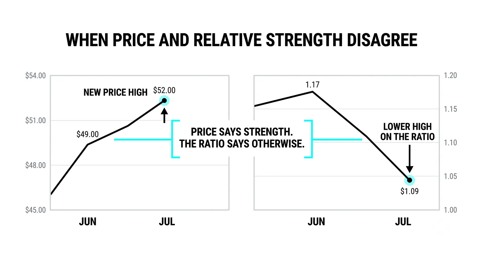
Here is the catch that burns new traders. The strongest asset on your ranked list has usually already run the farthest. Buying it at the highs means paying full price for someone else's good news.
Relative strength tells you which asset has been strongest. It does not promise the gap keeps growing.
The disciplined use is subtler. Buy the leader on a pullback to support, when it pauses and the ratio line holds its trend. Or use the ranking the other way: drop the laggards from your shortlist and stop giving them chances.
Also know that leadership rotates. Last quarter's leaders routinely become this quarter's laggards as money moves between sectors. A relative strength list is perishable. Rebuild it on a schedule, weekly or monthly, and treat any old list as stale.
Chasing strength at the highs and clinging to an outdated ranking are the two ways traders turn a good tool into a bad habit.
Common Questions About Relative Strength
Is relative strength the same as the RSI indicator?
No, they are different tools that happen to share a name fragment. The Relative Strength Index (RSI) is a momentum oscillator that measures the speed of one asset's own recent gains against its losses. Relative strength, as covered here, compares two separate assets against each other. You can use both, but never confuse them on a chart.
How long should the comparison window be?
Match the window to your holding period. Swing traders holding for weeks often use 20 to 60 sessions. Position traders holding for months look at 3 to 12 months. A window far shorter than your holding period gives noisy signals; one far longer gives stale ones.
Does relative strength work in falling markets?
Yes, and it is arguably more useful there. In a decline, the assets that fall least, or hold flat while the index drops, show relative strength. Those names often lead the next recovery, because sellers never took control of them.
Can I use it between any two assets?
You can, but the comparison is most meaningful between assets that compete for the same money. Two stocks in one sector, a stock against its index, or gold against the dollar all make sense. Comparing a tech stock to a wheat futures contract produces a ratio line, but not much insight.
Once you can rank a watchlist and read a ratio chart, the natural next step is learning how sector rotation moves leadership from one group to another, because that is what reshuffles your list every few months and creates the next batch of leaders before the crowd notices them.