Multi-Timeframe Support and Resistance
Multi-timeframe support and resistance is the practice of checking whether a level exists on more than one chart, because a price zone that shows up on the weekly and the daily carries more history and more orders than one that only appears on the intraday chart. You already know how to draw a level. This lesson is about ranking them.

Think of old flood lines on a wall. You can repaint the lower wall as often as you like, but the high-water mark stays visible until a bigger flood takes it out. Weekly levels are the high-water mark. Intraday lines are fresh paint.
What Makes a Level Strong
Three things decide how much weight a level deserves: age, number of touches, and how many charts agree on it.
Age matters because old levels sit in more memories. Traders who were stopped out there, took profit there, or watched a reversal there still remember it. Some of them left orders behind. A level from eight months ago has a longer list of interested parties than one from Tuesday.
Touches matter because each test is a public event. The first touch might be an accident. The third touch at the same price means the market keeps finding the same buyers or sellers in the same place.
Agreement across charts is the multiplier. A weekly floor tested for months is a different animal from an hourly wiggle. The weekly level was built by funds, swing traders, and position traders. The hourly wiggle was built by whoever happened to be awake that afternoon.
Most beginners get this backwards. They spend their screen time on the 5-minute chart, so the 5-minute levels feel most real to them. The market does not care which chart you watch.
The Same Price, Three Charts
Take one price area and look at it on three timeframes. The picture changes completely.
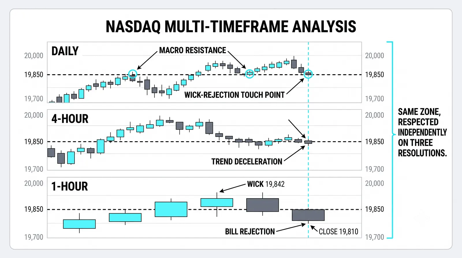
On the weekly chart, you see one major shelf. Price stalled there twice over the past year. It is obvious, clean, and slow-moving. That shelf is the level that matters most.
On the daily chart, the same area shows more detail. You can see the recent tests: three or four attempts at the shelf over the past two months, each one rejected a little lower or a little higher. The daily tells you how the level is behaving right now.
On the 1-hour chart, the same area explodes into dozens of minor lines. Every pause, every small bounce, every lunchtime drift prints a tiny level. Most of them will be meaningless by next week.
The mistake is treating all of these as equal. They are not. The weekly shelf can stop a move for months. The hourly line can stop it for forty minutes. If you give them the same respect, you will exit good trades at noise and hold bad trades through real walls.
How Confluence Changes Decisions
When charts agree, you get zones worth positioning around. A level that shows on the weekly and the daily is where you plan trades, place alerts, and think about size. Your stop can sit just outside the zone, because the zone itself is doing the work of defining your risk.
When charts disagree, the higher chart wins. A support level on the 1-hour that sits directly under a weekly ceiling is not a buying opportunity. It is a pause inside a larger rejection. The lower timeframe is showing you mechanics, not direction.
The intraday chart is where you execute, so it feels like the authority. The authority sits one chart higher.
A blunt rule helps here: never take an intraday signal that fights a weekly level without a very specific reason.
A Practical Stacking Order
Order of operations keeps this from becoming chaos. Work top down, every time.
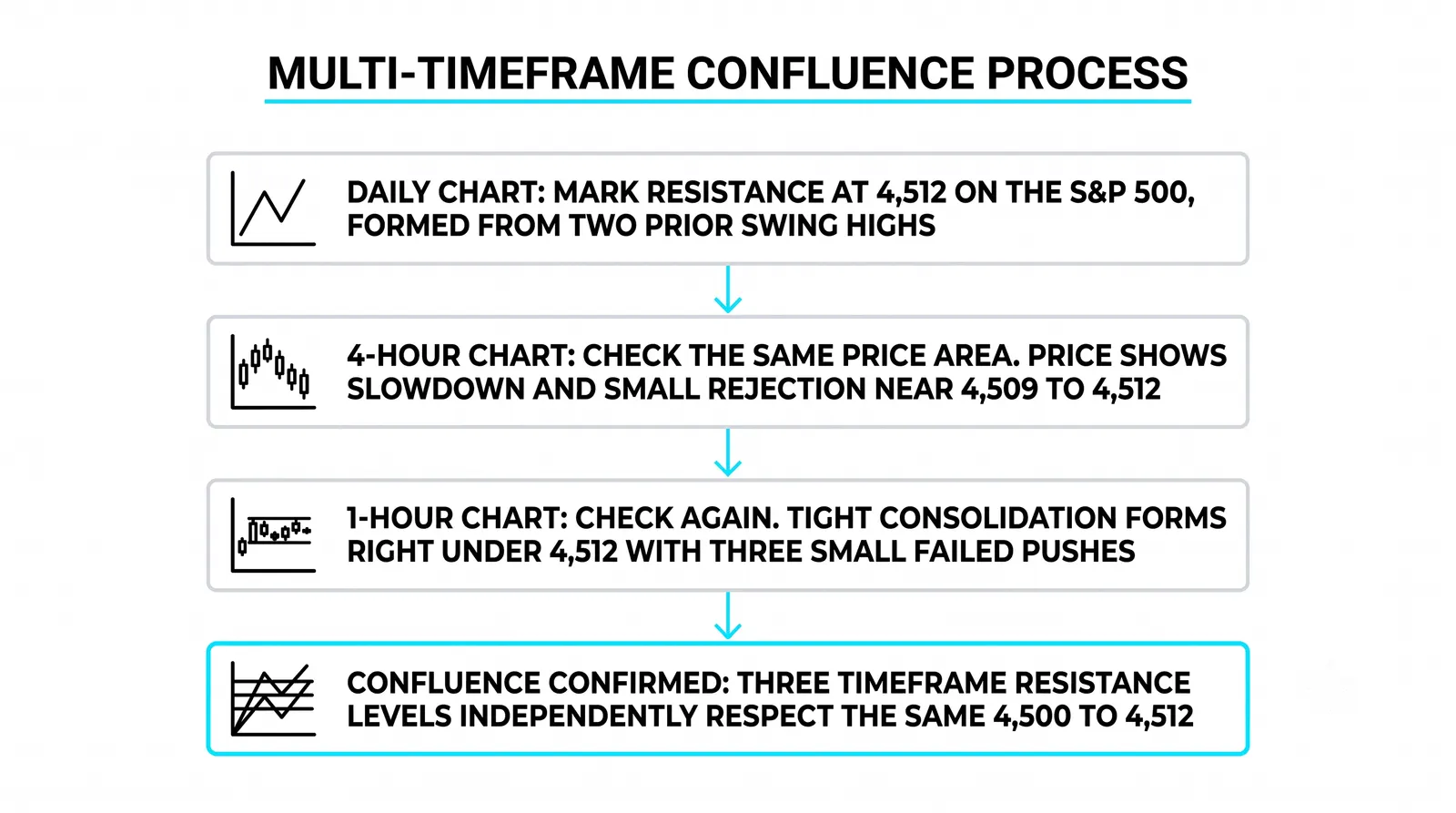
- Weekly first. Mark the two or three most obvious shelves and floors. These are your structural levels. If a level is not visible on the weekly without squinting, it is not a weekly level.
- Daily second. Add the levels formed over the past few months. Note where they overlap with the weekly marks. Overlaps get a star.
- Intraday last. Only now look at the hourly or lower, and only to refine entries near the zones you already marked.
Cap the total at three to five zones on your working chart. More than that and the chart stops being a decision tool and becomes wallpaper. If everything is a level, nothing is.
Delete aggressively. A level that price has sliced through twice without reacting is dead. Take it off.
The Level Both Charts Agree On
Here is a hypothetical example with round numbers to show how the rules fall out of a shared zone.
Say the weekly chart shows a ceiling near 50. Price tested it in January at a high of 50.40, again in March at 50.90, and again in July at 50.20. Three touches over seven months. That is a real shelf.
Now drop to the daily chart covering those same months. Inside that area, you find five more touches between 49.50 and 50.30. The daily is confirming what the weekly already told you: sellers keep showing up around 50.
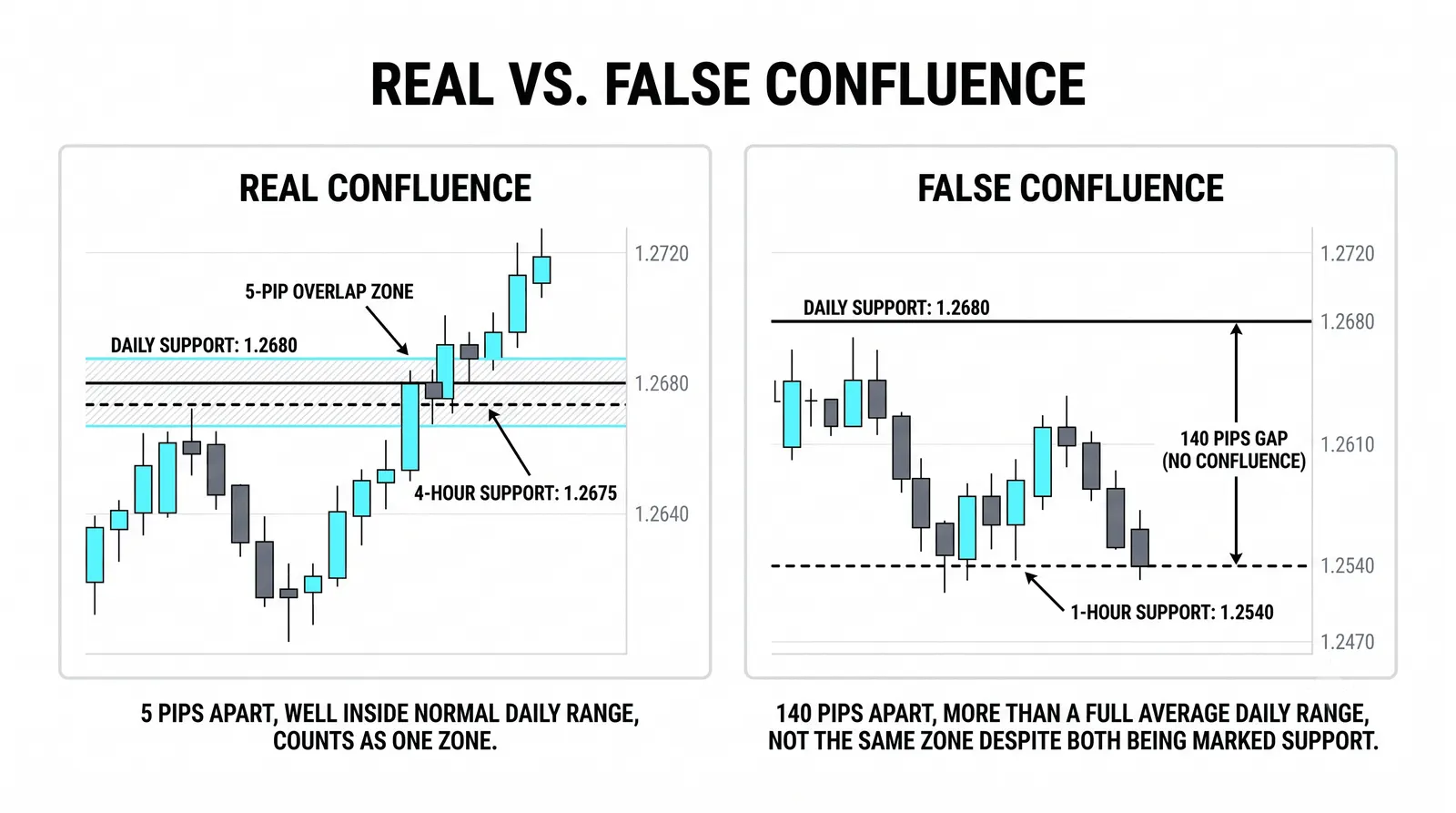
Your working zone becomes 49.50 to 50.50. It is a band, not a line, because the actual reactions happened across that whole span.
Three rules follow directly:
- Longs get trimmed approaching the zone. If you are holding from 46, you do not wait for 50.50 to take profit. You scale out as price enters 49.50 and up, because that is where sellers have appeared eight times.
- A weekly close above 50.50 relabels the zone. Not an intraday poke, not a daily close. A weekly close. If that happens, the old ceiling becomes candidate support, and you treat pullbacks into the zone as potential buys instead of exits.
- No new trades inside the zone itself. Opening a position at 50.10 means buying directly into eight documented rejections with no room for a sensible stop. The zone is where you react, not where you initiate.
Notice what the multi-timeframe check did. The weekly gave you the zone's authority. The daily gave you its boundaries. Neither chart alone would have given you both.
When the Charts Disagree
Disagreement between timeframes is normal, and it has a standard interpretation.
A daily ceiling inside a weekly uptrend is a place for pullbacks, not a reason to short the trend. Price will often stall there, digest, and continue. Traders who short every daily ceiling in a weekly uptrend donate money steadily.
A daily floor inside a weekly downtrend is a place for bounces to be sold. The bounce can look strong on the hourly. It can run for days. It is still a counter-move inside a larger decline until the weekly chart says otherwise.
The higher chart is the decider. Always. When the daily and the weekly point in different directions, you either trade in the weekly's direction or you stand aside. Those are the only two options that respect the structure.
This does not mean lower timeframes are useless. They time your entries, tighten your stops, and show you when a higher-timeframe level is starting to fail. They inform. They do not overrule.
Common Questions About Multi-Timeframe Levels
How many timeframes is too many?
Three is enough for almost everyone: one for structure, one for context, one for execution. A common stack is weekly, daily, and 1-hour. Adding a fourth or fifth chart rarely adds information. It adds conflicting signals and hesitation. If two extra charts have not changed a single decision in a month, remove them.
Do round numbers count as confluence?
Yes, but only as a supporting factor. A level at 50.00 that also shows touches on the weekly and daily is stronger than the same level at 50.37, because round numbers attract orders on their own. A round number by itself, with no chart history, is a guess rather than a level.
What if a level appears only on the intraday chart?
Treat it as a minor level and trade it small or not at all. Intraday-only levels are useful for timing entries toward bigger zones, but they break often and without warning. Size your positions for the levels the higher charts confirm, and let the small ones serve the big ones.
How wide should a shared zone be?
Wide enough to contain the actual reactions you can see on the chart, and no wider. If touches happened between 49.50 and 50.50, that is your zone. Do not tighten it to a single line to feel precise, and do not widen it to make a trade fit. A zone that covers 10 percent of the chart's range has stopped being a zone and become the chart.
In the next lesson, we take these stacked zones and combine them with trend structure, so you can tell the difference between a level that pauses a trend and one that ends it.