Multi-Timeframe Fibonacci Analysis
Multi-timeframe fibonacci analysis is the same ratio practice run at every scale of the same market, a swing drawn and its levels marked on the weekly, the daily and the intraday chart, one city read on a globe, an atlas and a street map. Nothing about the ratios changes between scales. The 38.2 percent line is the same calculation on a monthly candle as on a five-minute candle. What changes is the swing the ratio measures and the weight the resulting line carries, and learning to read that difference is the skill.

Think of one city printed three times, a globe for the continent, an atlas page for the district and a street map for the corner, each one true and none of them the whole city. The weekly chart shows the swing that took a year. The daily chart shows the swing inside that swing. The hourly chart shows the pullback inside the pullback. Each fibonacci line drawn on each chart is accurate, and each one alone is incomplete.
The framework lesson already mapped the general multi-timeframe practice, the top-down read and the hierarchy of charts, so that ground stays covered there. This lesson runs the ratio work through that frame: the fibonacci lens applied at every scale, one chart at a time, then all of them together.
One Swing Set per Chart
The practice on each timeframe is independent and identical. Open the chart. Find the swing that stands out at that scale, the move a stranger would point at first. Draw its retracements. Mark the lines. Then stop.
Fibonacci cluster practice treats swing selection as exactly this repetition, run unchanged across markets and scales. The 240-minute euro chart, the daily cable chart and the 15-minute gold chart each contribute the swings that stand out at their own scale, and the analysis repeats per chart with no adjustment to the method. The ratio does not know what timeframe it is measuring. Only the trader does.
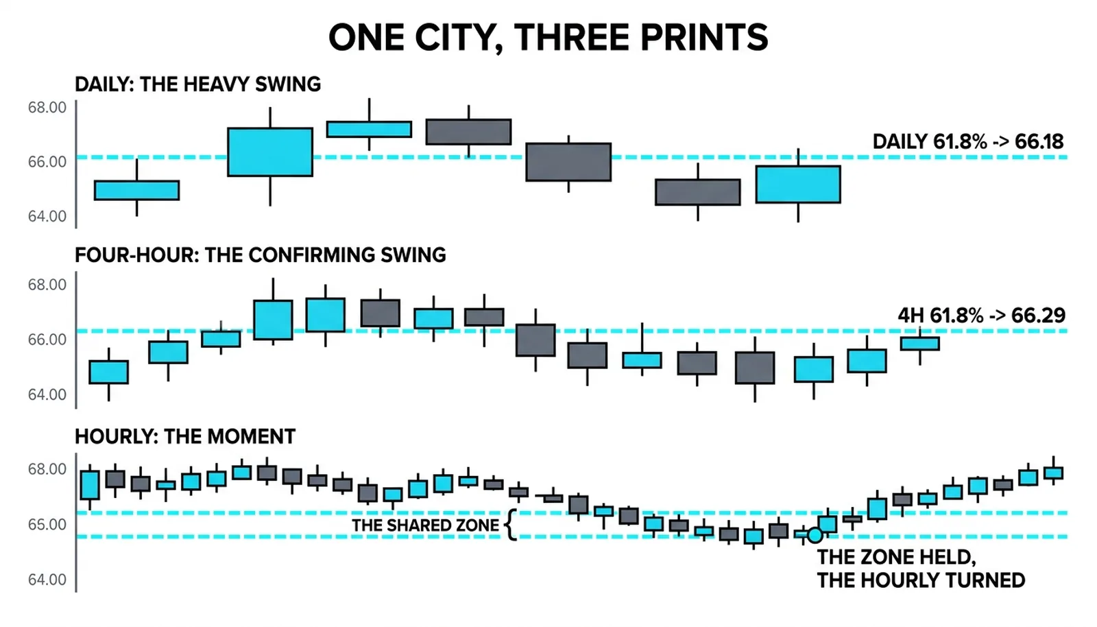
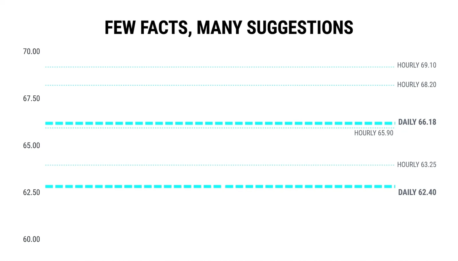
The character of the output differs by scale. The daily chart yields few, heavy lines, drawn from swings that took months to build. The hourly chart yields many, light lines, drawn from swings that took hours. Both sets are correct. They are not equal.
The trap is collection. A trader who marks every swing on every chart ends up with a fence of lines and no gate, a chart where every price sits near some level and therefore no level means anything. A line that is everywhere predicts nothing.
The discipline is one swing set per chart, chosen, not collected. Choosing forces a judgment, and the judgment is the skill. When two swings compete on the same chart, pick the clearest one, the move with the cleanest origin and the most obvious extreme, and let the other go unmarked.
Reading the Scales Together
Once each chart holds its own lines, the scales are read together, top down. The higher chart's lines draw the zones the lower chart's lines must live inside. A daily retracement level is territory. An hourly level inside that territory is an address.
The price action canon explains the weights: the higher chart's crowd is larger and slower, and its lines mark prices where more capital acts. That is why a small chart's perfect line is a suggestion while a big chart's rough line is a fact. The five-minute chart can produce a beautiful 61.8 percent retracement that the daily chart simply overruns, because the daily's participants never agreed to care about it.
The strongest signal the method produces is alignment, a line from two scales landing at one price. When the daily's 38.2 percent line and the four-hour's 61.8 percent line print within a few ticks of each other, two independent crowds have marked the same ground. That overlap is the tightest zone the method draws.
Alignment is rarer than traders expect, and that rarity is the point. Most hours of most days, the scales disagree, and the correct read is to wait. The method pays the trader who treats disagreement as information rather than as noise to be averaged away.
Trading the Aligned Zone
The division of labor in a multi-timeframe fibonacci trade is strict. The daily chart owns the zone, because its lines carry the weight. The hourly chart owns the moment, because its candles show the reaction. The trade exists only when both do their part.
The sequence runs like this. The higher charts define a zone where two or more lines overlap. Price travels into that zone. The small chart then prints evidence, a reversal candle, a shift in momentum, a failure to push lower. Entry, stop and target are all measured from the small chart's structure, but the reason for the trade comes from the big charts. Confusing those roles produces trades with good timing and no backing, or good backing and no timing.
What matters is what the method refuses. The failed version of the trade is one chart alone, an hourly reversal candle printing in empty space with no zone beneath it. That candle is real and it is meaningless, a fine signal in the middle of nowhere. The multi-timeframe work earns its keep in the trades it vetoes as much as in the trades it takes, and the trader who skips the top-down step loses the veto and keeps only the entries.
The Zone at 66.18
A hypothetical illustration with round numbers. A market's daily chart shows a clean swing from 60.00 to 70.00, a run of 10.00 points. Its 38.2 percent retracement line sits at 66.18. That is the heavy line, drawn from a swing that took months.
The four-hour chart shows its own swing, from 64.00 to 70.00, a run of 6.00 points. Its 61.8 percent retracement line sits at 66.29. Two scales, two independent swings, two lines overlapping in a zone from 66.18 to 66.29.
| Timeframe | Swing it owns | Line it contributes | Weight it carries |
|---|---|---|---|
| Daily | 60.00 to 70.00 | 38.2 percent at 66.18 | Defines the zone |
| Four-hour | 64.00 to 70.00 | 61.8 percent at 66.29 | Confirms the zone |
| Hourly | The pullback into 66.18 to 66.29 | Reversal candle closing at 66.90 | Times the entry |
| None alone | Any single chart in isolation | A line with no cross-scale agreement | A suggestion, not a zone |
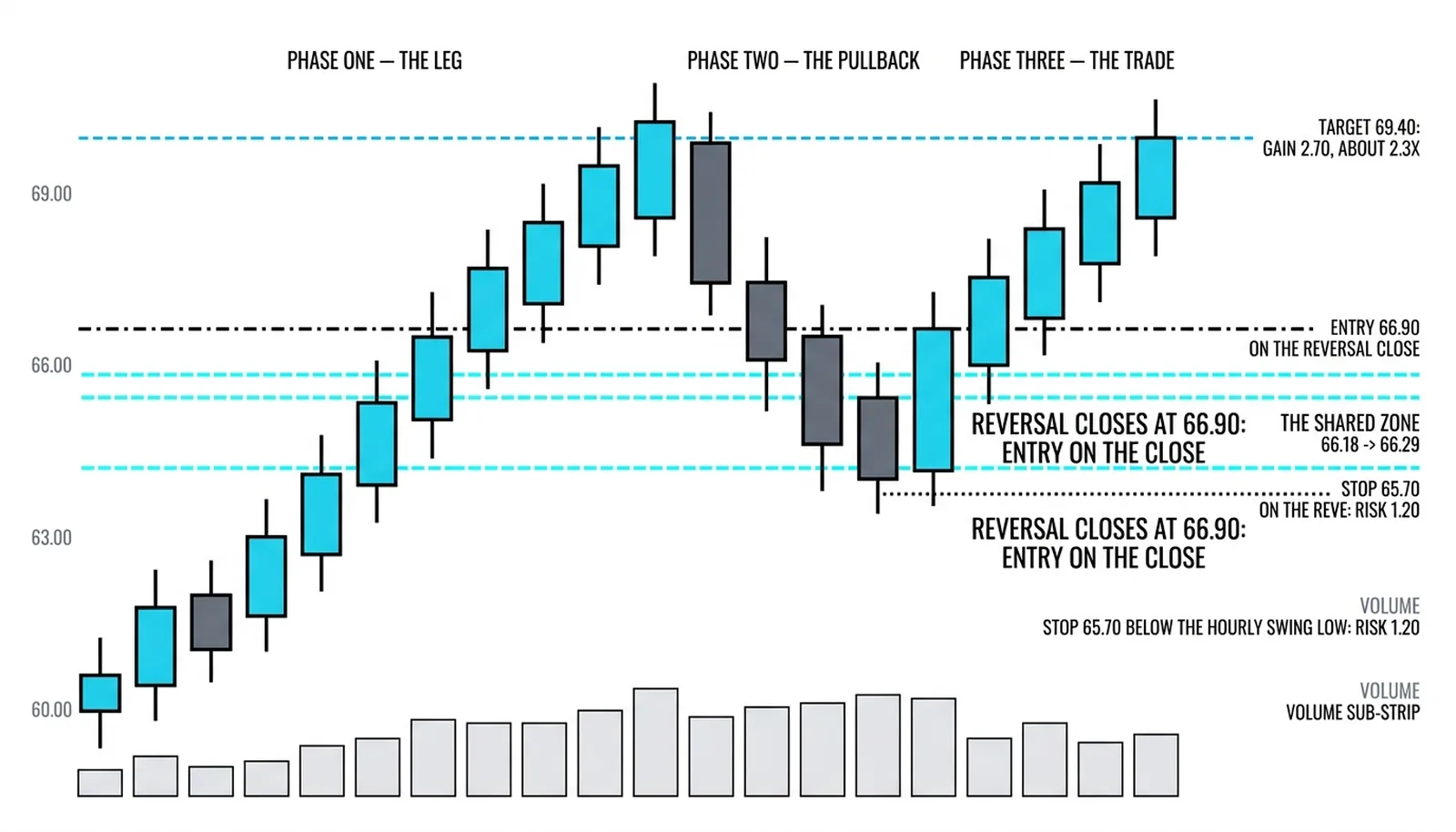
Price pulls back into the zone on the hourly chart and prints a reversal candle closing at 66.90. The long is taken at 66.90 on that close. The stop goes at 65.70, just below the hourly swing low of 65.80, risking 1.20. The first target is 69.40, just under the old high, a gain of 2.50, about 2.1 times the risk.
The three charts each told one true story and the trade needed all three, the daily for the zone, the four-hour for the confirmation, the hourly for the moment.
Now the refused version. The same hourly reversal candle prints at 67.80, well above the zone, with no daily or four-hour line under it. The candle is identical in shape. The trade is declined, because the timing existed without the backing. Some of those refused trades would have won, and taking the method seriously means accepting that cost in exchange for the trades that had two scales of capital standing behind them.
Analysis Questions, Answered
What is multi-timeframe fibonacci analysis?
It is the practice of drawing fibonacci retracements on the same market at several chart scales, then reading the results together from the top down. Each timeframe contributes the swing that stands out at its own scale, the higher chart's lines define the zones that matter, and the lower chart's lines and candles supply the timing inside those zones.
Which timeframes should the analysis cover?
Three scales are enough for most traders: one chart that defines the major swing, one intermediate chart, and one execution chart. A common set for a swing trader is the daily, the four-hour and the hourly. Adding a fourth and fifth chart adds lines faster than it adds information.
Do the same ratios work on every timeframe?
Yes, the ratios are identical calculations at every scale, and the standard retracement levels apply unchanged from the monthly chart to the five-minute chart. What changes across timeframes is the weight of the line, since higher-scale swings reflect larger and slower pools of capital.
How many charts is too many?
Too many is the point where the charts stop disagreeing with each other and start merely duplicating lines. If every price on the screen sits near some level, the analysis has become a fence with no gate. One chosen swing set per chart, across three charts, keeps the zones rare enough to mean something.
The next lessons in Level 9 leave the ratios and turn to volume itself, where the same multi-scale discipline applies to a different kind of evidence: not where price paused, but how much participation stood behind the move.