How to Mark Up a Chart Professionally
Marking up a chart professionally means annotating only what changes a decision, in a fixed order, with a system a stranger could read. The goal is a chart that answers questions at a glance. The test is simple: can you explain every mark on the screen in one sentence? If you cannot, the mark is noise.

Think of it like a chess player annotating a game record: the marks exist to explain decisions, and an annotation nobody can read is decoration.
This lesson is about the workflow, not the mechanics. Drawing an individual trendline correctly has its own lesson. Stacking levels across timeframes has its own lesson too. Here you learn how to take a blank chart and turn it into a working document, in the right order, with the least ink possible.
The Order of Operations
Every mark-up session runs the same sequence: structure first, levels second, patterns third, and the current plan last. Same order, every chart, every time.
Structure comes first because it frames everything else. Before you draw anything, you answer one question: what is this market doing on the higher timeframe? Trending up, trending down, or ranging. That answer gets one mark, usually an arrow or a single line. Nothing more.
Levels come second. Once you know the direction of the bigger picture, you mark the prices where that picture could continue or break. These are the swing highs, swing lows, and zones you would actually trade against. Two or three of them, not twelve.
Patterns come third, and only if they matter. A consolidation near your level is worth a small note. A triangle in the middle of nowhere is not. Patterns are context for a level, never a reason to add ink on their own.
The plan comes last because it depends on everything above it. Only after structure, levels, and any relevant pattern are on the chart do you write down what you intend to do: where you enter, where you are wrong, what you are waiting for.
The order protects you. Small things crowd out big things when you let them. If you start with a five-minute pattern, you will fill the chart with detail and never step back. Starting at the top forces the big picture to claim its space first.
Ink Discipline
Every mark on your chart must earn its place. The standard is strict: a level you can name, a trendline you can defend, a zone you would act on. Nothing else survives.
The test is the one-sentence rule. Point at any line on your chart and say out loud what it is and why it is there. "That is the daily swing high where sellers stepped in twice." Good mark. If your answer is vague, or starts with "I think maybe," the line is graffiti. Delete it.
Most beginners mark charts the way nervous students highlight textbooks: everything ends up colored, which means nothing stands out. A chart with fifteen lines tells you less than a chart with three, because your eye cannot rank them. You already know this feeling. You open an old chart, see a tangle of lines, and close it because reading it would take longer than redrawing it.
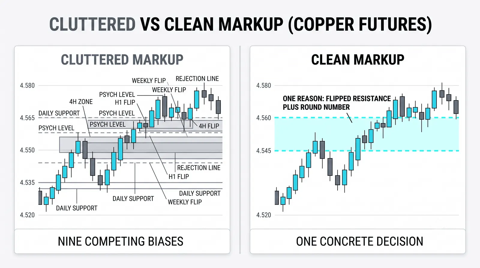
A useful habit: when you finish a mark-up, count the marks. If the number is above five or six, find the weakest one and remove it. Repeat until every survivor has a sentence behind it.
A Color and Layer System
Use two or three colors. That is the full budget. Each color gets exactly one meaning, and the meaning never changes.
A common split that works well:
- One color for trend and structure. The higher-timeframe direction, the major swing points. These marks change rarely.
- One color for levels and zones. Support, resistance, the areas you would trade against. These change when price breaks or confirms them.
- One color for the current plan. Your entry idea, your invalidation, your target. This layer changes the most, sometimes daily.
One meaning per color matters more than which colors you pick. The moment blue sometimes means trend and sometimes means a level, the system is broken and you are back to reading tea leaves on your own chart.
Keep the layers separated in your platform too, if it allows it. Most charting tools let you group or lock drawings. Lock the structure layer so you never drag a weekly line by accident while adjusting your plan.
A readable chart beats a decorated one every single time, and a readable chart is one you can summarize in a memo: trend is up, level is here, plan is this.
The Mark-Up Review
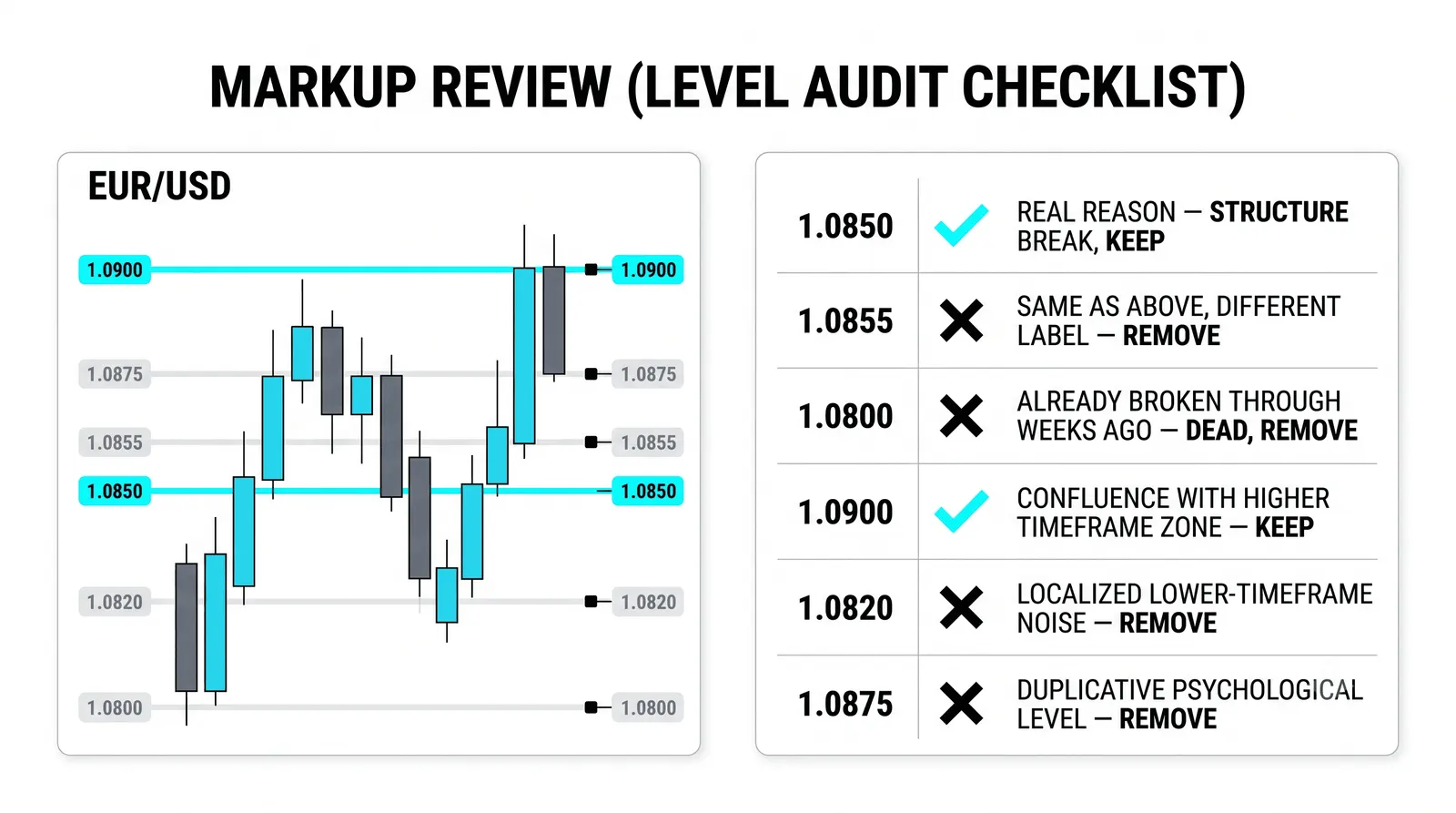
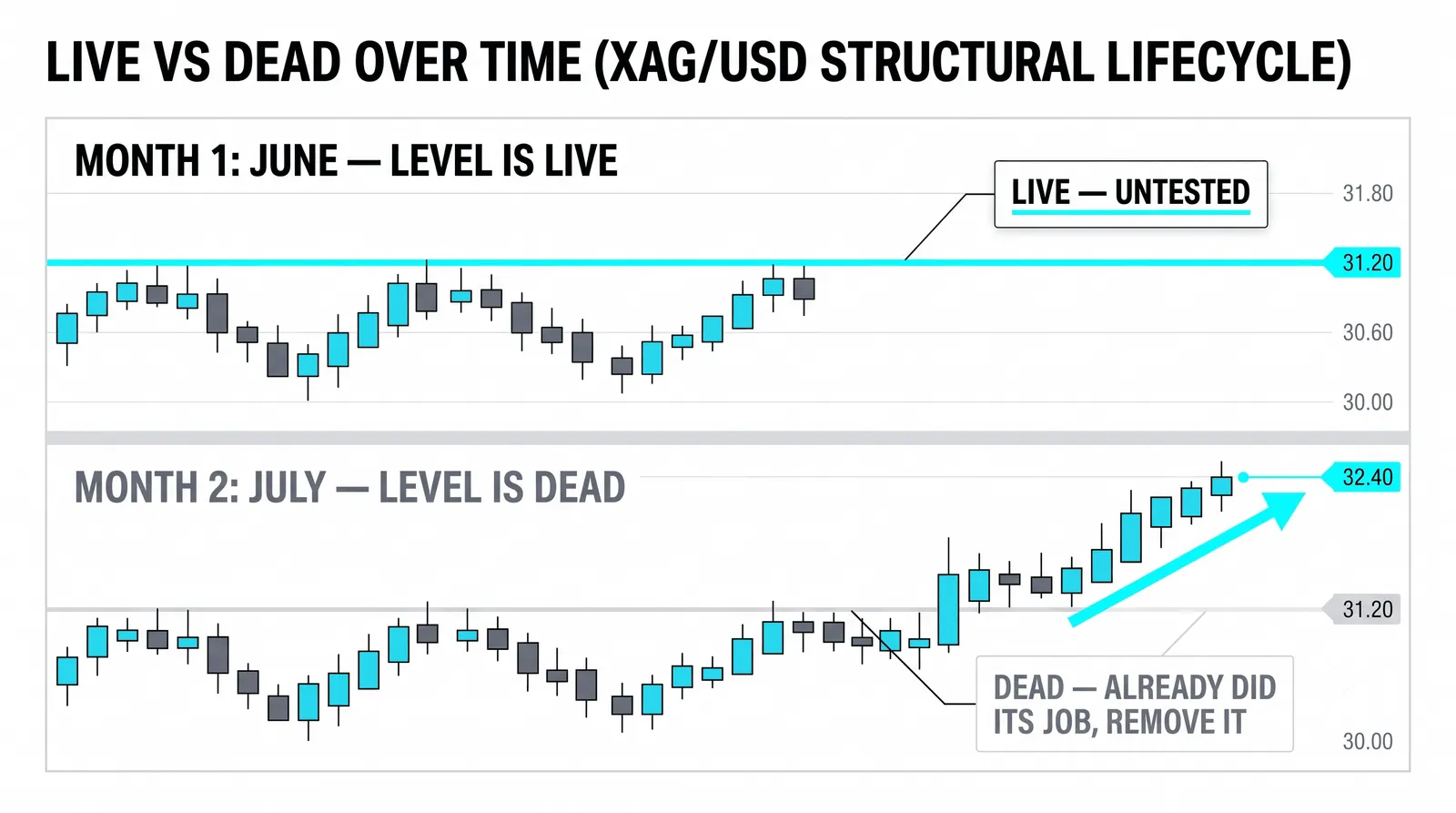
Charts go stale. Levels break, patterns complete, trends bend. A mark that was true last week can be a lie today, and stale marks are worse than no marks because you stop seeing them while they still influence you.
The professional habit is re-marking on new information, not on boredom. New information means a level broke, a swing formed, a pattern completed or failed. Boredom means you are staring at a quiet chart and feel the urge to tinker. The first is maintenance. The second is vandalism.
When you re-mark, archive the old notes instead of stacking new ones on top. Screenshot the chart, save it with the date, then clear the dead marks and draw the updated picture. This gives you two things: a clean current chart, and a record you can study later to see what you believed and when.
That archive becomes one of your best learning tools over time. Reviewing old mark-ups against what price actually did shows you whether your levels were real or imagined. You cannot get that feedback from a chart you kept overwriting.
Marking One Chart in Five Minutes
Here is a hypothetical walkthrough with round numbers, so you can see the whole workflow end to end. Imagine a daily chart of a market trading near 88.
Minute one: structure. You zoom out to the weekly. Price has made higher highs and higher lows for months. You draw one arrow pointing up in your structure color and write nothing else. One mark. The chart now says: the big picture is up.
Minutes two and three: levels. Back on the daily, you see price pulled back into an area where it based before the last push higher. You mark the daily level at 88, and you shade the zone from 87 to 88.50, because that is the band where buyers showed up twice before. Two marks. The chart now says: this is where the trend is being tested.
Minute four: the plan. In your plan color, you write the current idea: long above the zone, wrong below 87. That is the plan, complete: entry logic, invalidation, one line each. The chart now says what you intend to do and what would prove you wrong.
Minute five: deletion. You look at everything else on the chart. An old trendline from three weeks ago that price already broke. A rectangle from a pattern that completed. A random horizontal line at 92 you drew once and forgot. All of it goes. Delete, delete, delete.
You finish with three marks: an arrow, a zone, a plan. Those three marks answer the only questions that matter. Which way is the market moving? Where would I act? What proves me wrong? Anything beyond that is a distraction you drew yourself.
What Deserves Ink
| Mark | Question It Answers | When It Gets Drawn | When It Gets Erased |
|---|---|---|---|
| Structure arrow or trend line | Which direction is the higher timeframe moving? | First, at the start of every mark-up | When the swing structure breaks |
| Level or zone | Where would I act or expect a reaction? | Second, after structure is clear | When price breaks it or it stops being relevant |
| Pattern note | What is price doing at my level right now? | Third, only if it sits at a marked level | When the pattern completes or fails |
| Current plan | What am I doing, and where am I wrong? | Last, after everything above is set | After the trade resolves or the idea is invalidated |
Common Questions About Marking Up Charts
How many marks is too many?
More than five or six on one chart is too many for most traders. The real limit is the one-sentence rule: if you cannot explain a mark in a single sentence, it should not be there. When you hit the point where adding a line forces you to squint past other lines, you have gone past useful and into clutter.
Should I keep old marks on the chart?
No. Archive them as screenshots with dates, then remove them from the live chart. Old marks that no longer describe the market still pull your attention and quietly bias your read. A clean current chart plus a saved history gives you both clarity and a record to learn from.
Do professionals use the same colors?
There is no industry standard, and the specific colors do not matter. What professionals share is consistency: one meaning per color, held constant over months and years. Pick two or three colors you can tell apart at a glance, assign each a single job, and never change the assignment.
How often should I re-mark a chart?
Re-mark when new information arrives: a level breaks, a swing completes, a pattern resolves. Many traders also do a scheduled review, weekly for swing trading or daily for day trading, to catch drift they missed. What you should never do is re-mark out of boredom, because tinkering without new information just adds noise.
Once this workflow feels natural, the next skill is speed under pressure: re-marking a chart in the middle of a fast session without breaking your own system. Practice the five-minute drill on historical charts until the order is automatic, then test it live on a market you do not trade, where mistakes cost nothing.