Clean Charts vs Noisy Charts — How to Think
Clean charts vs noisy charts is mostly a question of which timeframe you are standing on. Every chart carries random wiggle, and no setting removes it. The practical skill is knowing which moves change the structure and which ones change nothing.

Chart noise is the static between radio stations; the trend is the music, and leaning toward the speaker never turns static into music. Your job is to stop leaning.
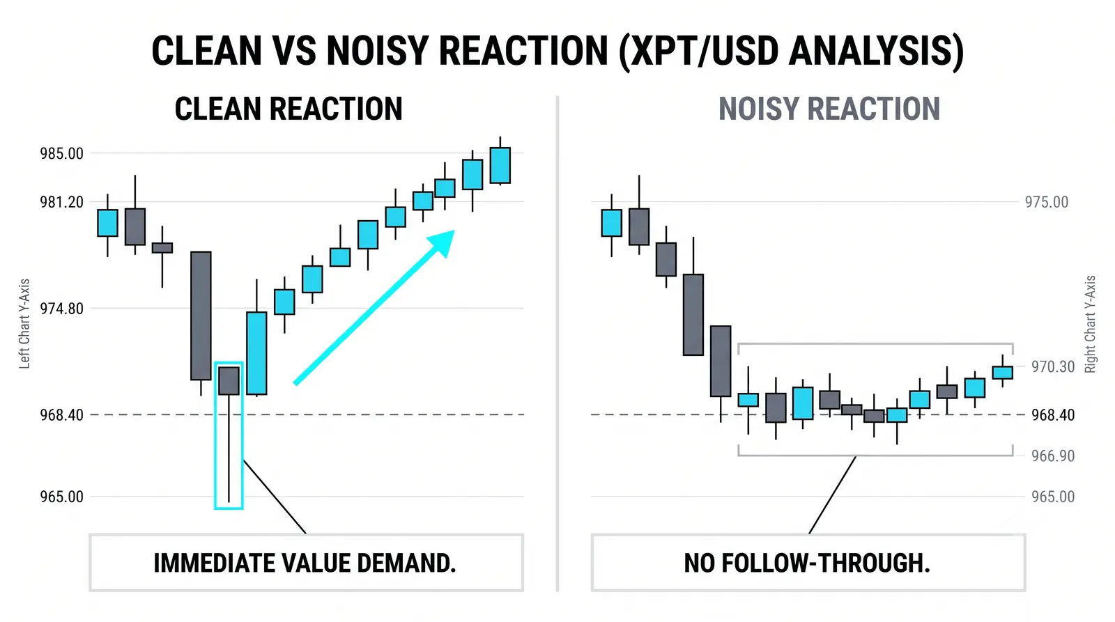
Where the Noise Comes From
Noise is not a defect in your data feed. It is the market working as designed. Small orders hit the book all day. The spread bounces price back and forth by a tick or two. Buyers and sellers match off in ordinary, meaningless increments, and each match prints on your chart.
None of that carries information about direction. It is the mechanical cost of continuous trading.
Here is the arithmetic that matters. A trading day holds hundreds of small bars and exactly one daily candle. On a one-minute chart, a single day is 390 separate prints. Each print gets the same visual weight on your screen, whether it represents a genuine shift in sentiment or one odd lot crossing the spread.
So the smaller the timeframe, the larger the share of what you see that is noise. Not because small timeframes are dishonest. Because you are dividing the same amount of real information into more and more containers, and filling the empty space with churn.
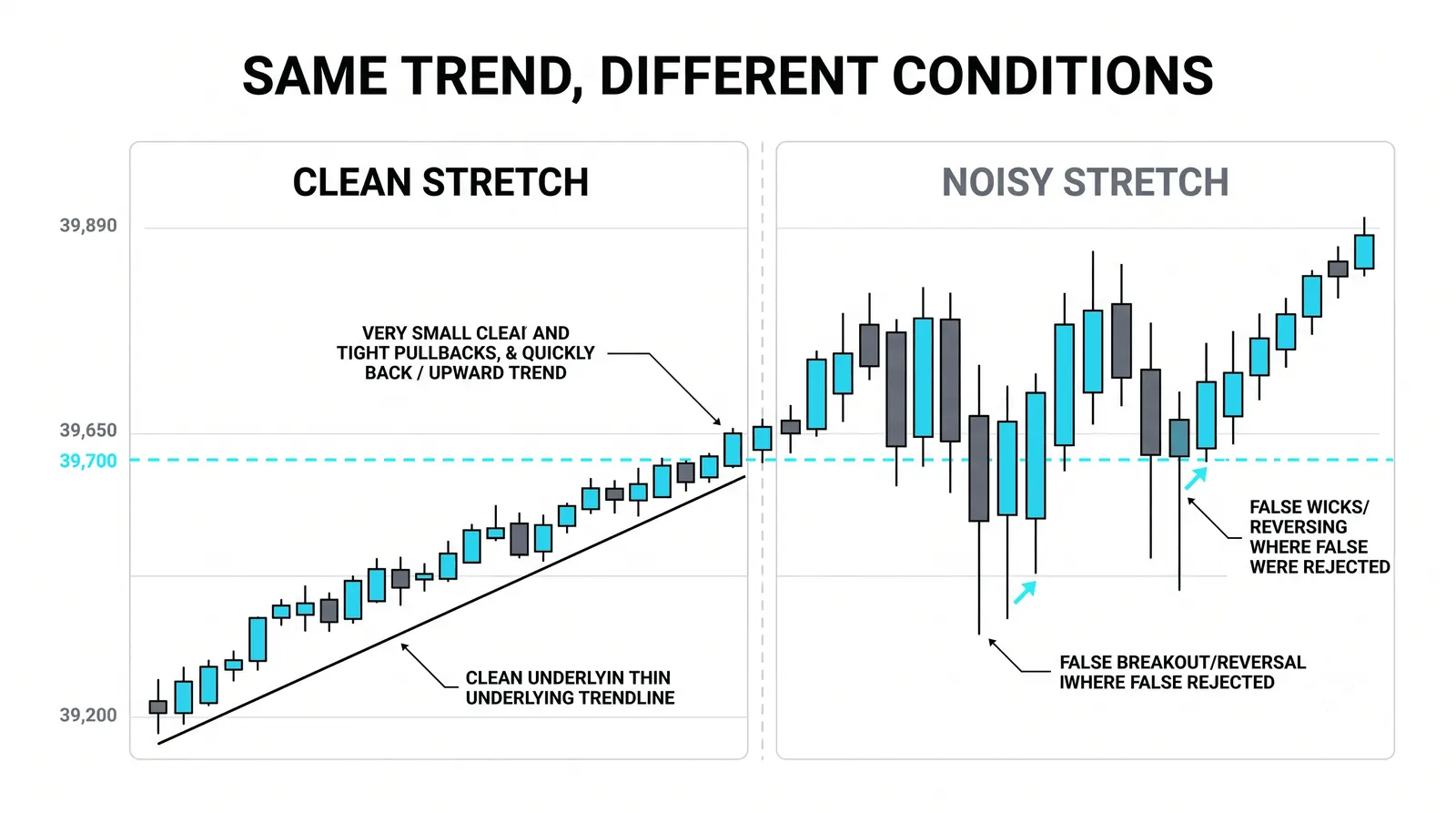
A daily candle compresses all of that churn into one open, high, low, and close. The noise still happened. It just did not earn a bar of its own.
The Test That Separates Signal From Static
A move matters when it changes the structure. You can apply the test in seconds.
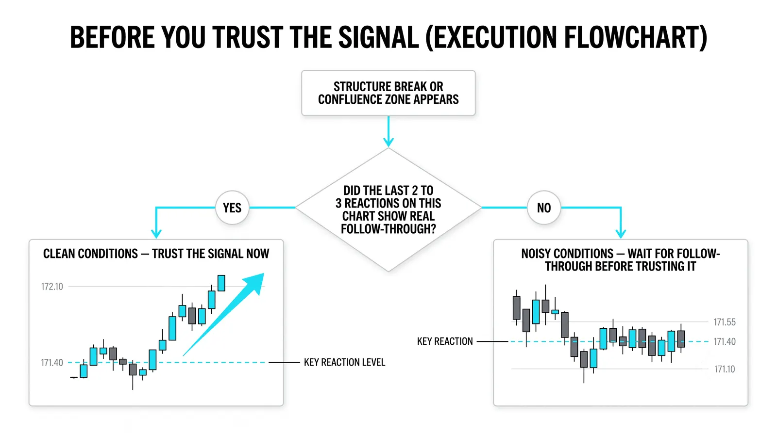
Ask three questions. Did the move take out a swing high or low? Did it break a level that the higher timeframe respects? Did it flip the sequence of highs and lows from rising to falling, or the reverse?
If the answer to all three is no, the move changed nothing worth trading.
This test only works if you have a higher chart to check against. A dip on the five-minute chart means nothing until you know whether it touched a daily level, broke a daily swing, or sat harmlessly inside an intact daily uptrend. Structure is defined from the top down, never from the bottom up.
Most losing trades from new traders fail this test after the fact. The move felt big. It changed nothing.
Why Noisy Charts Feel Urgent
Speed reads as importance. A fast drop on a one-minute chart fills your screen, moves your P&L, and triggers the same alarm response as real danger. Your brain does not distinguish between a big move and a big-looking move.
An intraday drop that fills the screen can be a rounding error on the daily chart. The pixels are the same size either way. The meaning is not.
Urgency is the noise talking. Real structural breaks are usually obvious on the higher chart without any squinting, and they remain obvious tomorrow. If a move demands an instant decision and loses all meaning when you zoom out, it was never information.
Boredom is a useful signal here. When the higher chart is boring and the lower chart is exciting, trust the boring one.
How to Make Any Chart Cleaner
Cleanliness is a habit, not a chart setting. No template fixes a noisy process. These four habits do most of the work:
- Zoom out first. Open the higher timeframe before the lower one, every session, no exceptions.
- Cut indicators down. Each one repackages the same price data and adds visual clutter. Keep one or two at most, or none.
- Mark only levels that exist on the higher chart. If a level is invisible on the daily, it is a doodle.
- Check the bigger chart before reacting. Before any entry, exit, or stop adjustment, look up one timeframe and run the structure test.
Notice what is absent from that list: a special chart type, a paid feed, a magic smoothing setting. Clean charts come from looking at less, more deliberately.
The Same Week, Two Charts
Here is a hypothetical week, with round numbers, to make the arithmetic concrete.
A stock trades near 100. The session runs 6.5 hours, which is 390 one-minute bars per day. Across a five-day week, that is about 1,950 bars on the one-minute chart. The daily chart shows the same week as five candles.
On Monday, the one-minute chart shows a sharp dip from 100.00 down to 99.20. On that chart, the drop fills the screen. It looks violent. Dozens of red bars stack up, and every one of them feels like a decision point.
Now look at the daily chart. The same event is one small lower shadow on a single candle. The day closes at 100.40, inside an uptrend that has been making higher highs and higher lows for weeks. No swing broke. No level failed. The sequence is intact.
Count the decisions each chart demanded. The one-minute chart produced 390 bars that day, and a trader watching it faced 390 moments where acting felt reasonable. The daily chart needed zero decisions, because nothing on it changed.
Same stock. Same day. Same money at risk. One chart said sit still, and it was right.
What Noise Actually Costs You
Noise is not free to watch. It bills you in three ways.
First, overtrading. Every convincing-looking wiggle is an invitation to enter, exit, or adjust. More trades means more commissions, more spread paid, and more chances to be wrong for no structural reason.
Second, you stop-hunt yourself. Place a stop inside the ordinary churn and the churn will take it, repeatedly, on trades where your read of the structure was fine. The market did not target you. You parked your stop in the static.
Third, you start treating churn as information. Once you react to noise a few times, you build a habit of reacting, and habits are expensive to unwind.
The bill arrives as commissions and fatigue. Fatigue is the worse half, because a tired trader stops running the structure test at exactly the moment it matters.
Questions About Chart Noise
Is noise ever tradable?
Yes, but probably not by you yet. Market makers and very short-term specialists do extract money from small-timeframe churn, using tight spreads, fast execution, and cost structures a retail account does not have. For a developing trader, noise is something to filter, not something to harvest.
Which timeframe has the least noise?
The higher the timeframe, the smaller the share of noise, so weekly and daily charts are the cleanest. That does not mean you should trade them exclusively. It means your structural read should come from them, even if your entries happen lower down.
Do indicators remove noise?
No. Indicators repackage the same price data, and smoothing indicators just delay it. A moving average can make noise look tidier, but tidier is not the same as gone, and the lag creates its own problems.
How do I know my stop is not inside the noise?
Check whether your stop sits beyond a structural point on the higher chart, not just beyond recent wiggles. If ordinary one-minute churn can reach your stop without breaking any swing or level, the stop is inside the noise. Move it behind structure, and cut position size if the wider stop stretches your risk.
Next, put this into practice: pick one instrument, mark its daily structure, and spend a week watching the one-minute chart without trading it. Count how many urgent-looking moves failed the structure test. That count is the foundation for reading multi-timeframe alignment, which is where we go next.