Footprint Charts: Reading Inside the Candle
A footprint chart opens every candle and shows the two numbers that live inside it: at each price the bar traded, the volume bought at the ask and the volume sold at the bid. Instead of one bar per five minutes, you see every transaction's side and level. This is the order flow block's highest-resolution view, the closest a chart gets to the raw tape without leaving the chart window.

Think of it as the seating chart after a sold-out show, every seat tagged with who sat in it and when, the whole house visible at a glance instead of one number on the marquee. A regular candle gives you the marquee: open, high, low, close. The footprint gives you the house.
The previous lessons in this block covered delta, the net score of aggression, and cumulative delta, its running total across a session. Those lessons owned the tags. This lesson owns the chart that displays the raw bid-and-ask split at every price inside every bar, so you can see where the tags were written rather than just their sum.
Inside Every Bar
Each bar on a footprint chart is stacked by price. If a five-minute bar traded at six different prices, the bar has six rows, one per price level, running from the low at the bottom to the high at the top.
Each row carries two numbers. On one side, the volume bought at the ask at that price during that bar. On the other, the volume sold at the bid. Every transaction lands in exactly one of those two buckets, because every trade is either a buyer lifting the offer or a seller hitting the bid.
That split is the entire foundation. A price where 800 contracts were bought at the ask and 90 sold at the bid is a different event from a price where the same 890 total split evenly. The plain candle treats both identically. The footprint does not.
Rows stack vertically, so the bar reads like a column of small contests. You can scan upward and watch which side won at each level, where the fighting was heavy, and where one side barely showed up. The shape of the column often tells you more than the bar's close does.
What the Rows Reveal
The first thing the rows expose is imbalance. When the ask-side volume at a price runs three times the bid-side volume, that is a buying imbalance, and when the ratio flips, a selling one. The earlier lesson on imbalances introduced the three-to-one threshold and the idea of stacked rows. On a footprint, those imbalances appear bar by bar, row by row, exactly where they happened, instead of as an abstract marker.
A single imbalanced row can be noise. Two or three adjacent rows all printing the same imbalance, stacked on top of each other, is a zone where one side pressed and the other could not answer. Stacked buying imbalances inside an up bar show demand working through the whole level rather than a glancing touch.
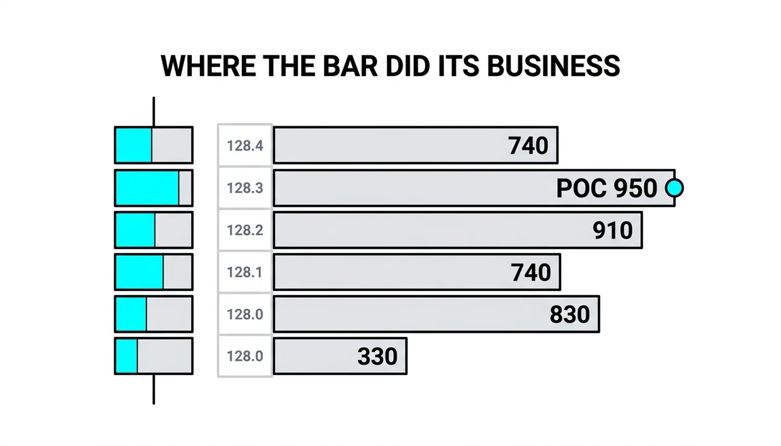
The second thing the rows reveal is the per-bar point of control. That is the single row inside the bar where total volume, both sides combined, was heaviest. Every bar has one, and it marks the price where the most business was actually transacted during those five minutes.
The order flow framework is blunt on this: rising or falling per-bar point-of-control levels are the basic requirement of any trade. If you are long, you want each new bar's heaviest row to sit above the previous bar's heaviest row. If the points of control stall or slip while price still drifts up, the move is being carried by thin volume at the edges, and order flow analysis treats that as a warning rather than a trend.
Migration is the read. Plot the point of control mentally from bar to bar. A steady climb means acceptance is moving higher with price. A point of control stuck at the same level for several bars while price probes around it means the market keeps returning to do business at one price, which is balance, not trend.
The plain chart cannot give you any of this. It cannot show where inside the bar the business happened, which rows were fought over, or where the bar's weight sits. Two identical green candles can have opposite interiors: one with volume stacked at the highs and accepted, one with volume parked at the lows and a hollow push at the top. The footprint separates them instantly.
Big Prints and Trapped Cells
Two expensive mistakes live on this chart, and both start the same way.
First: one huge print is a question, not an answer. A giant sell figure at a row can be a single trader closing a winning long, which is liquidation dressed as aggression. Nothing about that trade is bearish in intent; the trader wanted out, not down. The order flow framework's caution is to trust size only when it repeats in an area. A 2,000-lot sell print at one row, once, is a curiosity. Heavy selling returning to the same zone across several bars is evidence.
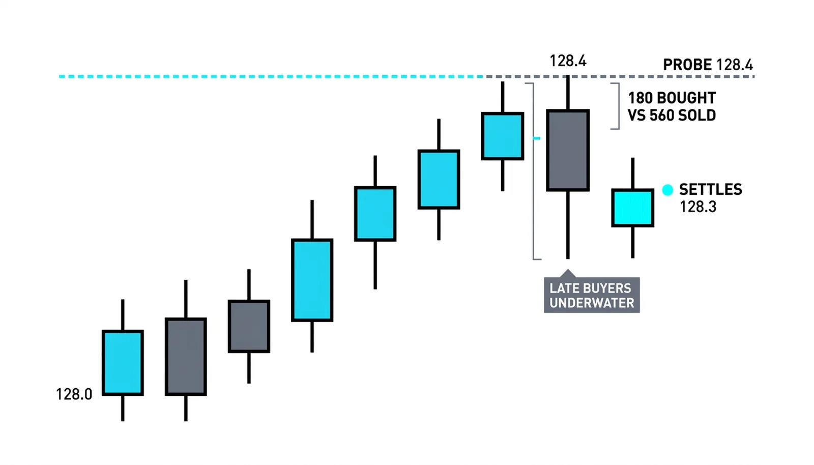
The wedge at the extreme deserves the same discipline. When the top row of a bar shows heavy selling against almost no buying, that is a trapped cell: anyone who bought the high of the bar is underwater the moment price ticks down. Trapped buyers become future sellers, which is why a rejected extreme matters. But one wedged print is still one event. The signal firms up when the next bar fails to reclaim that level.
Second: resolution overload is real. A full footprint view on an active market is thousands of numbers per hour, and the human eye cannot process them all in real time. Trying to read everything is how traders turn a good tool into a reason for paralysis.
The traders who profit from this chart read three things per bar and ignore the rest:
- The imbalances, especially stacked ones, three-to-one or better.
- The trapped cells at the bar's extremes, where one side got caught.
- The point-of-control migration, bar to bar, up or down or stuck.
Everything else on the screen is context for those three reads. Ruthless filtering is not laziness here. It is the only way the tool stays usable at market speed.
One Bar, Ten Rows
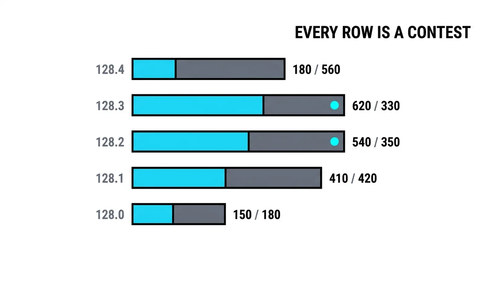
A hypothetical illustration, all numbers invented. A five-minute bar spans 128.0 to 128.4 and closes at 128.3. Each row below shows volume bought at the ask against volume sold at the bid.
| Row | Bought at ask | Sold at bid | The read |
|---|---|---|---|
| 128.0 | 150 | 410 | Sellers pressed the low, buyers absorbed it |
| 128.1 | 300 | 280 | Roughly balanced, a contested row |
| 128.2 | 540 | 170 | Buying imbalance above three to one |
| 128.3 | 720 | 230 | Second stacked buying imbalance |
| 128.4 | 180 | 560 | Sellers rejected the probe at the high |
Read the column as a sequence. Sellers hit the bid hard at 128.0, but the bar did not break down from there. The middle of the bar flipped: rows 128.2 and 128.3 both printed buying imbalances above three to one, a stacked pair sitting mid-bar. That is demand working through a zone, not grazing it.
The bar's point of control sits at 128.3, where total volume, 950 contracts, was the heaviest of any row. The weight lives in the stacked pair, mid-bar, away from the rejected extreme. If the next bar's point of control prints above 128.3, the order flow framework's requirement for a long is met. If it prints below, the stacked buying imbalances just failed to lift acceptance, and the read changes.
The top row is the warning. At 128.4, 560 sold against only 180 bought. Sellers rejected the probe the moment it printed, and every buyer at 128.4 was instantly underwater when the bar settled back to 128.3. That is a trapped cell at the extreme, and those late buyers are now motivated sellers on any retest of the high.
The bar's story, in one line: acceptance built mid-bar while the probe above was refused. A plain candle shows a modest green bar closing near its high. The footprint shows where the real business happened, who got caught at the top, and exactly which level the next bar must clear to keep the long case alive.
Footprint Charts, Answered
What is a footprint chart in trading?
A footprint chart is a candlestick chart where every bar is opened up and split by price, showing the volume bought at the ask and the volume sold at the bid at each level the bar traded. It is the highest-resolution standard view of order flow, sitting between a normal chart and the raw time-and-sales tape.
How do you read a footprint chart?
Read three things per bar and ignore the rest: the imbalances where one side outtrades the other by three to one or more, the trapped cells at the bar's extremes where late traders got caught, and the point-of-control migration from bar to bar. Rising per-bar points of control support longs; falling or stalling ones undermine them.
What are the numbers on a footprint chart?
Each pair of numbers is the volume transacted at one price during that bar, split by side: contracts bought at the ask on one side, contracts sold at the bid on the other. Every trade lands in one of those two buckets, so the two columns together account for all the business done at that price in that bar.
Are footprint charts worth it?
They are worth it for short-term traders who already read structure and volume well and who can filter ruthlessly, because the chart adds real information about where business happened and who is trapped. They are a poor fit for anyone who cannot yet ignore most of the numbers on the screen, since the resolution that makes the tool powerful is the same thing that makes it overwhelming.
The next lesson in this block closes out order flow with absorption: what it looks like when large players quietly stop a move, and how the footprint makes that visible before price admits it.