The CPI Report: Reading Inflation Data
The consumer price index, or CPI, tracks the price of a fixed basket of goods and services a typical household buys, and its monthly and yearly changes are the inflation numbers that headlines, wages, pensions, and central bank decisions all lean on. When you see a single number move currencies, bonds, and stock indexes in seconds, this is usually the number doing it.

The idea is simple. The CPI is the same shopping basket rung up every month, and the receipt's year-over-year total is the inflation rate. Statisticians price that basket, compare it to last month and to the same month a year ago, and publish the percentage changes. What inflation is and why it matters was covered earlier in this level, so we will not re-teach it here. This lesson is about how the most-watched inflation number is built and how to read it when it lands.
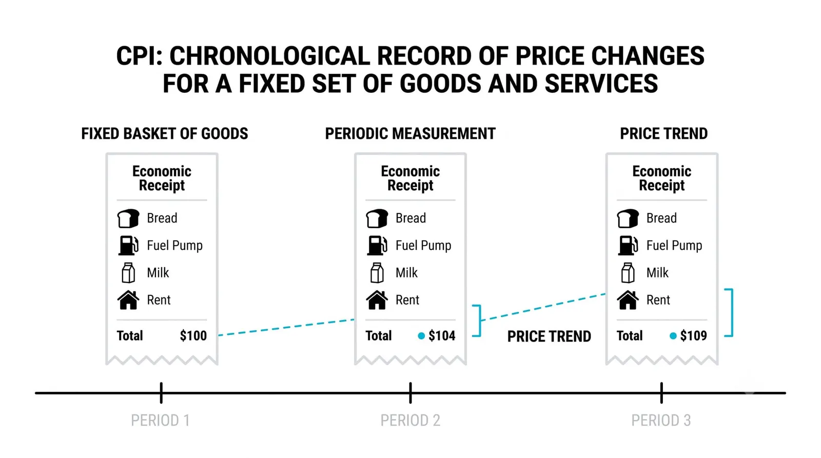
One number carries this much weight because so many contracts and decisions reference it directly. Pension payments adjust off it. Some wage agreements tie to it. Central banks react to it. When a single statistic sits upstream of interest rates, it stops being a statistic and becomes an event.
What the CPI Basket Actually Contains
Start with the weights, because the weights are where most beginners get fooled. The basket is not a pile of equal items. Housing and shelter carry the largest weight by a wide margin, often around a third of the total index. Then come food, energy, transportation, and medical care, each with smaller slices.
That heavy shelter weight has a practical consequence. Rent and owners' equivalent rent move the index more than most people guess. A sharp jump in gas prices feels dramatic at the pump, but a slow grind higher in rents does more arithmetic damage to the headline number because shelter's slice is so much bigger.
The basket is also fixed between periodic overhauls. Statisticians update the weights every few years to reflect changing spending habits, but between those updates the basket stays frozen. That is a feature, not a flaw. A fixed basket isolates price changes from changes in what people buy, which is exactly what an inflation measure should do. The trade-off is that the basket always lags real life a little. New products arrive, old ones fade, and the index catches up only at the next overhaul.
Core vs Headline: Why the Distinction Matters
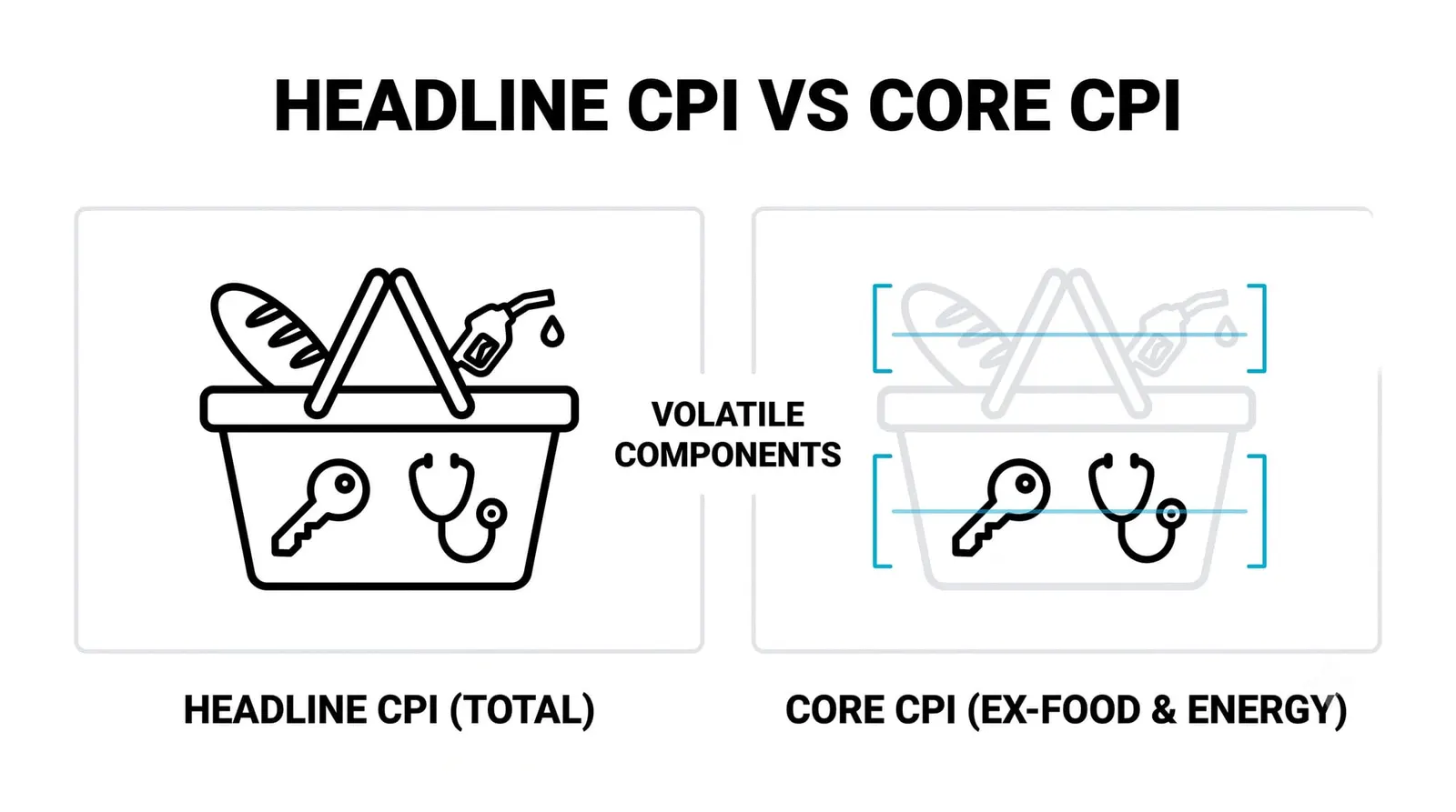
Two versions of the number get published, and mixing them up is the most common reading error. Headline CPI includes everything in the basket. Core CPI strips out food and energy, because those two categories swing wildly from month to month on weather, harvests, and oil supply decisions that have little to do with the underlying trend.
Central banks watch core because they want the signal without the noise. A central bank that hiked rates every time gas prices spiked would whipsaw the economy. Households, on the other hand, live the headline. Nobody can opt out of food and fuel, so the headline number is the one that matches the felt cost of living.
Both are honest numbers answering different questions. Headline asks: what did the cost of the basket do? Core asks: what is the underlying trend once you remove the volatile parts? When the two diverge, the story is usually in food or energy, and the detail tables will show you exactly where.
Reading the Release: What Counts as a Surprise
Every release comes with two growth rates. The month-over-month figure tells you the pace right now, and the year-over-year figure tells you the accumulated change over twelve months. The yearly number smooths noise but reacts slowly. The monthly number reacts fast but jumps around. Professionals watch both, with special attention to the monthly pace because it reveals turning points first.
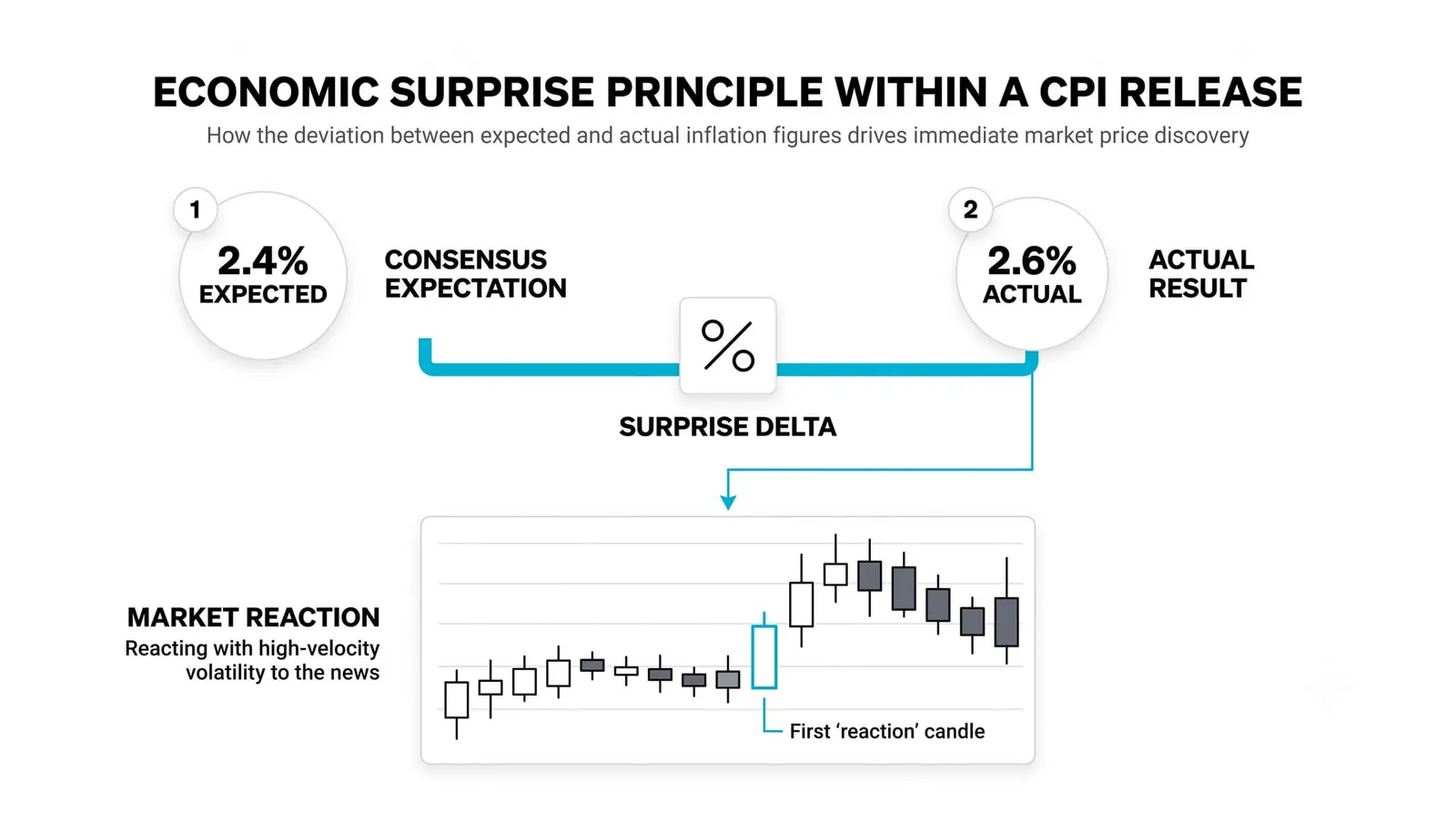
The beat, miss, and in-line framework from the earlier lesson on reading data releases applies directly here. Markets price in a consensus forecast before the release. A print above consensus is a surprise to the upside, and markets react to the surprise, not to the level itself. A 3 percent reading can rally markets if consensus expected 3.3, and sink them if consensus expected 2.7.
Then there are the detail lines, and this is where experienced readers spend their time. Shelter inflation and services inflation often move markets more than the headline does, because they reveal whether price pressure is broad and sticky or narrow and fading. A soft headline driven entirely by falling energy, with shelter still running hot, reads very differently from a soft headline with cooling across the board. The headline gets the first reaction. The details decide whether that reaction holds.
Why CPI Moves Markets More Than Most Reports
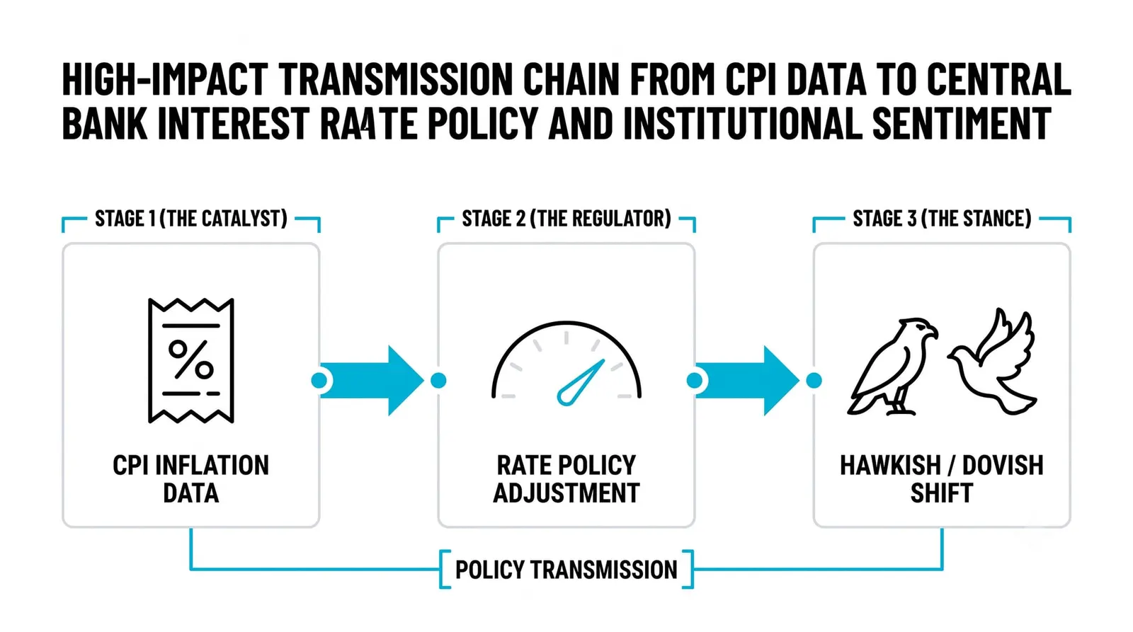
The transmission runs straight through interest rates. Inflation data feeds directly into rate expectations, and rate expectations reprice bonds, currencies, and equities within seconds. This is the mechanism from the rates lessons: higher expected inflation means higher expected policy rates, which means higher yields, a stronger currency, and pressure on rate-sensitive assets. Central banks and their rate decisions were covered in their own lessons, so we will keep this to one line: CPI sits at the center of the central bank's reaction function.
The report also has mechanical reach beyond trading floors. Pension payments in many systems index to CPI. Some wage agreements reference it. Tax thresholds and government benefits adjust off it in various countries. That means the number moves real money for millions of people who never open a chart.
Later in this level you will meet the PCE index, the Fed's preferred inflation gauge, which differs from CPI in weights and formula. For now, hold the simpler point: CPI is the number the public and the headlines run on, and it arrives with enormous expectations already priced in.
One Basket, One Year
Here is a fully hypothetical illustration with round numbers. Imagine a basket that costs exactly 100 at the start of a year and 103 at the end. The year-over-year CPI reading is 3 percent. The calculation at its simplest: (103 minus 100) divided by 100.
Now walk the monthly pace. Three percent over twelve months works out to roughly a quarter of a percent per month, compounding. A monthly print of about 0.2 or 0.3 percent is consistent with 3 percent annual inflation. If monthly prints start running at 0.5, the yearly rate will climb toward 6 percent unless the pace cools. This is why analysts extrapolate the monthly run rate: it shows where the yearly number is heading.
Now the split. Suppose shelter, the heavyweight, rises 5 percent over the year while energy falls 4 percent. Because shelter's weight is large and energy's is small, the index nets to a mild headline around 3 percent. But the two components tell opposite stories. Shelter rising 5 percent says underlying, sticky inflation is alive. Energy falling 4 percent is doing all the work of keeping the headline tame.
What does each reading do to rate expectations? The mild 3 percent headline, taken alone, suggests policy can stay steady. The 5 percent shelter line, noticed by anyone who reads the details, argues inflation pressure persists and rate cuts are less likely. The falling energy line argues the opposite, but everyone knows energy can reverse next month. Markets may rally on the headline, then reprice once desks digest the shelter detail. The first move is rarely the final one.
The Four Lines Side by Side
| Measure | What it includes | What it tells you |
|---|---|---|
| Headline CPI | The full basket: food, energy, shelter, everything | The total cost-of-living change households actually face |
| Core CPI | The basket minus food and energy | The underlying trend, the line central banks watch most |
| Food and energy | Groceries, gasoline, electricity, heating fuel | The volatile component, driven by weather and commodity supply |
| Shelter | Rent and owners' equivalent rent | The heaviest weight and the stickiest pressure in the index |
The CPI Report, Answered
Why does my personal inflation feel higher than the CPI?
Because your basket is not the average basket. CPI reflects the spending pattern of a typical household across an entire economy. If your spending leans heavily toward categories rising fastest, such as rent in a hot city or food, your personal inflation runs above the published number. The index is an average, and almost nobody is exactly average.
Is core really more important than headline?
For policy decisions, yes; for your cost of living, no. Central banks set rates based on where inflation is heading, and core is the better guide to that because it filters out temporary food and energy swings. But households pay the headline. Both numbers matter, and they answer different questions.
How often is CPI published?
Monthly in most major economies, including the United States, typically in the middle of the following month. Some countries also publish quarterly versions. The release calendar is fixed well in advance, so you always know when the next one lands.
Can CPI numbers be revised?
Yes, though revisions are usually small. Seasonal adjustment factors get updated, and some component data gets refined after the first release. Unlike jobs reports, which can see large revisions, CPI revisions tend to be modest. The first print is usually close to the final one.
Next in this level, you will meet the PCE index and see why the Fed prefers it over CPI, and how the two can tell different stories in the same month. Knowing both gauges is what separates reading the news from reading the economy.