What Is a Trendline in Trading
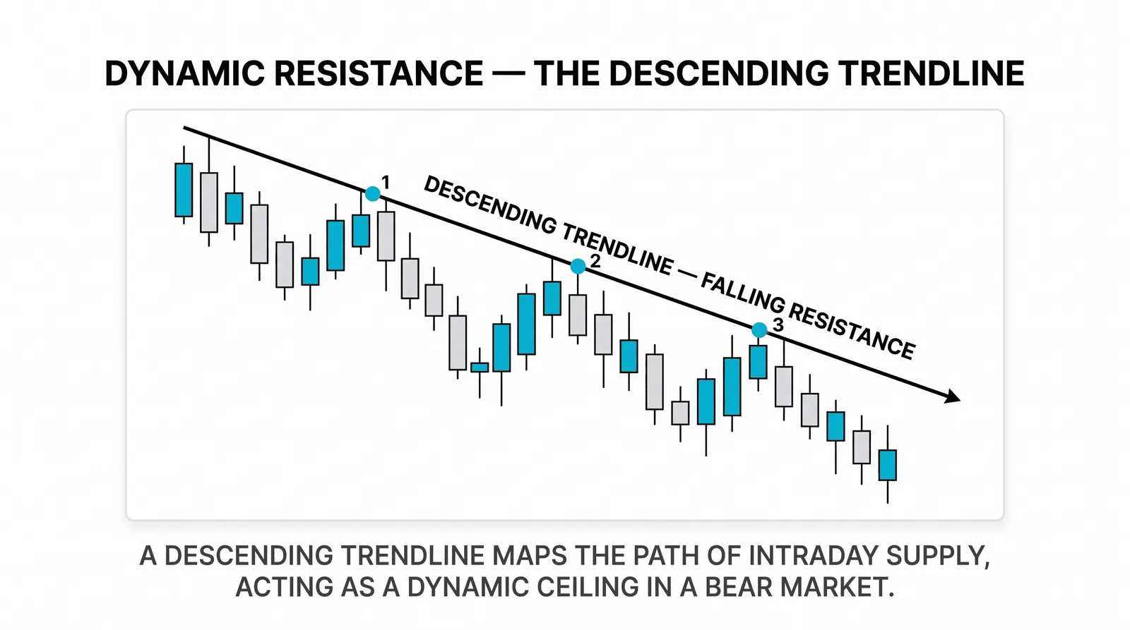
A trendline is a straight line drawn across a trend's swing points, connecting the lows in an uptrend or the highs in a downtrend, so you can see the trend's rate of progress at a glance. It turns a series of zigzags into one clean reference. Price rallies, pulls back, rallies again, and the line ties those pullbacks together into something you can measure.

Think of it as the string you stretch between fence posts: the posts are the swing points, and the string shows whether the fence runs straight and at what slope. Nothing more mystical than that.
One reminder before we start: an uptrend is a sequence of higher highs and higher lows, and a downtrend is lower highs and lower lows. That structure is what the line is trying to describe; the full definitions live in what a trend is.
How to Draw a Trendline
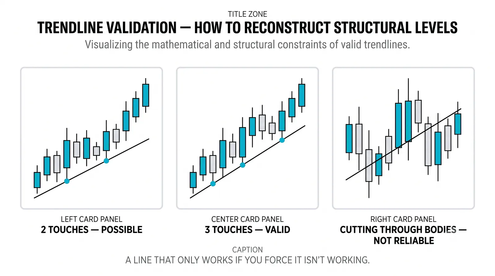
You need at least two swing points to draw the line, and a third touch to confirm it means anything. Two points define a line in geometry, but two points on a chart define nothing yet, because any two random lows can be connected. The third touch is where the market tells you other traders are respecting the same line.
In an uptrend, connect the significant pullback lows. In a downtrend, connect the significant rally highs. Do not mix them, and do not force the line through candle bodies just to make it fit.
Practical steps:
- Mark the obvious swing lows (uptrend) or swing highs (downtrend) first.
- Draw the line through the two clearest points, usually the wicks.
- Extend it forward and wait. The next pullback is the test.
- If price touches the line and turns, you have a working trendline. If price slices through without pausing, the line was wrong or the trend changed.
Small adjustments are normal as new swings form. Redrawing the line every hour to fit your bias is not adjustment. That is storytelling.
What the Angle Tells You
The slope of the line is the trend's speed, and speed has consequences. Very steep trendlines look exciting and break quickly, because price cannot sustain that pace for long. A line climbing at roughly 45 degrees reflects steady, durable demand, and those trends tend to last longer.
Here is a hypothetical example with round numbers. Suppose a stock pulls back to a low at 90, rallies, then pulls back again to a low at 95 over a similar stretch of time. Connect those two lows and extend the line forward. If the same spacing holds, the line projects the next pullback zone somewhere around 100. That gives you a concrete area to watch for buyers, instead of guessing. The angle idea has a catch worth its own page in chart scaling: the same slope looks different on a linear and a log axis.
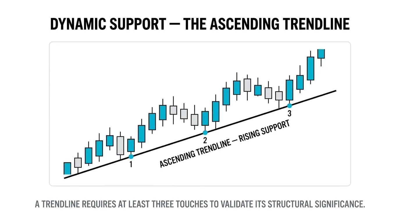
Notice what the projection is and is not. It is a zone where buyers have previously shown up, extrapolated forward. It is not a promise that price will stop at 100, or even reach 100 in an orderly way.
When a trend accelerates, traders often draw a second, steeper line inside the first. The steeper line breaking is usually an early warning, not a funeral. The flatter, original line still defines the trend until price takes it out too.
Valid Trendline or Just a Line You Drew
Anyone can draw a line. Validity comes from evidence, and the evidence has three parts.
First, touches. Three or more clean touches, each followed by a reaction, carry far more weight than two. Each touch is another instance of the market treating the line as meaningful.
Second, time span. A line connecting lows spread over weeks or months describes a real trend. A line connecting two lows from Tuesday morning describes noise.
Third, honesty. If you skipped a low because it ruined your line, or nudged the angle until it touched what you wanted, you cherry-picked it. A good test: cover the right side of the chart, draw the line on the data you had at the time, then uncover. If the line still works, it was real. If it only works with hindsight, it was decoration.
Two Touches, Three Touches, Broken
The same tool means different things at different stages. This table sums up how to read each state.
| State | What it is | What it means | How to treat it |
|---|---|---|---|
| Two touches | Line drawn through two swing points | A hypothesis, nothing more | Watch it, but do not trade from it alone |
| Three touches | Third pullback respected the line | Market participants are responding to it | A usable reference for entries, stops, and expectations |
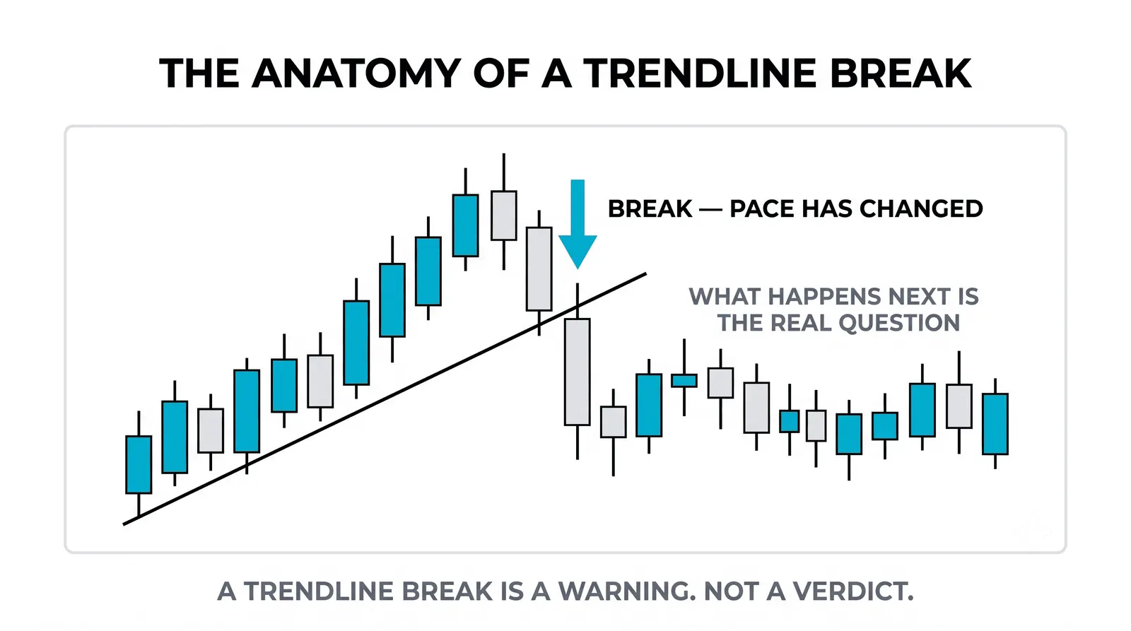
| Broken trendline | Price closed through the line | The trend's pace has changed; the trend itself may or may not be over | Step back, check the structure of highs and lows before acting |
The broken row deserves emphasis. A broken line tells you the old rate of advance is finished. It does not automatically tell you the trend reversed.
The Honest Limits
Put two traders in front of the same chart and you will often get two different trendlines. One connects wicks, the other connects closes. One picks the obvious lows, the other picks earlier ones. Both lines can be defensible, which means the tool has built-in subjectivity you cannot fully remove.
The structure of highs and lows outranks the line, always. If a trendline breaks but price keeps making higher lows and higher highs, the uptrend is intact and the line was simply drawn at the wrong angle. If the line holds but price starts printing lower highs, trust the price, not your drawing.
Trendlines also degrade in fast, news-driven markets. A line built on calm, orderly pullbacks can be shredded in one session by an earnings report or a central bank surprise. The tool assumes some continuity in behavior, and news breaks continuity.
Use the line as one input among several: structure first, then the line, then whatever support and resistance sits nearby. Confluence is where trendlines earn their keep. The full validity checklist gets a deeper treatment in valid versus invalid trendlines.
Questions About Trendlines
Do trendlines predict where price will go?
No. A trendline describes the trend's past pace and marks where buyers or sellers have previously stepped in. It gives you a level to watch and plan around, not a forecast. Treat every projection as a scenario with an invalidation point, not a destination.
Which timeframe should I draw trendlines on?
Draw them on the timeframe you actually trade, then check one timeframe higher for context. A line on the daily chart that also lines up with the weekly structure carries more weight than one that only exists on a five-minute chart. Higher-timeframe lines are respected by more participants, which is what gives any line its power.
Do trendlines have to be straight, or can they curve?
By definition a trendline is straight; when price accelerates along a curve, traders usually handle that with channels, moving averages, or a sequence of redrawn straight lines rather than bending the line itself. Curved tools exist, but they answer a different question. Keep the straight line for measuring a steady rate of progress.
What if the trendline breaks but the structure holds?
Then the structure wins and the trend is still alive. A broken line with intact higher lows usually means the trend slowed to a more sustainable angle, so you redraw the line flatter and carry on. Only when price breaks the line and then breaks the prior swing low do you have real evidence the trend itself has ended.
Once you are comfortable drawing and validating trendlines, the natural next step is channels: adding a parallel line on the opposite side of price so you can map both the pullbacks and the rallies within the same trend.