The 20, 50, 100 and 200 Moving Averages
The 20, 50, 100 and 200 period moving averages are the standard lines because each one tracks a different horizon of the same trend: roughly a trading month, a quarter, half a year, and a trading year. Each horizon has its own crowd of traders watching it.

That matters more than it sounds. The 20-period line is the short-term crowd's trend. The 200-period line is the long-term crowd's trend. When price sits above all four, every horizon agrees. When price cuts through one, one group of holders changes its mind while the others wait. Reading these lines is really reading four audiences at once.
Crossovers between moving averages were covered in the previous lesson, so this one does not repeat them. Dynamic support and resistance was also covered already; this lesson is about which specific lines do that job, and why those specific numbers became the defaults.
Why These Four Periods Became the Standard
The logic is calendar logic. A daily chart has roughly 20 trading days in a month, 50 in a quarter, 100 in half a year, and 250 in a full year. The 200 period moving average is a slightly rounder stand-in for the trading year. These are not magic numbers discovered in the data. They are the calendar translated into averages.
Think of four calendars on one desk: the day page, the week spread, the month grid, and the year wall. It is the same schedule at four horizons, and each moving average period is one of those calendars laid on the chart.
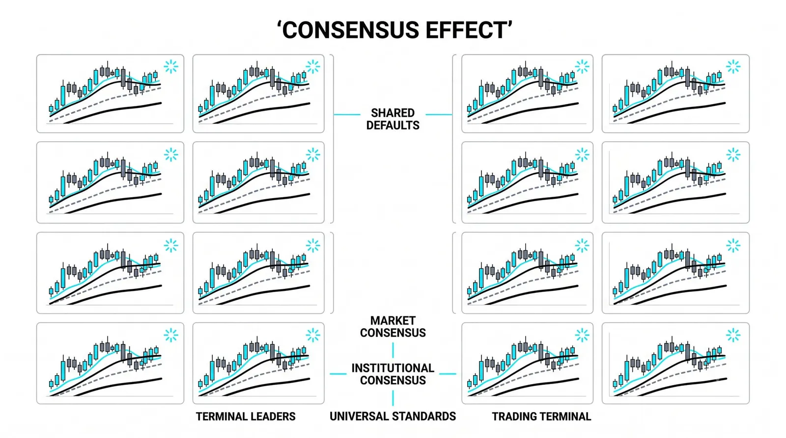
The second reason is convention. These periods became the standard because traders adopted them, and traders adopted them because they were the standard. A line that everyone watches matters because everyone watches it. Once a level is on every screen, orders cluster around it, and clustered orders make the line behave like a real level.
The third reason is pure inertia. Open any charting platform and the default moving average settings are 20, 50, 100, and 200, or some near variant. Defaults spread. New traders learn the defaults, become experienced traders, and keep them. Nobody voted for these numbers. They just won by being first and everywhere.
The 20 and 50: What Traders Use Them to Watch
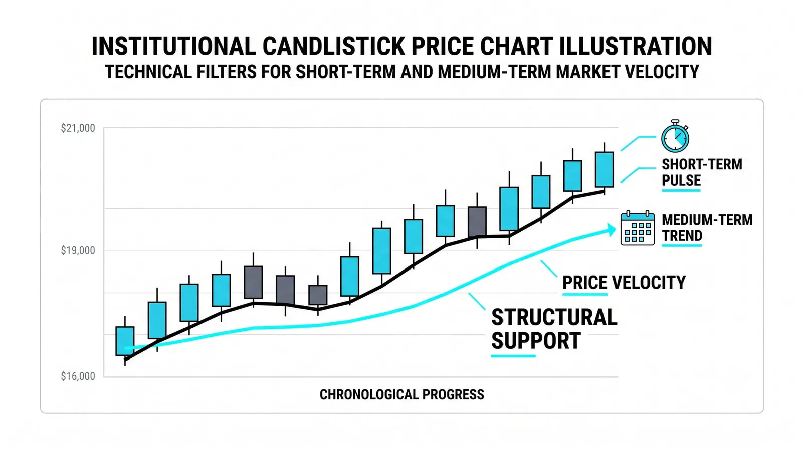
The 20 period is the swing trader's trend line. In a healthy trend, price hugs it. Strong uptrends often pull back to the 20 and bounce, sometimes several times in a row. A close through the 20 is the first sign that the short-term rhythm has broken.
Because it reacts fast, the 20 also whipsaws. In a sideways market it flips slope constantly and produces false signals. Traders who follow it accept that cost in exchange for early warnings.
The 50 period is the intermediate line. It is often described as the first line institutions are said to defend, because many funds and systematic strategies track it. Whether or not any single fund literally buys at the 50, enough orders sit near it that pullbacks frequently stall there.
Pullbacks to the two lines differ in depth and meaning. A dip to the 20 is a shallow pause inside a strong trend. A dip to the 50 is a deeper correction that tests the intermediate trend. Price reaching the 50 means the 20 already failed, so the tone has weakened. Price breaking the 50 after holding the 20 for weeks is a real change in character, not noise.
The 100 and 200: What Traders Use Them to Watch
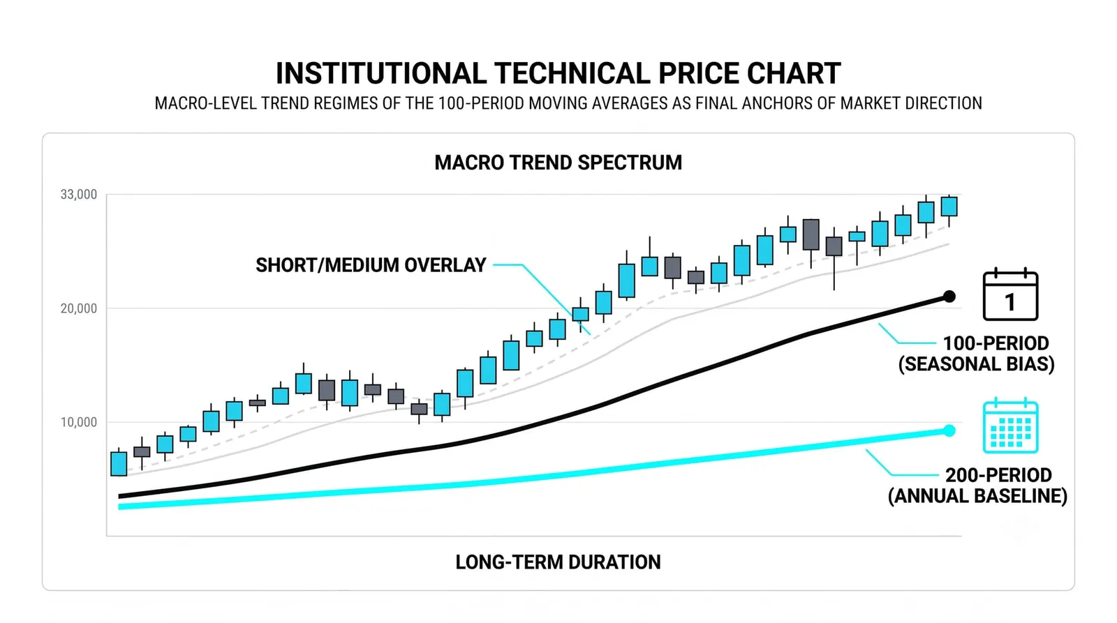
The 100 period is the quieter midpoint. It gets less attention than its neighbors, and that is partly its use. When price falls through the 50 and holds the 100, the correction has stayed within the half-year trend. The 100 acts as a second line of defense before anyone has to ask the big question.
The 200 period is the bull-and-bear line of market commentary. Price above the 200 is conventionally called a long-term uptrend; price below it, a long-term downtrend. Analysts use it as a regime filter: a simple yes-or-no answer to whether the long-term backdrop favors buying dips or selling rallies.
The 200 appears in headlines far more than in day-to-day trading, and there is a reason for that. It moves slowly. A day trader gets nothing from a line that takes a year of data to turn. But when a major index crosses its 200, that is news, because it means the average price of an entire trading year has been breached. The 200 is a statement about regime, not a tool for timing entries.
Why So Many Traders Watching the Same Lines Matters
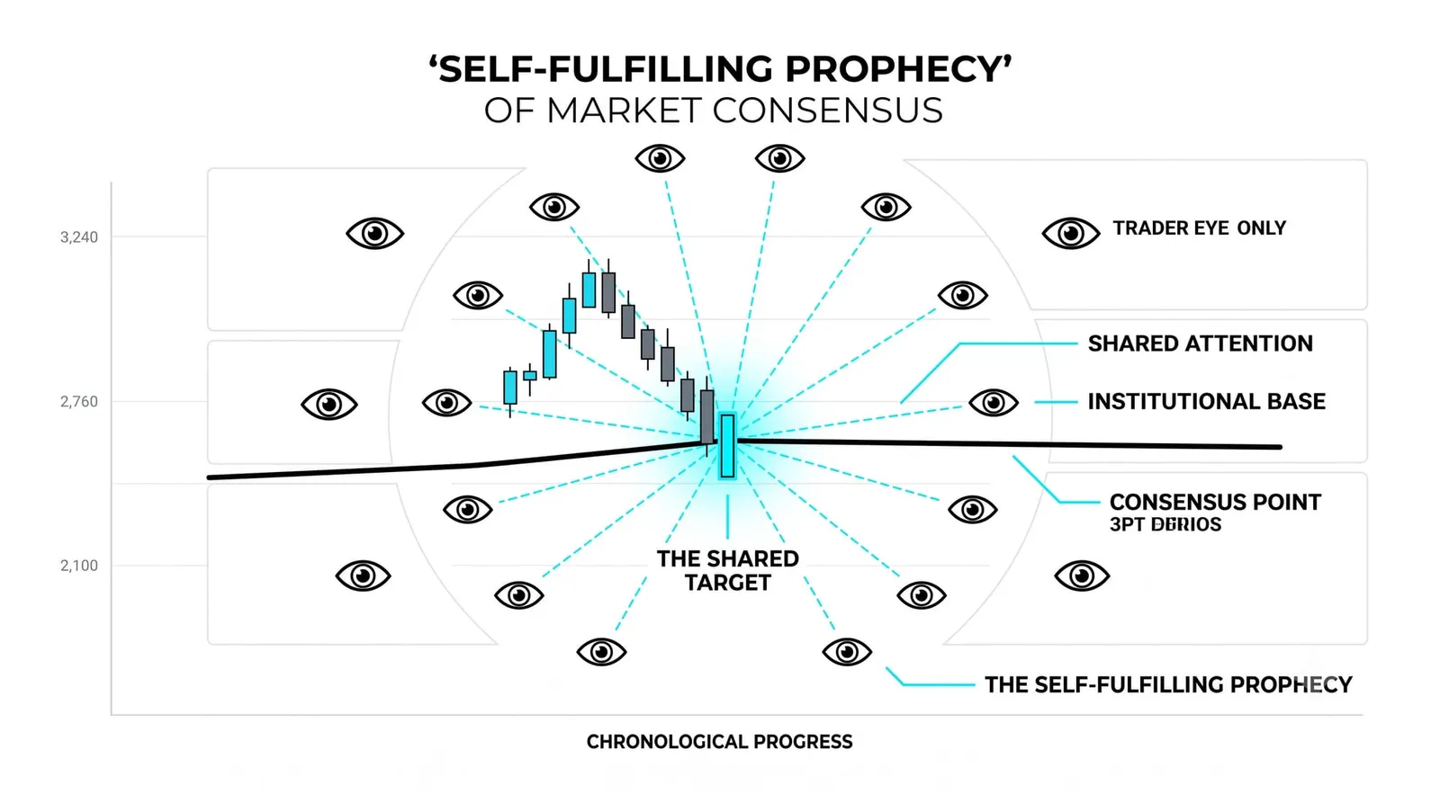
The standard periods work partly through reflexivity: the watching creates the effect. Enough traders place stops below the 200, place buys at the 50, and trim positions when the 20 breaks, that the lines genuinely move price. The level is a coordination point. Nobody has to agree on why it matters. They only have to agree on where it is.
This is a prophecy that partly makes itself true, and that cuts both ways. The same crowd that defends a line on the way down exits through the same door when it breaks. A widely watched level that fails can produce a fast, one-directional move, because everyone who trusted it reacts at once. Respect the crowd around these lines. Do not assume the crowd is right.
One Price, Four Verdicts
Take a hypothetical stock trading at 62. Its 20-period average sits at 58, its 50 at 53, its 100 at 49, and its 200 at 44. Price is above every line, and the lines stack in order: shortest on top, longest on the bottom. That is the textbook picture of an uptrend at every horizon.
Over the next two weeks the stock slides to 51. That single price produces four different verdicts.
- The 20 at 58 is broken. Swing traders watching the short-term line treat the trend as damaged. Many are out.
- The 50 at 53 is broken. Intermediate traders see the correction deepen past a routine pullback. Some reduce, some tighten stops.
- The 100 at 49 holds. Price at 51 is still above it. Traders on the half-year horizon see a deep correction, not a broken trend.
- The 200 at 44 is untouched. Long-term holders see nothing to act on. To them this is noise inside a regime.
Same stock, same drop, four conclusions. None of them is wrong. Each is correct for its horizon, which is why arguments about whether a chart "looks bullish" are usually arguments between timeframes.
Notice also why the 100 holding matters more than the 50 breaking. The 50 breaking tells you the correction is serious. The 100 holding tells you it has not yet become a reversal. The deeper the line that holds, the more of the trend's structure survives. If the 100 then breaks and price heads for the 200, the question stops being "how deep is the pullback" and becomes "is the long-term trend over."
| Period | Horizon It Tracks | Who Typically Watches It |
|---|---|---|
| 20 period | Roughly one trading month | Swing traders and short-term trend followers |
| 50 period | Roughly one quarter | Intermediate traders and, by convention, institutions |
| 100 period | Roughly half a trading year | Position traders checking correction depth |
| 200 period | Roughly one trading year | Long-term investors, analysts, and market commentary |
The Standard Periods, Answered
Why is the 200 period moving average important?
It approximates a full trading year of prices, so it defines the long-term trend. Price above it is conventionally read as a bull regime and below it as a bear regime. Because so many market participants and headlines reference it, orders cluster around it, which gives it real influence on price behavior.
Which moving average period is best?
None of them. Each period measures a different horizon, so the right one is whichever matches your holding period. A swing trader and a long-term investor need different answers from the same chart. Asking which period is best is asking which calendar is best: it depends what you are planning.
Can I change the standard periods?
Yes, and many traders adjust them slightly. The trade-off is audience. A custom period may fit your style better, but fewer people watch it, so fewer orders cluster there. The standard periods carry the crowd with them, and the crowd is part of what makes them work.
Do the same periods work on every timeframe?
The mechanics are identical on any timeframe, because a 20-period average is always the last 20 bars. What changes is the calendar meaning. A 20-period line on an hourly chart covers a few days, not a month. The lines still behave as dynamic levels on any timeframe, but the month-quarter-year interpretation belongs to the daily chart.
Next, the lesson moves from which periods to watch to a different way of building the average itself: a moving average that tries to keep the smoothness while cutting the lag.