Short Term Timeframes
Short term timeframes are the 1-, 5-, 15-, and 30-minute charts, where each candle packs a few minutes of market activity into one bar. They give you the most detail of any chart speed. They also give you the most noise. That trade-off defines everything about how you should use them.

Think of short-term charts as a microscope: more detail than you can use, and the field of view shrinks every time you zoom.
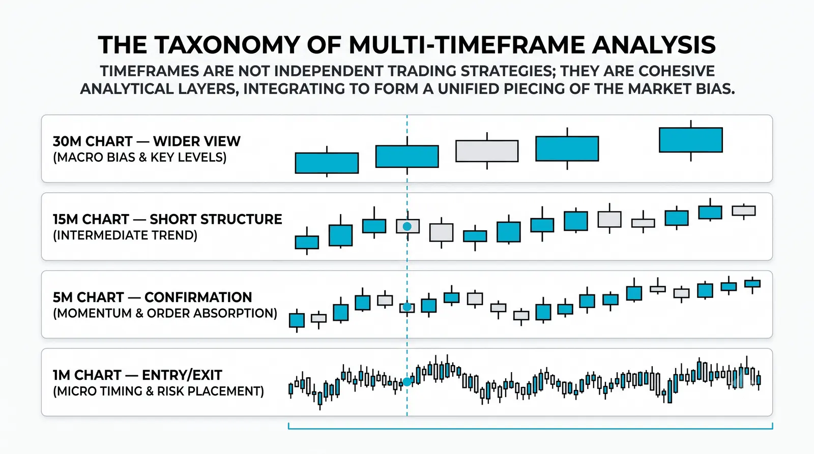
What Each Interval Actually Shows
The 1-minute chart is the grain of execution. This is where fills happen. Scalpers live here because they need to see the exact moment price touches their entry, and they measure trades in ticks, not points. One candle is sixty seconds of orders. Nothing on this chart means much beyond the next few minutes.
The 5-minute chart shows the intraday swings day traders plan around. A typical session produces roughly 80 of these candles, enough to see small pushes, pullbacks, and ranges inside a single day. Most day-trading entries are timed here.
The 15- and 30-minute charts show session structure. These are the pushes and pulls inside one trading day: the morning drive, the midday stall, the afternoon move. A day trader uses them to see where the day is in its own story. A swing trader uses them to fine-tune an entry or exit that was planned on a daily chart.
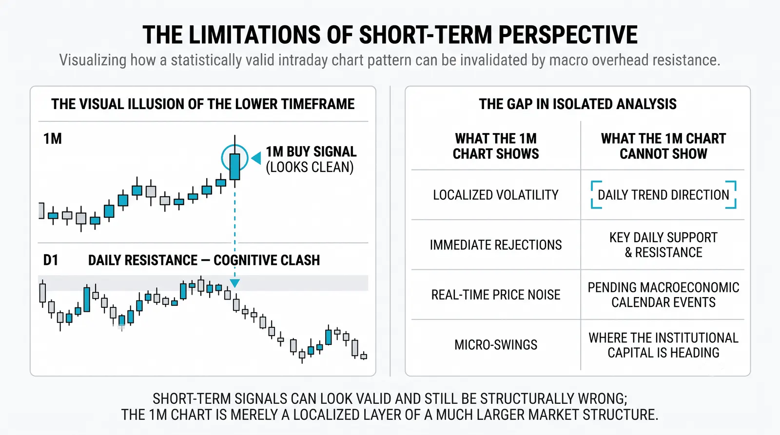
What These Charts Actually Show You
Each candle on a short-term chart is a few minutes of orders. That is all. A burst of buying from one institution can fill three 5-minute candles and look like a breakout. It was one order.
Trends that look obvious on a daily chart are barely visible as structure down here. A stock climbing for six months shows up on the 5-minute chart as a random-looking drift with dozens of dips. The uptrend is real. The chart speed is just too fast to display it.
One large order can redraw the whole picture. On a daily chart, a single big trade is a rounding error. On a 1-minute chart, it can be the biggest candle of the hour. Short-term charts magnify whoever happens to be trading right now, not what the market actually thinks.
The Signal-to-Noise Problem
More bars per week means more of everything, including more garbage. A 5-minute chart produces more than 1,500 candles a month. A daily chart produces about 21. Every crossover, every touch of a level, every pattern appears a hundred times more often on the fast chart, and most of those appearances mean nothing.
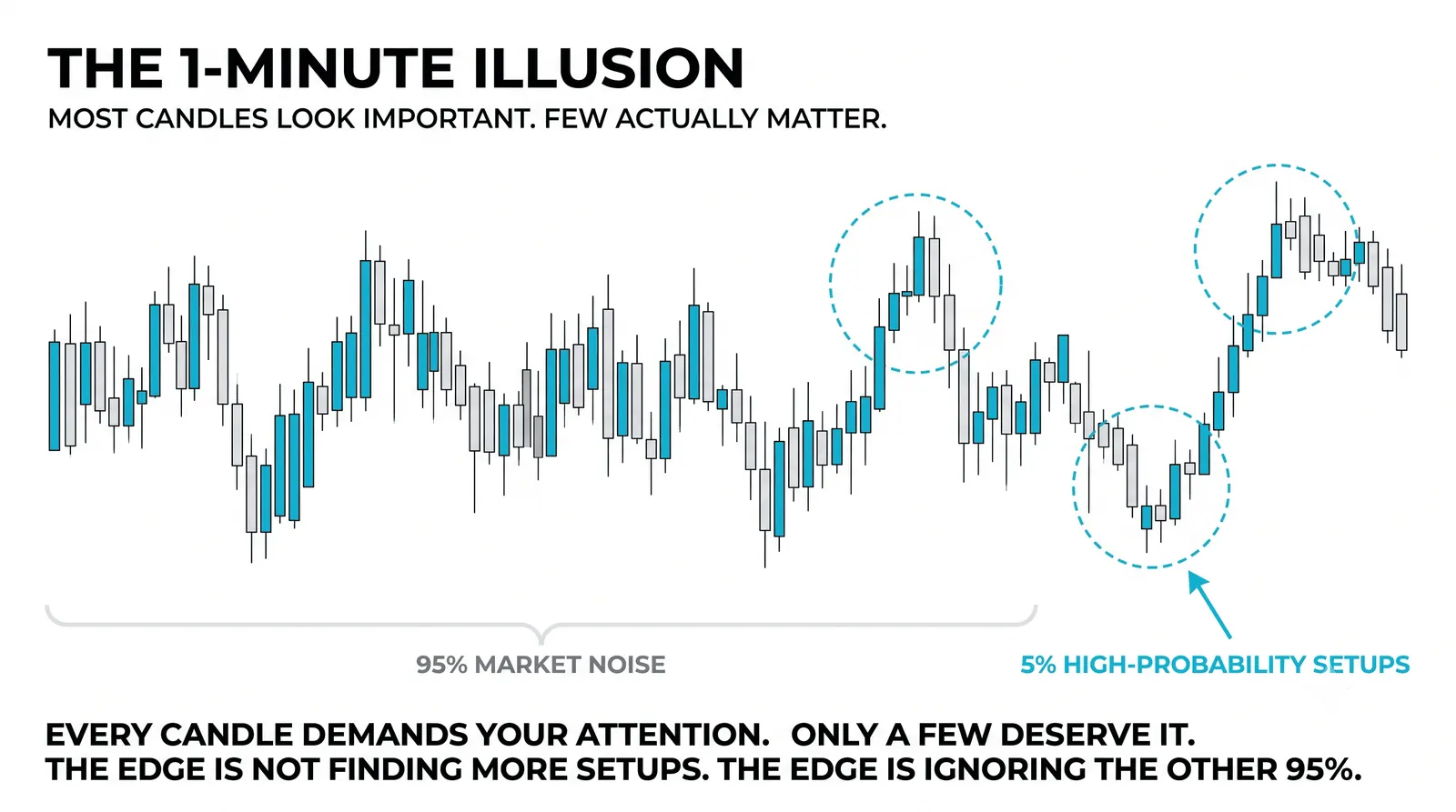
Here is the blunt version: most signals on short-term charts are noise wearing a signal's clothes.
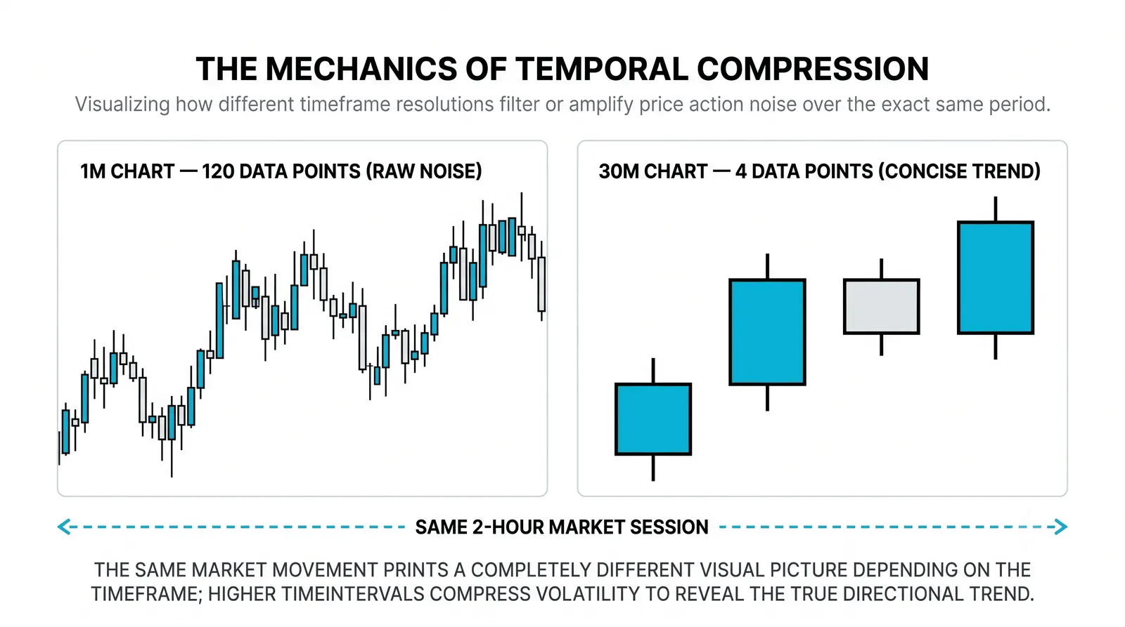
Take a support level that decides a week on the daily chart. Price tests it once, holds, and the week resolves. That same level on the 5-minute chart gets crossed twelve times in a day. Each cross looks like a break. Eleven of them reverse within minutes. If you traded every cross, you took eleven losses and one real move.
This is why new traders burn out on fast charts. The chart is not lying. It is answering a much smaller question than the one they asked.
When Each Interval Gets Used
- 1-minute: scalping. Entries and exits measured in seconds to minutes, where execution detail is the whole edge.
- 5-minute: day-trading entries. The standard working chart for planning and timing intraday trades.
- 15-minute: reading the session. Day traders check it to see whether the day is trending or chopping before committing.
- 30-minute: timing exits. Swing and position traders use it to leave a trade cleanly without watching every tick.
Notice the pattern. The faster the chart, the shorter the decision it serves. Nobody plans a month-long trade on a 1-minute chart, and nobody scalps off a daily.
A Worked Example: One Price, Two Stories
Say a stock has clear support marked at 100 on the daily chart. This is a hypothetical, but the pattern shows up every week in real markets.
During one week, the 5-minute chart crosses 100 a dozen times. Price dips to 99.60, recovers in four minutes. Drops to 99.80, bounces. Slips to 99.50, snaps back. A trader watching only the 5-minute chart sees support breaking over and over. It looks weak. It looks doomed.
The daily chart tells a different story. Four of the five days close above 100. The level held all week on the timeframe that defined it. Then on Friday, the daily chart closes at 99.40, under 100, exactly once.
That single close is the one that matters. The dozen intraday crosses were noise. The one daily close was the signal. Same price, same week, completely different meaning depending on which chart you trusted.
Comparing the Short-Term Intervals
| Interval | One Candle Holds | Typical User | Noise Level |
|---|---|---|---|
| 1-minute | 60 seconds of orders | Scalper | Extreme |
| 5-minute | A small intraday swing | Day trader | High |
| 15-minute | A session push or pullback | Day trader reading structure | Moderate |
| 30-minute | A meaningful chunk of the session | Day or swing trader timing exits | Lower |
The pattern in the table is the whole lesson in miniature. Slower candles carry more meaning per bar. Faster candles carry more bars per idea.
What Short-Term Charts Cannot Tell You
Short-term charts cannot tell you the trend. They cannot tell you the context. They cannot tell you which levels matter. They assume you already got all of that from a higher chart before you zoomed in.
This is the mistake that defines most struggling traders. They open the 5-minute chart first and try to build an opinion from it. That is backwards. The correct order is daily first for trend and levels, then a short-term chart for timing. The fast chart answers "when," never "whether."
A 5-minute buy signal inside a daily downtrend is not a buy signal. It is a well-lit dead end. The fast chart has no way to warn you, because the information that would warn you does not exist at that zoom level.
Used properly, short-term charts are a finishing tool. The decision comes from the slow chart. The fast chart just helps you execute it at a better price.
Questions About Short Term Timeframes
Which short timeframe should I start with?
Start with the 15-minute chart. It is slow enough that structure is visible and fast enough to teach you how intraday price behaves. Move to the 5-minute only after you can read a session on the 15-minute without confusion. Skip the 1-minute entirely until you have a proven reason to be there.
Are short timeframes more profitable?
No. They are more active, which is not the same thing. Faster charts produce more trades, more costs, and more noise-driven losses. Profit comes from the quality of your decisions, and decisions are easier to get right on slower charts where the signal is cleaner.
Why do my 5-minute signals keep failing?
Because most 5-minute signals are noise, and because you are probably reading them without higher-timeframe context. A signal that agrees with the daily trend and sits at a daily level has a real chance. The same shape in the middle of nowhere is a coin flip with fees attached.
Do I need short timeframes if I swing trade?
You need them only for timing, not for decisions. Your analysis lives on the daily chart. The 15- or 30-minute chart can tighten an entry or manage an exit, but many swing traders do fine never looking below the daily at all.
You now know what each chart speed shows and what it hides. The next step is learning to combine them: reading the daily for direction, then dropping down for timing, without letting the fast chart talk you out of what the slow chart already told you.