Long Term Timeframes
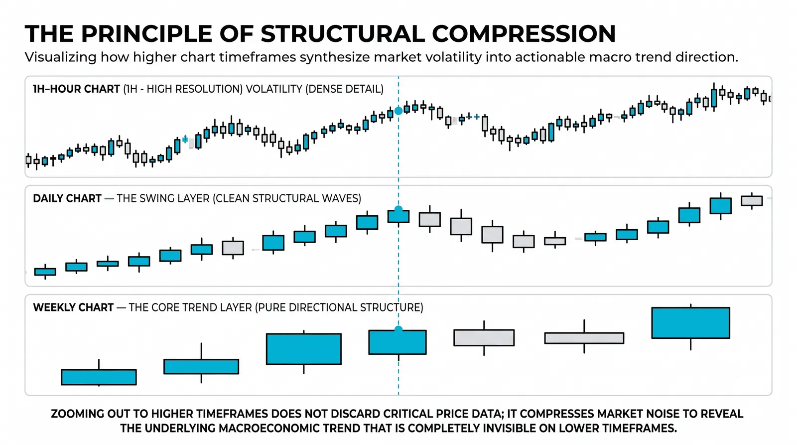
Long term timeframes are the daily, weekly, and monthly charts, where each candle holds a full day, a full week, or a full month of trading. They are the slow end of chart speed, and that slowness is the point. Because so much activity is packed into each bar, these charts give you the cleanest view of trend and the strongest view of support and resistance you can get.

Think of long-term charts as a coastline seen from altitude: the wobble of every wave disappears, and the shape that remains is the one that does not move. That is what these charts do to price.
What These Charts Actually Show
A daily candle is a full session of fighting compressed into four numbers: open, high, low, close. Thousands of trades, every news headline, every bout of fear and greed, reduced to one small rectangle.
A weekly candle compresses five of those sessions. A monthly candle compresses roughly twenty. Each step up throws away more detail and keeps more meaning.
What survives that compression is what enough participants agreed on. A level that held on a monthly chart held against weeks of selling. That is not a line on a screen. That is a record of where large amounts of money changed their minds.
The Daily Chart Is the Workhorse
Of the three, the daily chart does the most work for the most traders. It shows full trend structure: the highs, the lows, and whether they are rising or falling over months.
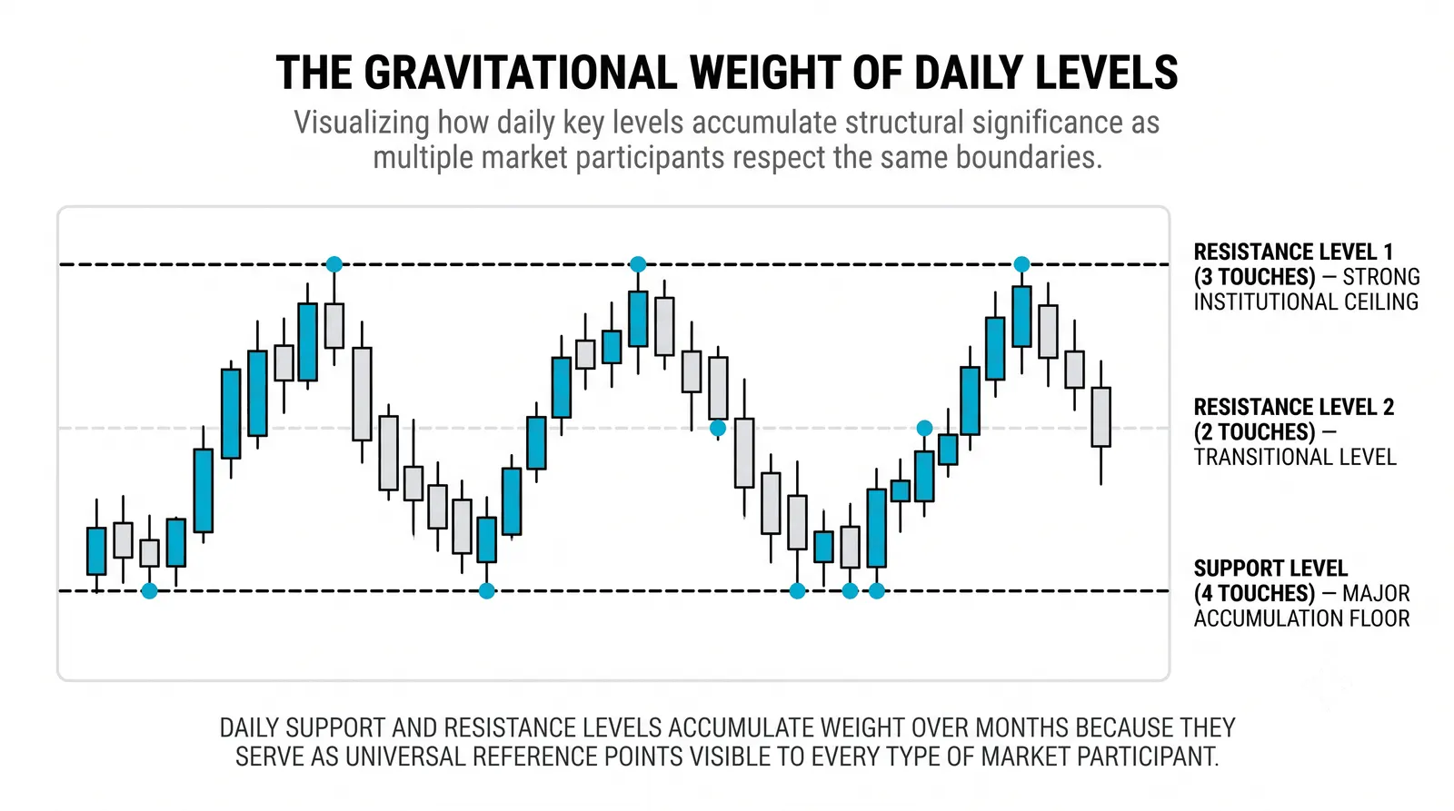
It also shows the levels everyone watches. When analysts, funds, and retail traders all mark support, they are usually marking it on the daily. Levels that many people watch tend to matter, partly because so many orders cluster around them.
Practically, the daily gives you one decision point per day. The candle closes, you review, you decide. That is slow enough to think clearly and fast enough to actually trade. For most swing traders, this is home.
Weekly and Monthly: The Biggest Picture
Move up to the weekly and monthly and the signal count collapses. A monthly chart produces twelve candles a year. You might get one or two meaningful signals in twelve months.
What those signals lack in frequency they make up in weight. Position traders and investors live here because this is where multi-year trends are visible. A support level on a monthly chart is years of memory. When price returns to it, the market is retesting a decision it made long ago.
Even if you never place a trade from a monthly chart, you should look at one before you trade anything. It tells you which direction the big money has been moving for years, and fighting that direction is expensive.
The Trade-Off: Detail for Context
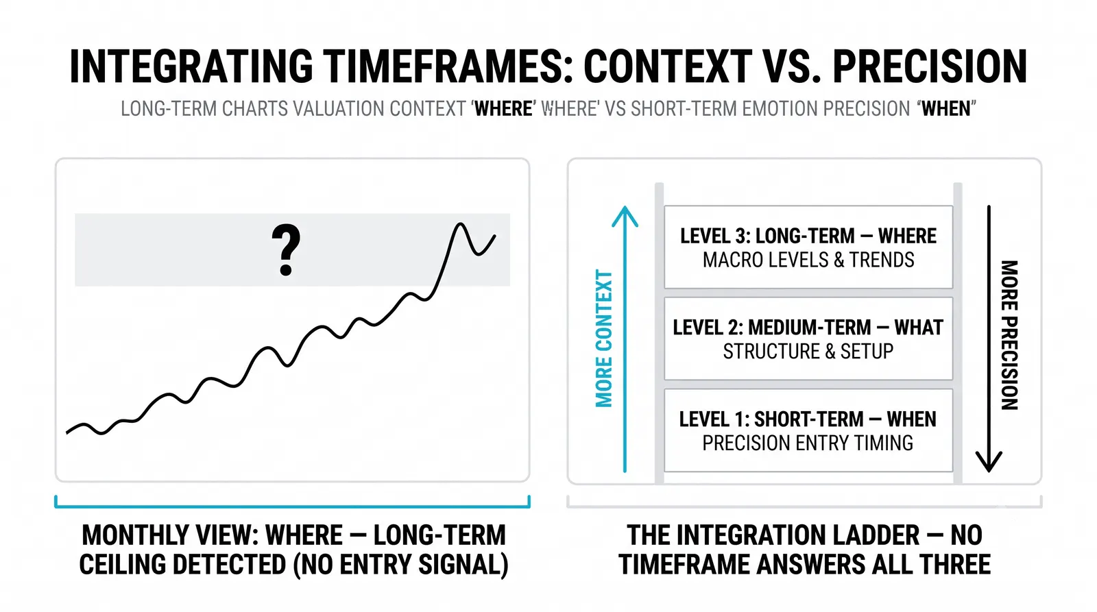
Every timeframe choice is a trade. On long-term charts you give up detail and receive context.
You cannot see the intraday fight. You do not know whether the level held cleanly or survived a violent test at noon. Your entries are coarser, and your stops must sit wider, because a normal daily swing would stop out a tight intraday stop instantly.
The payoff is that almost nothing on these charts is noise. A breakout on a monthly chart took a month to build. Randomness gets filtered out by sheer compression. Fewer signals, but each one earned.
A Worked Example
Take a hypothetical stock over the same six months, viewed two ways.
On a 5-minute chart, six months is roughly 10,000 candles. Zoomed out, it is an unreadable band of chop. Zoomed in, every small move looks urgent. You could stare at it for hours and learn nothing durable.
Now look at the same six months on the daily chart. About 120 candles. The picture is obvious: an uptrend from 40 to 60, with three clean higher lows along the way. Each pullback stopped near a prior breakout zone, around 44, then 49, then 54.
Those buy zones held for weeks at a time. They did not hold by accident. They held because everyone watching the daily chart saw the same levels and placed buy orders there. The chart is a shared reference point, and shared reference points move markets.
What Long-Term Charts Cannot Tell You
These charts tell you where, not when. The daily can say a level matters. It cannot say the level will hold at 10:15 on Tuesday.
That is why many traders combine timeframes. The daily or weekly identifies the zone and the direction. A lower chart, like the hourly, times the actual entry inside that zone. The slow chart makes the decision; the fast chart executes it.
Using only a fast chart is the common beginner error. You get precise entries into moves that have no bigger picture behind them.
Daily vs Weekly vs Monthly
| Daily | Weekly | Monthly | |
|---|---|---|---|
| One candle holds | One trading session | Five sessions | About twenty sessions |
| Typical user | Swing traders, active investors | Position traders | Investors, position traders |
| Signals per year | Roughly 10 to 30 | Roughly 3 to 8 | 0 to 2 |
| Best at | Tradable trends and widely watched levels | Confirming the primary trend | Multi-year context and major levels |
Notice the pattern: as the candle gets slower, the user gets more patient and the signal gets rarer and heavier. Pick the row that matches how often you actually want to make decisions, not the row that sounds impressive.
Questions About Long Term Timeframes
Is the daily chart best for beginners?
Yes, for most new traders the daily is the right starting point. It gives you one decision per day, which removes the pressure and overtrading that destroy beginners on fast charts. You can review the close in the evening, plan calmly, and place orders without watching a screen all day.
Why do weekly levels matter more than daily levels?
Weekly levels matter more because they represent more agreement over more time. A level on the weekly survived five times as much trading as a daily level, so more participants remember it and defend it. When daily and weekly levels line up at the same price, that zone deserves extra respect.
How many signals a year is normal on a monthly chart?
Zero to two meaningful signals per year is normal on a monthly chart. Some years produce none at all, and that is fine. The monthly chart is a context tool first and a signal tool second. If you need frequent trades, this is not your chart.
Can I trade long-term charts with a small account?
Yes, but you must size positions to handle wider stops. Daily and weekly swings are larger, so your stop sits further away, and each share carries more risk. The fix is simple: buy fewer shares so the total amount at risk stays the same. Small accounts fail on slow charts when traders use fast-chart position sizes.
Now that you can see what each end of the speed spectrum offers, the next step is learning how to combine timeframes in one routine: slow charts for direction and levels, faster charts for timing. That top-down process is where everything you have learned about trends, levels, and candles starts working together.