Heatmap: Reading Order Book Depth
A heatmap is a color-intensity view of the limit order book: price runs along one axis, time along the other, and the brightness of each cell shows how much resting limit size sits, or sat, at that price at that moment. It is a picture of intent, the orders waiting to be filled, not the trades actually happening.

Until now this block has read executed business: delta, the tape, what traded and at what pace. This lesson flips to the other side of the market, the resting book, the orders that have been placed but not yet touched. Think of city lights seen at night from a hilltop: the bright patches show where activity concentrates, and a dark band is empty ground that traffic crosses fast. The heatmap gives you that same aerial view of the book, and learning to read it tells you where price is likely to meet company and where it is likely to travel alone.
What the Colors Actually Show
Every cell on a heatmap answers one question: how many resting limit orders were displayed at this price, at this moment. The data is nothing exotic. It is the same Level 2 depth your DOM ladder lists as numbers, bid size stacked below the market and offer size stacked above it. The heatmap simply draws that depth as color instead of digits, usually with cool colors for thin size and hot colors, yellows and whites, for heavy size.
That change of format matters more than it sounds. A DOM ladder shows you the book right now, one snapshot. A heatmap keeps the history, so you can see a level build up over twenty minutes, hold, then vanish. Numbers are hard to remember; a glowing band that fades is impossible to miss.
Two things follow from this. First, the heatmap records displayed size only, what participants chose to show. Second, it records the past of the book, not commitments about the future. A bright cell from ten minutes ago describes where orders were resting, nothing more.
Bands, Walls, and Thin Zones
Three patterns cover most of what you will see on screen.
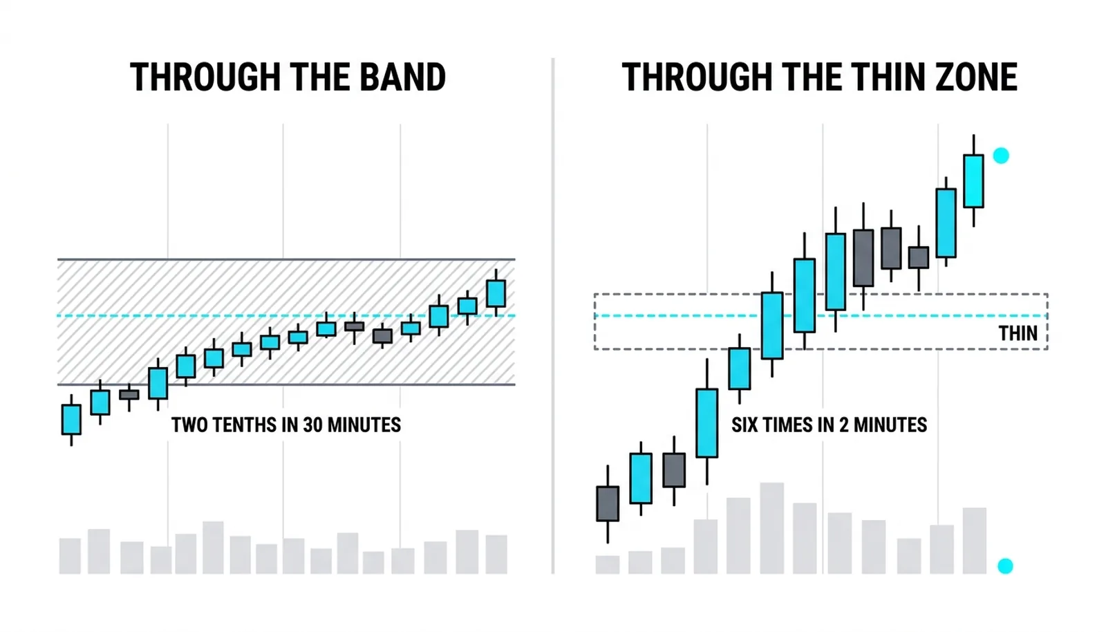
- Bright bands. A horizontal strip of heavy color means liquidity clusters at that price area. Price tends to slow when it enters a band, because each tick of movement must chew through real displayed size. Bands often mark prior value areas, round numbers, or prices where large participants have been working orders.
- Thin zones. Dark stretches of the book mean almost nothing rests there. When price enters a thin zone it often accelerates, because a modest wave of market orders can sweep several prices with little resistance. Thin zones above the market are where fast moves and stop runs live.
- Single bright rows. One intense line, far brighter than its neighbors, looks like a wall. Sometimes it is genuine, a large participant defending a price. Sometimes it is theater.
The third pattern needs care, because the book is not static. Real bands behave like real interest: they thicken as price approaches, they absorb hits, they hold their ground or pull in an orderly way. Deceptive size behaves differently. Order flow analysis describes a family of orders placed for attraction and removed before the trade gets there, size shown to shape what others do, then cancelled before it can be filled. On a heatmap this shows as a wall that flickers, or one that vanishes in the seconds before price arrives. The brightness was the bait; the disappearance is the confession.
Why a Wall Is Never a Promise
Two cautions keep this tool honest, and both are structural, not stylistic.
First, resting limits are context, not signals. Market profile theory's point about the auction and the order flow framework's core law agree here: limit orders are the liquidity of a market, but they cannot move price on their own. Only market orders move price. A wall of offers does not push price down; it simply sits there until buyers either stop arriving or arrive in enough force to consume it. So a big bright band is never a promise of rejection. It is an invitation to watch what happens when price arrives. The event is the interaction, not the display.
Second, the heatmap shows displayed size, and displayed size is a choice. Iceberg orders exist precisely to hide real capacity from this view: a large resting interest that reveals only a small slice, refilling each time the visible part is filled. The book can look thin at a price while an enormous interest feeds in underneath, absorbing everything thrown at it. Traders who trust the heatmap as a complete census get surprised by exactly this.
The order flow framework skips heatmaps, grouping them with tools that distract from the actual event, the trade itself. That skepticism is fair, and the tool earns its place anyway for one reason: it explains terrain. Why did price accelerate through that stretch last hour? Why did it stall here for forty minutes? The heatmap answers those questions at a glance, and that context sharpens the reading of the executed tape. Used as an explanation of speed and stall, it helps. Used as a standalone signal, it lies.
The Band at 104.50
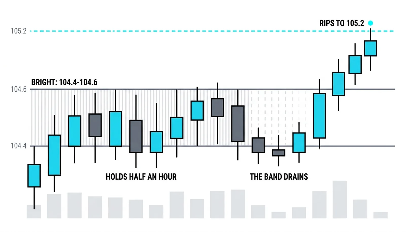
A hypothetical morning, all numbers invented. Price has been working higher toward 104.50. On the heatmap, a bright band has been sitting across 104.40 to 104.60 for most of the session, roughly 2,400 resting contracts of displayed offers.
Stage one: price reaches 104.40 and slows. For half an hour it grinds inside the band, each push higher met by visible offers, small rotations up and down between 104.42 and 104.56. The slow grind says the displayed liquidity is real enough to matter right now; buyers are having to work for each tick.
Stage two: in one five-minute bar, most of the band's brightness drains away. The 2,400 contracts thin to a few hundred. Nothing large traded to remove them; they were cancelled. Within two minutes price rips through 104.50 and prints 105.20, because the level lost its guard and the book above is thin.
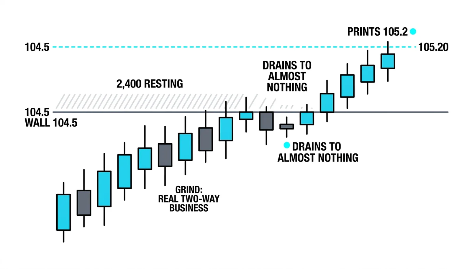
Stage three: the reads. The grind said genuine two-way business at the band. The drain said the displayed size was never intended to trade, or the holder lost conviction; either way, the obstacle was gone before price tested it fully. The misread would have been treating the band as a promise, selling 104.45 blind because "the wall is there," then holding as the wall evaporated and price ran. The band was context for the stall, and its disappearance was the information.
| Heatmap pattern | What it shows | What it might mean | The trap |
|---|---|---|---|
| Thick bright band | Heavy resting limits clustered at a price area | Real interest; price likely to slow and rotate there | Assuming it must hold and trading against a breakout |
| Thin dark zone | Little displayed size across a stretch of prices | Fast travel likely; stops and breakouts accelerate through | Icebergs hiding real capacity beneath a thin display |
| Single bright row | One price holding far more displayed size than its neighbors | A genuine defender, or size placed to influence others | Trusting the wall without watching whether it absorbs trades |
| Brightness that fades as price approaches | Displayed size being cancelled before it can trade | Attraction orders pulling back; the level is unguarded | Reading the earlier brightness as still-valid support or resistance |
Heatmap, Answered
What is a heatmap in trading?
A heatmap is a color-coded picture of the limit order book over time, with price on one axis and time on the other. Each cell's brightness shows how much resting limit size was displayed at that price at that moment, turning the DOM ladder's numbers into a visual history.
What do the colors on an order book heatmap mean?
The colors encode size: cool or dark colors mark prices with little resting size, and hot or bright colors mark prices where heavy limit orders are stacked. The color says nothing about direction, only about how much displayed liquidity sat at that price.
Can a heatmap show fake orders?
Yes, because it shows displayed size, and displayed size can be placed with no intention of trading. Orders posted to attract or repel other participants and cancelled before price arrives appear as bright cells that flicker or vanish, which is why a wall's behavior as price approaches matters more than its brightness.
Is a heatmap enough to trade on?
No. Resting limits cannot move price on their own, and icebergs hide real size from the display, so the heatmap is context for why price speeds up or stalls, never a standalone entry signal. The decision belongs to what actually trades when price meets the level.
Next in this block, the lesson turns from the resting book back to the live tape: time and sales, read print by print as it happens.