DMI: The Directional Movement Index
The Directional Movement Index is J. The original ATR/RSI framework's 1978 answer to a question most indicators dodge: which side is actually pushing price, and how hard. It splits every bar's movement into two parts, upward pressure and downward pressure, normalizes each by volatility, and draws them as two lines, +DI and -DI. When +DI sits above -DI, buyers control the tape. When -DI sits on top, sellers do. The crossover marks the handoff, and the distance between the lines tells you how decisive that control is.

Most trend tools give you one number and ask you to trust it. A moving average says "up" or "down" and nothing about the fight underneath. The DMI keeps the fight visible. Think of an up escalator and a down escalator side by side: the crowd on each one tells you which way the building's traffic is really flowing, and how decisively. That is the complete reading the indicator gives you, and it is more honest than a single smoothed line.
What the Original Design Actually Measured
The original design did not measure closes. The measurement was reach. For each bar, two questions. How far did today's high push above yesterday's high? That is the upward move. How far did today's low drop below yesterday's low? That is the downward move.
Then comes the rule that defines the whole tool: only the larger of the two moves counts, and only if it is positive. If a bar reaches 0.8 above the prior high and 0.3 below the prior low, the bar records +0.8 of upward movement and zero downward movement. If the downward reach is bigger, the bar records downward movement and zero upward. If neither side extends beyond the prior bar's range, both are zero.
This asymmetry is deliberate. A bar cannot advance the bull case and the bear case at the same time. One side wins each bar, or nobody does. Inside bars, where price stays within the prior range, contribute nothing to either line. The indicator's original design was built so that direction means expansion, not drift.
Back in the four-categories lesson, tools were sorted into trend, momentum, volatility, and volume. The DMI sits in the trend family, but notice what it does differently: it measures direction as pressure, not as an average of past prices.
How the Lines Are Built
Raw directional moves are noisy, so the original design smoothed them. The default is 14 bars. Sum the upward moves over 14 bars, sum the downward moves over the same window, then divide each by the 14-period true range. True range is the volatility yardstick from the indicator's original design, covering gaps as well as intrabar travel.
That division is the quiet genius of the design. A one-point push means something in a quiet market and almost nothing in a violent one. Dividing by true range converts raw movement into a share of the market's own volatility, so a jumpy chart cannot fake direction just by moving a lot.
Multiply by 100 and you get the finished lines. +DI and -DI are percentages, bounded between 0 and 100. A +DI of 35 means upward pushes account for 35 percent of recent true range. The two lines do not have to sum to 100, because many bars contribute to neither. The leftover is the market going nowhere in particular.
The Crossover, and What It Doesn't Tell You
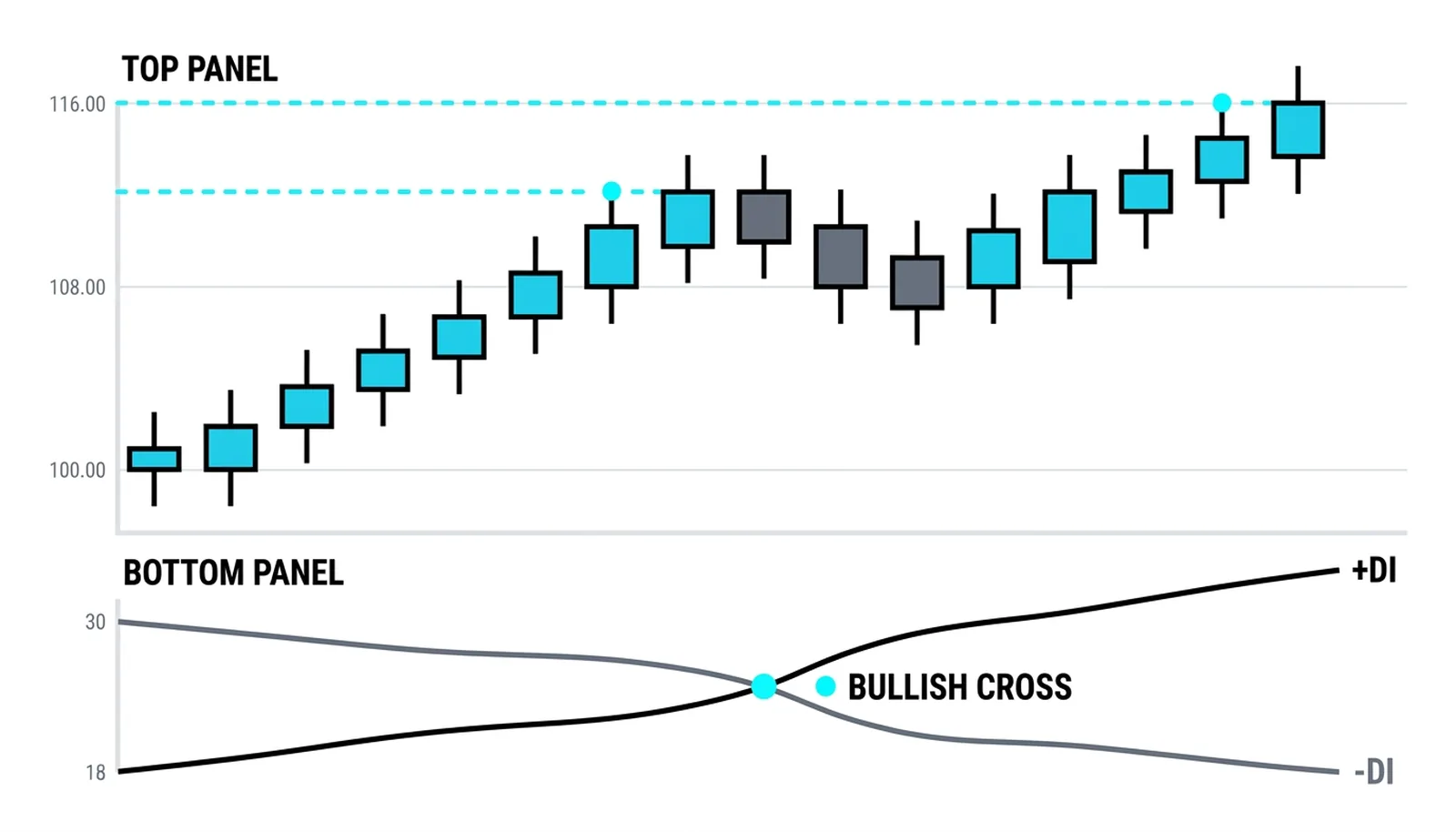
The classic signal is simple: +DI crossing above -DI marks a shift of control to buyers, and the reverse marks a shift to sellers. Many traders treat that cross as an entry trigger. Treat it more carefully than that.
A cross marks a change in control. It does not certify a trend. In a sideways market, the two lines braid together and cross constantly, each cross meaningless, each one a small trap for anyone trading it mechanically. Chop produces crosses the way a loose hinge produces squeaks.
The gap between the lines matters as much as the cross itself. A fresh cross with the lines still close together is a weak claim. A cross where +DI keeps climbing and -DI keeps sinking, opening a wide spread, is pressure asserting itself. Watch what the lines do after the cross, rather than the moment they touch.
One blunt rule: a crossover in a range is noise with a name. The DMI tells you who controls the bar-to-bar pushes, but it says nothing about whether that control will persist. For that, you need the third piece of the indicator's original design.
ADX Enters: Strength on Top of Direction
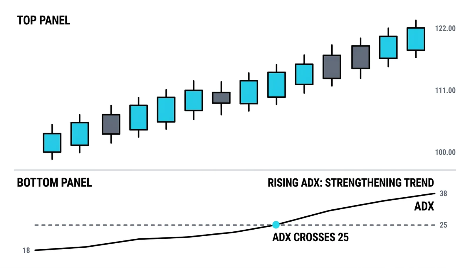
The original design took the gap between +DI and -DI and smoothed it into a single line, the Average Directional Index. ADX ignores which side is winning and measures only how one-sided the fight is. Rising ADX means a strengthening trend in whichever direction the DI lines indicate; falling ADX means the pressure is fading.
The full construction, thresholds, and trade-offs of that line belong to the ADX lesson already live in this level, and it covers the topic properly. Here, hold one idea: DMI gives direction, ADX grades conviction, and the two were designed to be read together.
One Trend, Measured
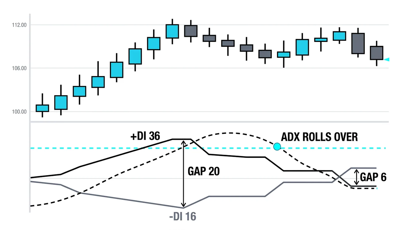
All numbers below are invented round figures for illustration. Picture a stock in a steady two-week climb. Over the 14-bar window, the average upward push above the prior high is 0.9 points. The average downward push below the prior low is 0.4 points. The 14-period average true range is 2.5.
+DI equals 100 times 0.9 divided by 2.5, which is 36. -DI equals 100 times 0.4 divided by 2.5, which is 16. Buyers control the tape, and the gap between the lines is 20 points.
The raw strength reading, DX, is 100 times the gap divided by the sum of the lines: 100 times 20 over 52, roughly 38. As the trend holds and those pushes keep repeating, the smoothed ADX climbs from the low 20s toward 30. Direction and strength agree.
Now shift two weeks forward. The climb stalls. +DI has cooled to 28, -DI has risen to 22. Buyers still lead, but the gap has shrunk from 20 to 6, and ADX rolls over and starts falling. Nobody has taken control from the bulls yet. The trend is tiring, and the indicator says so before price breaks down. That early fatigue signal is the practical payoff of watching the gap.
| Line configuration | What it says | What it does not say |
|---|---|---|
| +DI above -DI, ADX rising | Buyers in control and the uptrend is strengthening | How long the trend will last or where it ends |
| +DI above -DI, ADX falling | Buyers still lead but the trend is losing force | That a reversal has started; control has not changed hands |
| -DI above +DI, ADX rising | Sellers in control and the downtrend is strengthening | That the fall is safe to chase at any price |
| Lines tangled, ADX under 20 | No side controls the market; conditions are trendless | Which direction the eventual break will take |
DMI, Answered
What does DMI tell you that moving averages don't?
It tells you which side is pressing and by how much, separately. A moving average collapses the fight into one smoothed value, so you see direction but never the contest. The DMI keeps both pressures visible, and the widening or narrowing gap between them shows control building or eroding before price confirms it.
Is a +DI crossover a buy signal?
Not by itself. A cross means control changed hands on recent bars, nothing more. In a range, crosses fire constantly and mean nothing. The signal improves when the cross comes with a widening gap and a rising ADX, and when the higher-timeframe structure agrees. Traded blind in chop, it bleeds accounts slowly.
What time period does DMI use?
The default in the original ATR/RSI framework is 14 bars, and that remains the standard on nearly every platform. Shorter settings react faster and cross more often, which means more false signals. Longer settings smooth harder and respond later. Change the setting only with a reason, and test it on the markets and timeframes you actually trade.
Does DMI work in sideways markets?
No, and it was never meant to. It is a trend instrument. In a range, the lines tangle, crosses multiply, and every signal decays within a few bars. The honest use of the tool in chop is diagnostic: tangled lines with a low ADX are the indicator telling you to stand down and wait for a market worth measuring.
With direction and strength now in place, the next tool in this level takes a different route to the same problem: SuperTrend draws one line on the chart and lets volatility decide where it sits.