How to Use Anchored VWAP for Key Levels
Anchor the volume weighted average to any bar on the chart, a swing low, a gap, an earnings shock, an IPO, and the line that emerges measures everything since that event by the volume that traded there. That is anchored VWAP, and it turns one formula into a family of event-specific levels. The regular session VWAP from the full breakdown resets every day and answers one question: where is today's fair price? The anchored version answers a different question: since the event that changed this market, where has the average participant's money actually gone?

The image that makes the tool stick is a door frame with pencil marks. Parents measure a child at a birthday, mark the frame, and from then on every growth check references that mark. The mark has no magic; it simply records a moment everyone agrees to measure from. An anchored VWAP is a pencil mark made of volume, drawn at the bar where something happened, and every price that follows gets measured against the money that came in since.
Choosing the Anchor: Events That Carry Volume
The anchored VWAP method, which did the most to formalize this tool, gives a two-part rule for anchor selection: anchor to high-volume events, and anchor to measurable events. The point is not to anchor everywhere. A random Tuesday carries no information, so a line drawn from it measures noise. The anchors that work mark moments when the market's structure changed.
| Anchor event | Why it carries volume | What the line tells you |
|---|---|---|
| Swing high or swing low | Turning points print the heaviest two-way trade | Whether the move since the turn has real participation |
| Earnings or news shock | Repricing happens on a volume burst | The average cost of everyone who repositioned on the news |
| Price gap | The open gap is an order imbalance finding liquidity | Whether the gap's buyers or sellers are still in control |
| IPO first day | The entire float repricing at once | The average cost of every public holder since listing |
| Session or year open | Fixed reference points institutions measure against | The benchmark institutions measure their own fills against |
The mechanics never change: cumulative typical price times volume, divided by cumulative volume, starting from the anchor bar, and the line keeps updating until you move the anchor. What changes is the story each start point tells.
Support and Resistance With a Memory
Anchor at a swing low in an uptrend and watch what the line does on pullbacks.
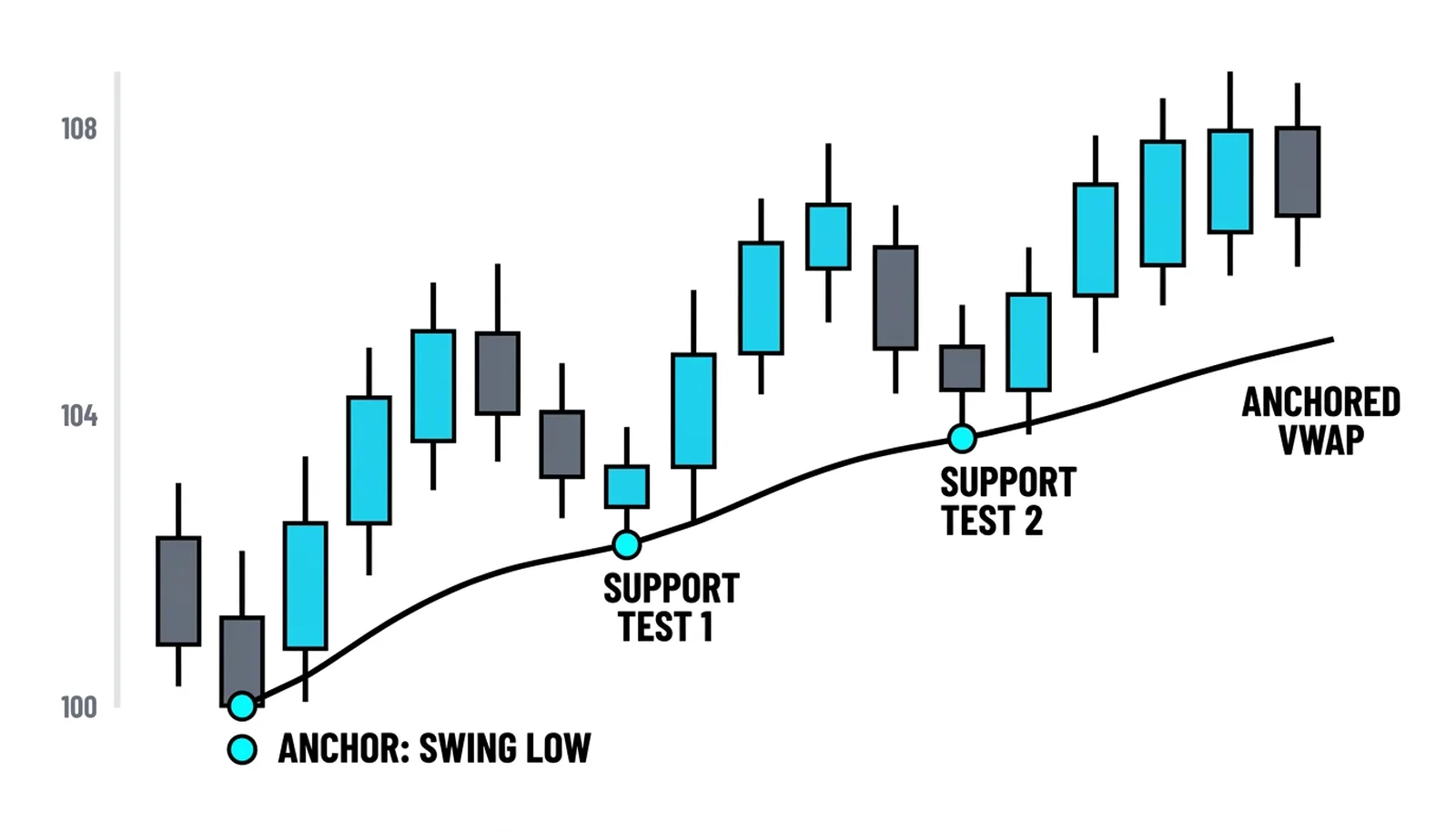
Both pullbacks found buyers within half a percent of the line. The reason is the average-cost logic: everyone who bought the strength since the low is, on average, holding near the anchored line. When price returns there, holders see a chance to add at their average cost instead of chasing, and that clustering of orders is what makes the line behave like support. Resistance works as the mirror image from a swing high.
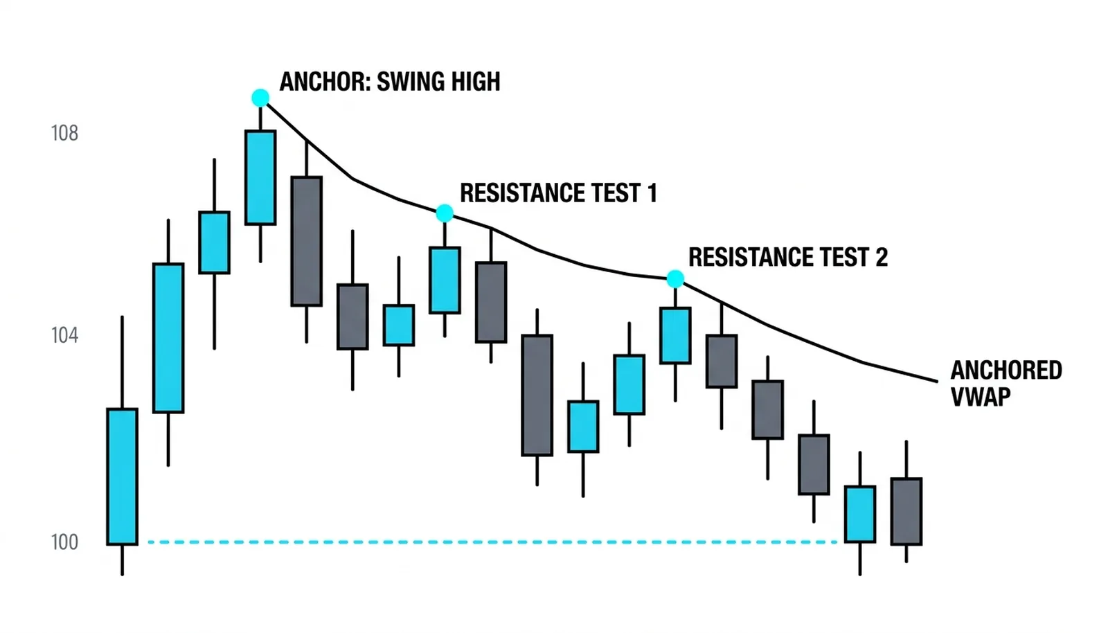
Everyone who shorted or sold since the high is, on average, positioned near the line, and each rally into their average cost hands them a chance to add. Two tests, two stalls, and the level held. These are the same self-reinforcing mechanics covered in the support and resistance lesson, except the level builds itself from volume instead of from touched extremes. The anchored VWAP method's deeper point is that the line carries memory: it remembers who is trapped, who is in profit, and where the average participant's break-even sits.
Handoffs and the Pinch
Two refinements come from the anchored VWAP method and they both involve drawing a second line. The handoff: when a trend accelerates from a new swing point, anchor a second VWAP there. The new line tracks the fresh momentum layer, and pullbacks to it give entries in the direction of the older, larger trend. The pinch: when the anchored line from a major low and the anchored line from a major high both sit on the chart, price sometimes coils between the two as they converge.
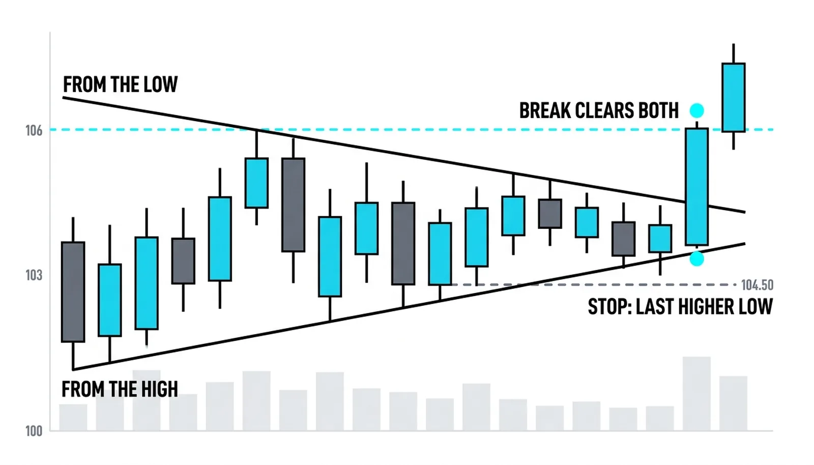
The convergence is compressed energy. The longer the market coils between the two lines, the more participants have orders stacked at their own break-even marks, and the break from the pinch tends to travel because one side's stop level is the other side's entry. The chart shows the close that cleared both lines; a stop under the coil's last higher low defines the risk.
Anchored VWAP, Answered
How many anchored VWAPs should a chart carry?
Two or three live ones. Each line measures the story that started at its anchor, and once that story resolves the line comes off. A chart covered in anchors from every minor swing measures nothing but noise.
Does the anchor have to be a low?
No. Anchors work at swing highs, gaps, earnings bars, and first-day prints, anywhere measurable volume clustered. The line from a swing high tracks the average seller since the top and tends to act as resistance, while the line from a low tracks the average buyer and tends to act as support.
Can you anchor on a weekly chart?
Yes, and long anchors are where the tool gets interesting. A line drawn from a major weekly low can act as support for years, because the average cost of everyone who participated in that whole advance is still computable and still matters to holders.
Common Anchor Mistakes
Three habits ruin an otherwise sound anchored VWAP practice. The first is anchoring to every minor swing, which litters the chart with lines until none of them mean anything; the anchored VWAP method's measurable-events rule exists precisely to prevent this. Two or three live anchors is a working chart. Ten is wallpaper. The second is forgetting to retire anchors once the story they measure has resolved: the line from a swing low belongs on the chart while the trend it measures runs, and comes off when the trend ends. The third is treating a touch of the line as an automatic signal. The anchored line is a level of interest, a place where something is likely, and the entry still needs the price confirmation covered in the support and resistance basics.
Confluence is where the tool earns its keep. When an anchored VWAP from an earnings gap, a static resistance zone from prior structure, and a rising 50-day average all sit within a few percent of each other, the zone concentrates three separate crowds, the repositioned holders, the level traders, and the trend followers, at nearly the same price. Breakthroughs from that kind of stack travel, and rejections from it are decisive. The anchored line rarely makes the trade by itself; it tells you which places on the chart have a reason to matter.
A Worked Anchor: The Gap
Take a stock that closes at 40.00 and gaps to 44.00 on earnings, trading 30 million shares across the gap day at an average near 43.50. Anchor there. For the next three weeks the stock drifts to 41.80, which puts price 3.9 percent below the anchored line at roughly 43.40. Every holder who repositioned on the earnings gap is now underwater on average, and rallies back toward 43.40 run into their break-even selling. The anchored line just told you where the trapped money is, without a single trendline drawn by hand.
Which timeframe should carry the anchors? The one that contains the event. An earnings gap lives on the daily chart, an opening print lives on the intraday chart, and a multi-quarter story lives on the weekly. The formula does not care about the interval; it accumulates whatever bars you give it from the anchor forward.
The intraday version of this tool, the one that resets each session and grades execution desks, lives in the VWAP as a dynamic level lesson. Start with the anchor events on this page, keep the marks honest, and let the volume do the remembering.