What Is a Price Chart
A price chart is a picture of a market's past prices laid out over time, with price on the vertical axis and time on the horizontal axis. The definition is that plain, and it is enough to build on. Everything else in trading education, from trend lines to indicators, sits on top of this one idea: a visual record of where price has been.

Think of a price chart as what a medical chart is to a patient: a condensed record of everything that happened, not the person itself. The record is useful. It is not the whole story.
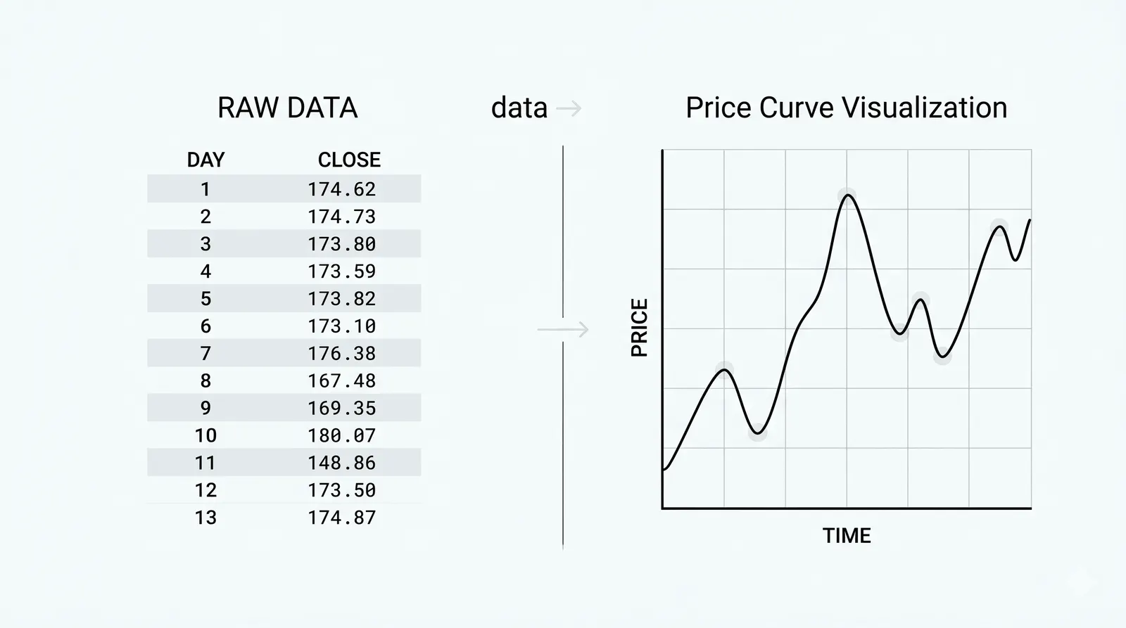
What a Chart Actually Shows
Every mark on a chart is a compressed summary of a period of time. That period might be one minute, one hour, one day, or one week. You choose it when you pick the chart's interval.
Inside each period, four things happened. Price opened somewhere. It traded up to a high. It traded down to a low. It closed somewhere. A candlestick packs those four numbers into one small shape, with a body showing the open-to-close range and thin lines showing the extremes; the full anatomy is in how to read a candlestick.
Change the interval and you change the compression. A daily chart squeezes an entire trading day into one mark. A five-minute chart of the same day breaks it into dozens of smaller marks. Same market, same day, different level of detail.
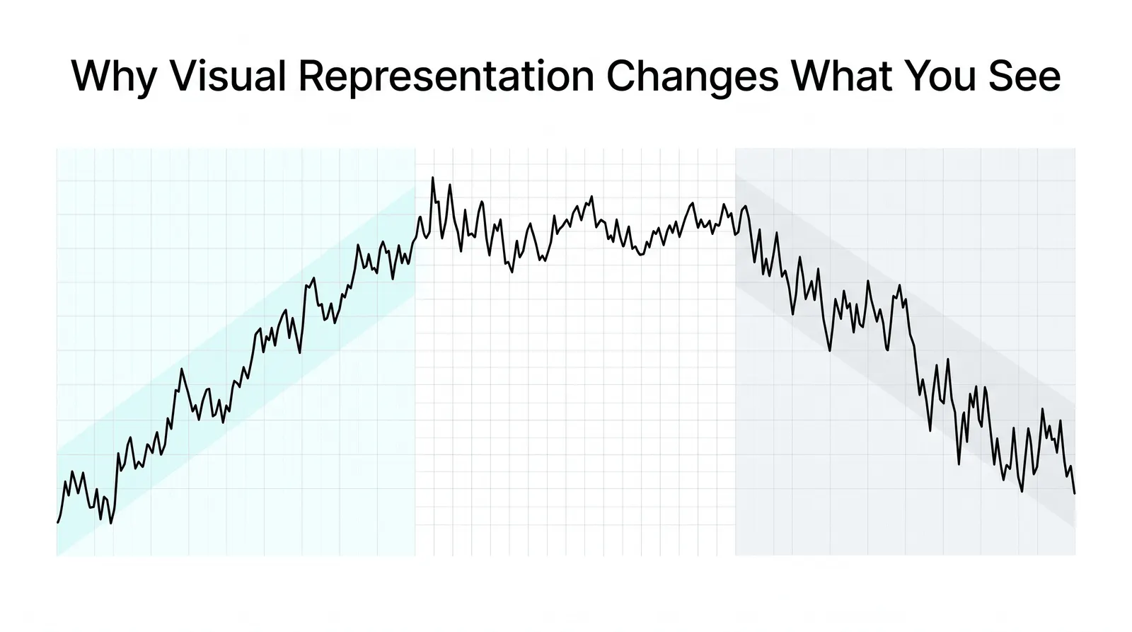
This is why two traders can look at the same market and describe it differently. One is reading the daily chart and sees a calm uptrend. The other is reading the five-minute chart and sees violent swings. Both are correct. They are just reading at different resolutions.
What the Chart Compresses Away
Compression has a cost. Behind every mark on your screen sit thousands of individual trades, each with a size, a time, and a counterparty. The chart throws almost all of that away.
It also discards the news of the day. An earnings report, a rate decision, a geopolitical shock: all of it gets flattened into shape. The chart shows you that price jumped at 8:30. It does not show you why.
And it erases the people. Every bar you see is the residue of buyers and sellers making decisions for their own reasons: hedging, speculating, rebalancing, panicking. None of those names or motives survive the compression. You get the shape the crowd left behind, not the crowd.
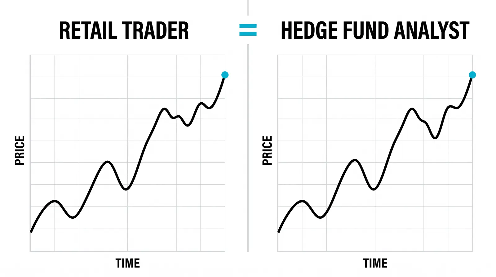
Keep this in mind whenever a chart looks clean and obvious. The clean look is an artifact of compression. The underlying activity was messy.
Why the Picture Helps
Humans read shapes and slopes far faster than columns of numbers. This is the entire reason charts exist.
Give someone a spreadsheet with a month of closing prices and ask whether the market is trending. They will need a minute, maybe more. Show them the same data as a line rising from lower left to upper right and they answer in half a second.
Speed matters in trading. You scan many markets, compare them, and filter out the ones not worth your attention. A chart lets you do that filtering visually. A month of closes becomes one glance.
Charts also make certain patterns visible that raw numbers hide. Pauses in a trend, repeated rejections at the same level, accelerating moves: these are shape phenomena. You notice them because your visual system is built to notice them.
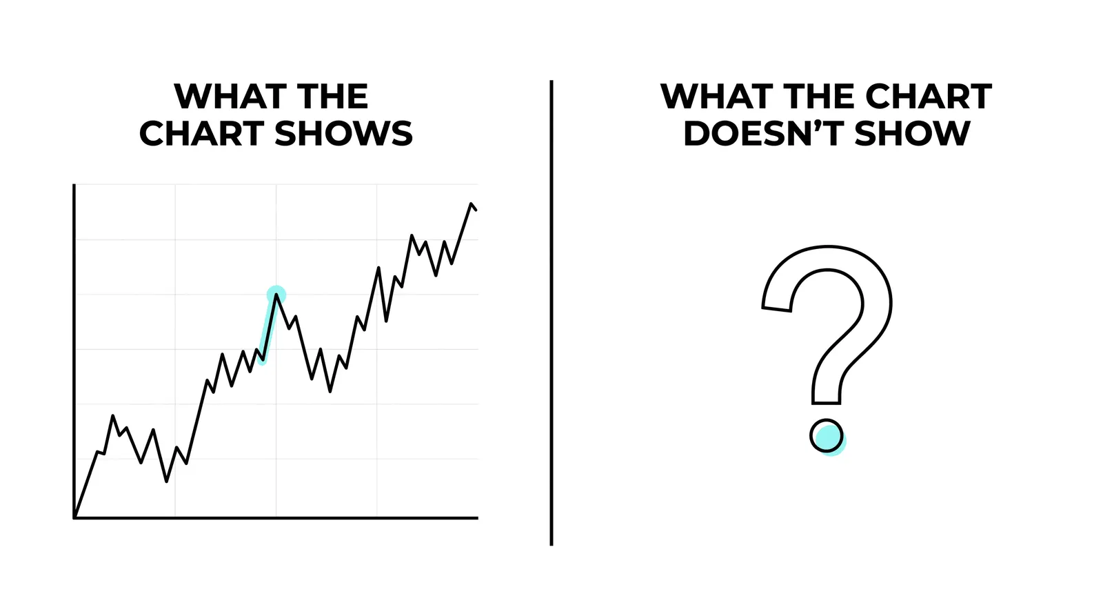
The risk runs the other way too. Your pattern-seeking brain will find shapes in noise. A chart makes real structure easy to see and imaginary structure easy to invent. Discipline is knowing the difference.
A Worked Example
Here is a hypothetical set of five daily closing prices for a stock: 98, 101, 100, 104, 107.
Read as text, that list feels flat. You can tell the numbers generally rise, but the information arrives slowly. You have to hold each figure in your head and compare it to the last.
Now picture the same five numbers plotted left to right. The line climbs from 98 to 101, dips slightly to 100, then pushes up through 104 to 107. Instantly you see a trend with one pause. The dip to 100 stands out as a small pullback inside a steady rise.
Nothing about the data changed. Only the format did. That is the chart's entire contribution: it converts arithmetic into geometry, and your eyes do the rest.
What a Chart Cannot Tell You
A chart is a record, not a forecast. It documents what happened. It says nothing certain about what happens next.
It cannot tell you why price moved. Two identical-looking rallies can have completely different causes, one driven by genuine demand and one by a short squeeze that will reverse by Friday. The shapes match. The causes do not.
It cannot tell you who is buying. A market rising on a few large, informed participants behaves differently from one rising on a crowd of small latecomers, even when the charts look alike.
And it cannot tell you what comes next. Past prices constrain the odds in some situations, which is why technical analysis exists at all. But every chart pattern fails sometimes, and the chart itself never warns you which time is the failure.
Traders who forget this start treating the chart as a crystal ball. It is a rearview mirror. Useful, honest, and pointed backward.
What the Picture Shows and What It Hides
| The chart shows | The chart hides |
|---|---|
| Current price and where it sits relative to history | Whether that price is fair or justified |
| Past turning points where buyers or sellers took control | Whether those levels will hold again |
| Direction and pace of recent movement | The reason for the move |
| The net result of all buying and selling | Who is trading and why |
| Volatility: how wide price swings | What will calm or inflame it next |
Read the table as a division of labor. The left column is what you get for free, instantly, from any chart. The right column is what you must supply from elsewhere: news, context, volume analysis, or plain acceptance that some things stay unknown.
Questions About Price Charts
Do I need a chart to trade?
Practically, yes. A tiny number of traders work from raw data feeds or order flow alone, but they are specialists with years of screen time. For everyone else, the chart is the fastest way to understand where price has been, and trading without that context means trading blind.
Which interval should a beginner use?
Start with the daily chart. Daily bars filter out most intraday noise, give you time to think between decisions, and match the pace at which a new trader can realistically analyze and act. Drop to shorter intervals only after you can read the daily picture consistently.
Are charts the same on every platform?
Mostly, but not exactly. Different platforms may use different data feeds, different closing times for daily bars, or different time zones, so the same market can show slightly different candles in two places. The broad shape will match. Fine details may not, which matters if your analysis depends on exact highs and lows.
Can a chart lie?
The chart does not lie, but it can mislead. Compressed data hides context, low-liquidity periods produce distorted shapes, and your own pattern-hungry brain fills in stories that are not there. The chart reports faithfully what happened. The misleading part is usually the interpretation layered on top of it.
Once you are comfortable reading a chart as a compressed record, the natural next step is learning the different chart types themselves: line, bar, and candlestick, and what each one emphasizes or hides. That is where the next lesson picks up.