Chart Types
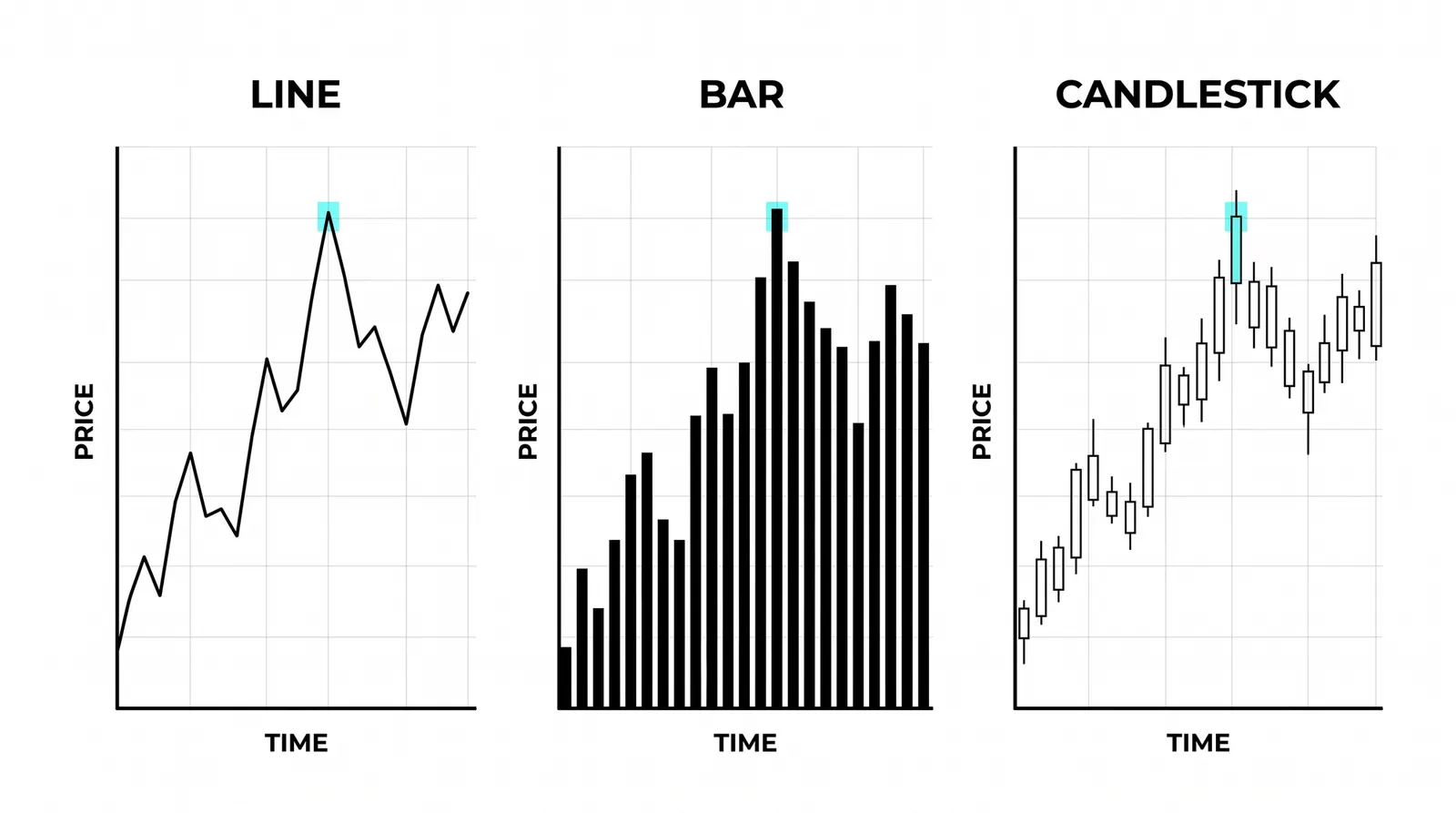
Chart types are simply different ways to draw the same price data, and the three that matter are line, bar, and candlestick. All three can show identical numbers from the same market on the same day. What changes is how much detail you see and how fast you can read it.

Think of them as the same story told three ways: a summary, a report, and a play-by-play. None of them is wrong. They just answer different questions.
The Line Chart: One Point Per Period
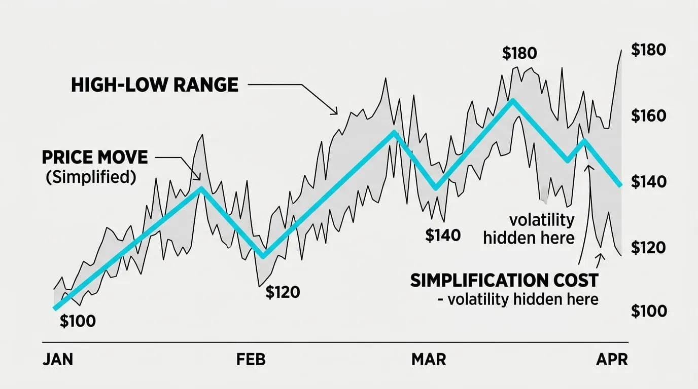
A line chart plots a single price per period, almost always the close, and connects the dots. Five trading days give you five points and four segments between them.
That simplicity is the point. With the noise stripped out, the shape of a trend becomes obvious. You can glance at a two-year line chart and know within seconds whether a market has been rising, falling, or going nowhere.
The cost is everything that happened inside each period. A day that opened weak, dropped hard, and recovered to close flat looks identical to a day that never moved. The line chart cannot tell you which one happened.
Use it when you want the big picture, when you compare two markets on one screen, or when intraday swings are distracting you from the actual trend.
The Bar Chart: Four Numbers in One Mark
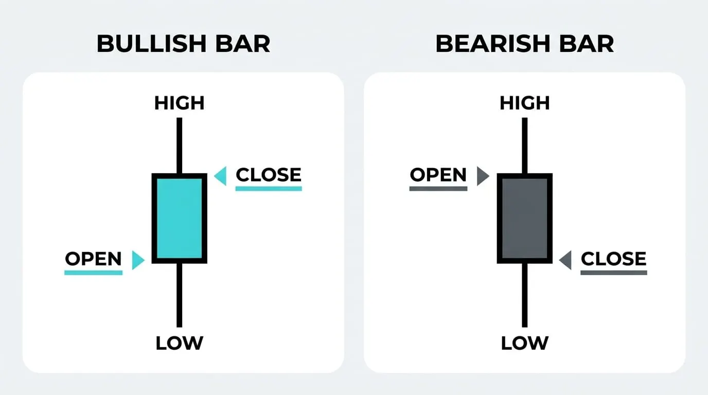
A bar chart packs four prices into each period: the open, high, low, and close. The vertical line runs from low to high, with a small tick on the left for the open and a tick on the right for the close.
This is strictly more information than the line chart. You can see the range of the day, where price started, and where it ended up. Nothing is hidden.
The tradeoff is readability. Bars are thin and monochrome, so at a glance a strong up day and a strong down day look similar. You have to check the ticks one bar at a time, which gets slow across a hundred bars.
Plenty of experienced traders still use bars, and some charting tools in the futures world default to them. But for most new traders, the next option does the same job faster.
The Candlestick Chart: Same Data, Faster to Read
A candlestick chart plots the exact same four numbers as a bar chart. The difference is purely visual.
The body is a filled or hollow rectangle spanning the distance between the open and the close, colored by direction. The wicks are thin lines extending from the body to the high and the low.
That coloring is the whole trick. Your eye catches green versus red instantly, so the direction and size of each period reads at a glance without checking any ticks. A long lower wick screams rejection of lower prices before you have consciously processed anything.
Candles became the industry standard because they deliver bar-chart information at line-chart reading speed. There is a full anatomy lesson in how to read a candlestick, covering bodies, wicks, and what their proportions mean, so we will leave the detail there.
A Worked Example: One Hypothetical Week
Imagine a stock, call it anything you like, trading five days. These numbers are invented for illustration.
- Monday: opens at 100, dips to 96, rallies to 105, closes at 103.
- Tuesday: opens at 103, trades between 101 and 104, closes at 102.
- Wednesday: opens at 102, sells off to 97, closes at 98.
- Thursday: opens at 98, grinds between 98 and 101, closes at 100.
- Friday: opens at 100, runs to 106, closes at 105.
On a line chart, this week is five dots: 103, 102, 98, 100, 105. You see a dip midweek and a recovery. Clean, calm, almost boring.
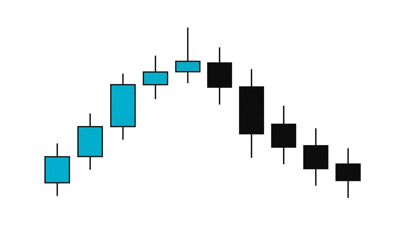
On a candlestick chart, the same week tells five stories. Monday is a strong green candle with a long lower wick, meaning buyers stepped in hard at 96. Wednesday is a solid red candle showing sellers in control all day. Friday is another strong green candle closing near its high, which suggests momentum into the weekend.
The line chart told you where price ended up. The candles told you about the fight that got it there. Both statements are true about the same data, and learning to hold both at once is what this lesson is for.
Choosing the Right Chart for the Job
Match the chart to the question you are asking.
- Long-term view: line chart. Monthly closes over five years show trend better than anything else.
- Comparing two markets: line chart. Two candlestick charts overlaid are unreadable; two lines are easy.
- Making actual trade decisions: candlestick chart. You need the open, the range, and the close, read quickly.
- Checking how violent a period was: candles or bars, since the line chart hides the range entirely.
You will also encounter exotic styles: Heikin Ashi, Renko, point and figure, Kagi. Some have real uses, mostly around smoothing noise. Ignore them for now. A trader who cannot read a standard candlestick chart fluently gains nothing from a fancier one. Earn the exotic stuff by getting bored with the basics first.
Line vs Bar vs Candlestick
| Line | Bar | Candlestick | |
|---|---|---|---|
| What it plots | One price per period, usually the close | Open, high, low, close as a vertical bar with ticks | Open, high, low, close as a colored body with wicks |
| What it hides | Everything inside the period: the open, the range, the fight | Nothing, but direction is slow to read | Nothing, and direction reads instantly |
| Best used for | Long-term trends and comparing markets | Detailed analysis when color is unavailable or unwanted | Day-to-day trading decisions |
One honest caveat: the chart type does not change the data, only your perception of it. A bad trade on a candlestick chart was still a bad trade on a line chart. The tool helps you see; it does not help you be right.
Questions About Chart Types
Which chart type is best?
For active trading, the candlestick chart is the best default because it shows all four prices per period and reads the fastest. For long-term trend analysis and market comparisons, the line chart wins. "Best" depends on the question you are asking, not on the chart itself.
Do indicators work on all chart types?
Yes. Indicators are calculated from the underlying price data, not from how that data is drawn. A moving average or RSI produces the same values whether you display line, bar, or candlestick charts. Only a few visual tools, like candlestick pattern recognition, depend on the display style.
Why do most traders use candles?
Because candles deliver the most information per second of attention. The colored body shows direction and magnitude instantly, and the wicks show rejection and range without any extra effort. Over thousands of hours of screen time, that reading speed compounds into a real advantage.
Is a line chart wrong for trading?
No, but it is incomplete for most trading decisions. A line chart hides the intraperiod range, so you cannot see volatility, rejection, or where the open sat relative to the close. Some long-term investors trade fine off line charts because those details do not affect their decisions. For shorter timeframes, you are giving up information for no benefit.
Once you are comfortable reading candles at a glance, the natural next step is learning what individual candle shapes and small clusters of them tend to signal, which is where the candlestick pattern lesson picks up.