TPO: Time Price Opportunity Explained
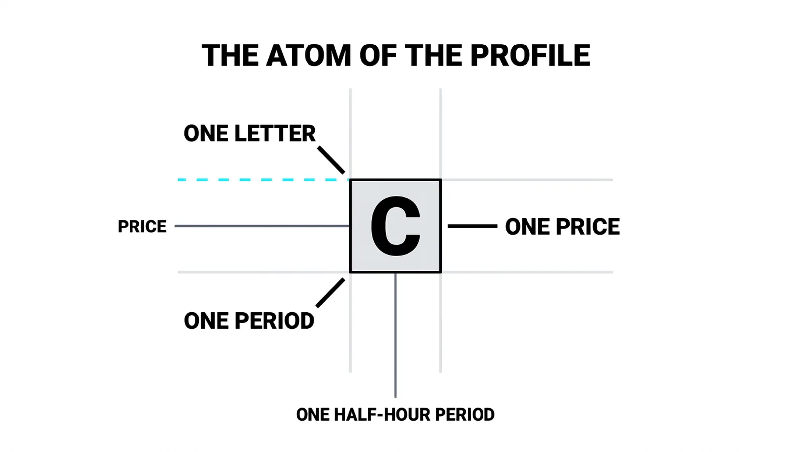
TPO stands for time price opportunity, and it is the smallest unit of the Market Profile: one letter marking that a price traded during one half-hour period. Stack those letters across a full session and scattered trades become a picture of where the market actually spent its time. J. The method grew around this simple stamp, and the letter chart that results is what traders mean when they say "the profile."

Picture hikers resting along a trail, each hour's group marking its initial at the elevation where it stopped, and by evening the trail records the whole day, every stopping height, every pause. The previous lesson covered how the Market Profile differs from the volume profile, so that comparison stays there. This lesson is about the letter chart itself: how it is built, how to read it, and what it cannot tell you.
How Letters Build a Profile
The trading day divides into half-hour periods. The first period prints the letter A, the second prints B, and the lettering continues alphabetically through the session. Whenever price trades during a period, that period's letter stamps every price touched in those thirty minutes.
That is the mechanic, all of it. A single TPO tells you one thing: this price traded during this period. One observation, nothing more. The power comes from accumulation, not from any individual letter.
Two shapes emerge as the letters pile up. A column of the same letter means one period swept many prices, usually a fast directional push. A row carrying many different letters means one price traded again and again across the day, which signals acceptance at that level.
The half-hour slice is a convention, not a law. Most platforms let you set periods of five minutes, fifteen minutes, an hour, whatever you want. The default thirty minutes became standard because it gave a full session roughly thirteen periods, enough granularity to see structure without drowning in letters. But treat it as a dial you can turn, not a rule handed down.
Reading Rows and Columns
Start with rows. Count the letters sitting on a single price level and you get a feel for acceptance. A row with eight or nine letters means the market kept coming back to that price all day. Buyers and sellers agreed on it. That row often becomes a reference for the next session, a level where the market proved it was comfortable doing business.
Now look at columns. When one letter spans a tall vertical range, that period covered a lot of ground quickly. A sweeping column early in the day often marks an aggressive open. A sweeping column late in the day can mark a closing push as traders square positions.
The letters also date the extremes. Whichever letter sits at the day's high tells you which half-hour printed it. Same for the low. This matters more than it first appears. A high printed in period A and never revisited means the opening probe failed and the market spent the rest of the day below it. A high printed in the final period means the market closed at its strongest, which carries a different read entirely.
So the reading habit is three questions. Which row is longest, because that is where the day was accepted. Which columns are tallest, because that is where the day moved. Which letters hold the extremes, because that is when the day turned.
What a TPO Does Not Tell You
A TPO records opportunity, not activity. One trade in a half-hour prints the same letter as five thousand trades. The letter says the price traded, never how much. This is the tool's defining blind spot, and pretending otherwise leads to bad reads.
A row of nine letters tells you the market returned to that price nine times. It does not tell you whether those visits were heavy institutional size or a handful of retail lots. If you need the weight behind the trades, that is volume's job, and it lives in a different tool. Keep the two separate in your head.
The alphabet is a clock, nothing deeper. The letters have no meaning beyond their order. C is not special. M is not special. They are timestamps and nothing more.
Because of that, a chart that re-bins the day into five-minute or hourly periods reshuffles every letter. The letter that sat at the high on a thirty-minute setting may sit mid-range on a five-minute setting. So never compare letter patterns across different period settings. A profile built on one bin size is only comparable to another profile built on the same bin size.
One Day in Thirteen Letters
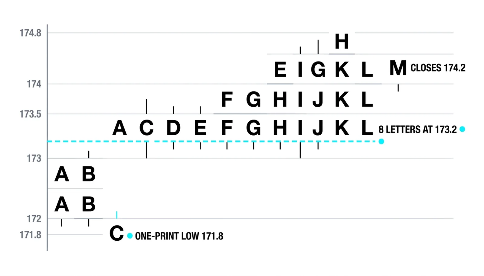
Here is a hypothetical session with round numbers. A stock opens at 172. Periods A and B build a range of 172 to 173.5, a balanced start. Period C dips to 171.8 and stamps the day's low. From period E the market extends upward through 174.8, and periods E through H crowd the rows between 173 and 174. The final letter, M, closes the day at 174.2.
Count the row at 173.2 and you find eight letters, the day's longest row. The market accepted that price and kept returning to it. Now look at 171.8. That row carries one letter, C alone. A one-print low tells you the dip was rejected the moment it printed. Sellers pushed once, nobody followed, and price never returned.
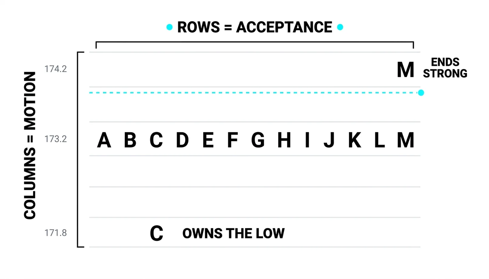
The letters also date the story. C owns the low, so the flush happened early. The upper extension happened from E onward, after the market had already rejected lower prices. M closed near the day's upper region, so the session ended strong. A plain volume profile would show you the same distribution shape, the bulge around 173, the thin tail at 171.8. What it could not show you is the sequence: that the low came first, that the acceptance built afterward, and that the close confirmed it. The letters carry the timeline. That is the reason they exist.
| Pattern on the chart | What the letters show | The read | The trap |
|---|---|---|---|
| Row at 173.2 with eight letters | Price traded there across most of the day | Acceptance; a likely reference level for tomorrow | Assuming high volume; letters count visits, not size |
| Row at 171.8 with one letter (C) | A single period touched the low | Rejection; the dip found no followers | Calling it "support"; one print is a probe, not a floor |
| Tall column in period E | One half-hour swept a wide range upward | Range extension; initiative buying entered | Reading one column as a trend; it is one period |
| Letter M at the close near 174.2 | The final period held the upper region | Strong finish; buyers kept control into the bell | Comparing M here to M on a different period setting |
TPO, Time Price Opportunity, Answered
What does TPO mean in trading?
TPO stands for time price opportunity. It is one letter on a Market Profile chart marking that a specific price traded during one specific period, usually a half-hour. The term "opportunity" is deliberate: the letter records that the market offered that price at that time, whether or not much business was done there.
How do you read a TPO chart?
Read it in three passes. First, find the longest row, which marks the price the market accepted most. Second, find the tallest columns, which mark the periods that moved furthest. Third, check which letters sit at the day's high and low, which dates when the extremes printed. Acceptance, movement, and timing, in that order.
What is a TPO count?
A TPO count is the number of letters on a given row, or sometimes across a section of the profile. Traders use it as a quick gauge of how much time the market spent at a price. A high count signals acceptance; a low count signals a price the market passed through or rejected.
Why are TPO periods half an hour?
Half an hour is a convention, not a law. It became the default because a standard session splits into roughly thirteen periods, enough to show intraday structure without cluttering the chart. Most platforms let you change the period length, but remember that changing it reshuffles every letter, so only compare profiles built on the same setting.
Once the letter chart reads cleanly, the next step is the day's full arc: initial balance, range extension, and the shapes those letters form when a session trends, balances, or breaks. That is where the Market Profile stops being a record and starts being a read on the day ahead.